538’s Best Data Visualizations
Folding context, arguments, and data into one graph to tell a story is devilishly difficult. It is a challenge that requires not just creating a clean, accurate graph but also…
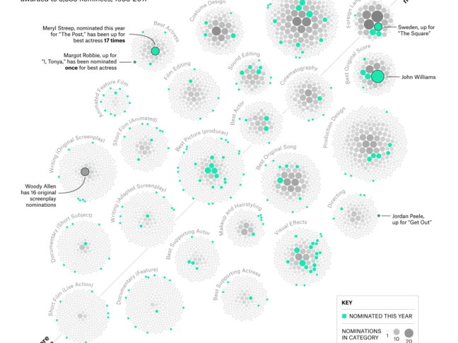
Folding context, arguments, and data into one graph to tell a story is devilishly difficult. It is a challenge that requires not just creating a clean, accurate graph but also…

Usually, when brands take any sort of altruistic angle in their marketing, people will still argue that it might be in their economic interest to do so, making their public…

Type: Commercial Campaign Name: We Believe: The Best that Men Can Be It would be an understatement to say that the most recent Gillette ad campaign provoked a strong and emotional…

Technical writing — writing about a specific topic and its techniques — is an important part of building materials for any SaaS business. You might use it in the Help…
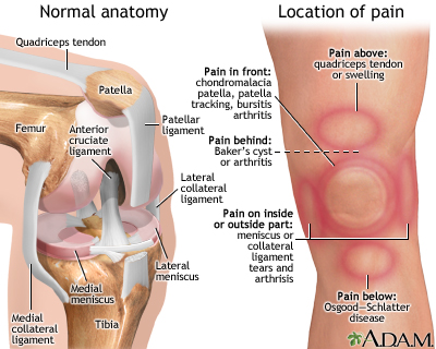
You’re sitting in the doctor’s office, legs kicking the back of the exam table. The nurse has just left and promised the doctor will be in “in a minute” —…

Word on the street is true: everyone and their mom does have a blog these days. And when you’re writing for business, it can be pretty dispiriting to see amazing…

No matter what type of business you run or where you are in the world, you need to be able to communicate with your audience. It’s your most basic ingredient…

Let’s face it — words aren’t always the best way to get your point across, especially when it comes to numbers and data. No matter how well you describe concepts,…
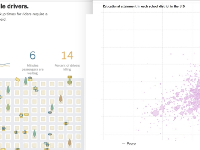
The New York Times has nailed digital subscribers. Since they became an early adopter of the industry trend and started pushing a digital subscription model, they New York Time’s subscriber…
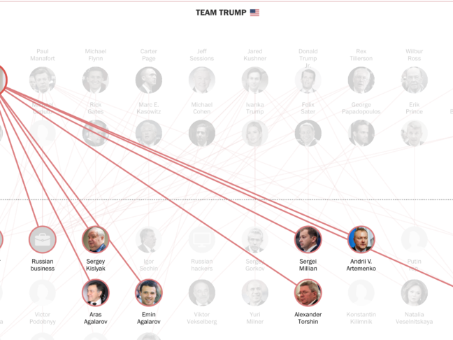
You sit down with a friend at a cafe and start to chat. Eventually, as it always seems to, politics comes up. “Hey, so I really don’t know anything about…