538’s Best Data Visualizations
Folding context, arguments, and data into one graph to tell a story is devilishly difficult. It is a challenge that requires not just creating a clean, accurate graph but also thinking about data and storytelling as inherently intertwined.
538 is a masterclass of data visualizations. In every category they cover, they find ways to make stories out of data interesting, accessible, and interactive. They have figured out how to present data through (interactive) graphics in a way that folds in discussion and narrative.
Politics
Leveraging politics as a key part of the 538 site is a shrewd move. Many political situations can be represented in graphs, charts, timelines, or other interactive viz. 538 distills commentary down to a “just the facts, ma’am” article without manipulating readers or leaving them short.
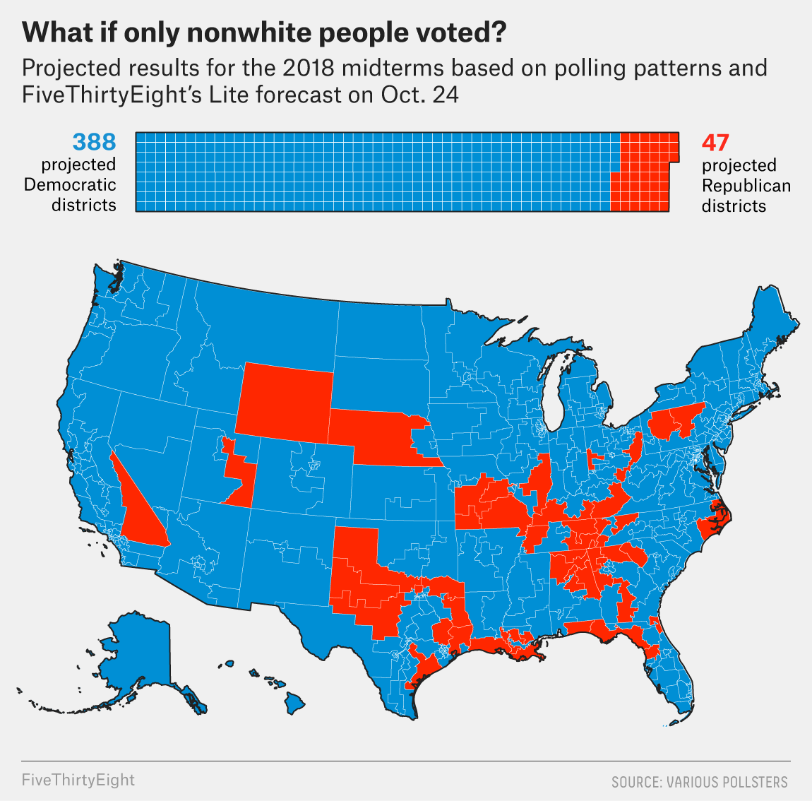
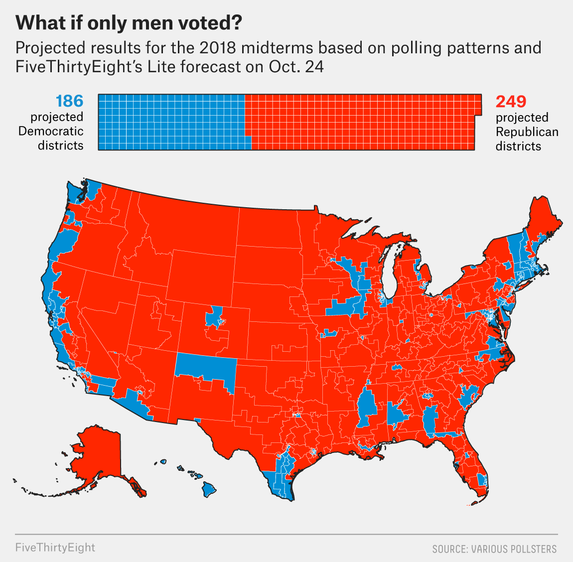
Answering voter what-ifs
After Trump’s election, questions about who, exactly, voted him into power have been bubbling up all over left-leaning news outlets for two years. The question of whether or not white women were particularly to blame was a particularly hot take from an exit poll that is still being disputed.
Before all of this happened, 538 preempted this discussion in a data-visualization-driven article that showed a likely breakdown of voters:
[Source]
The viz pulls no punches and offers easy-to-digest graphics. Critically, they include both projected seats and a map figure. Because the number of congressional seats is related to population and not to land area, a map alone could have been misleading. But having geographic information adds a layer of information about which regions lean one way versus another, even given demographic breakdowns.
The text that accompanies these graphics offers commentary and additional historical information but supplements the bold graphic takeaways. This is a clean, crisp political article.
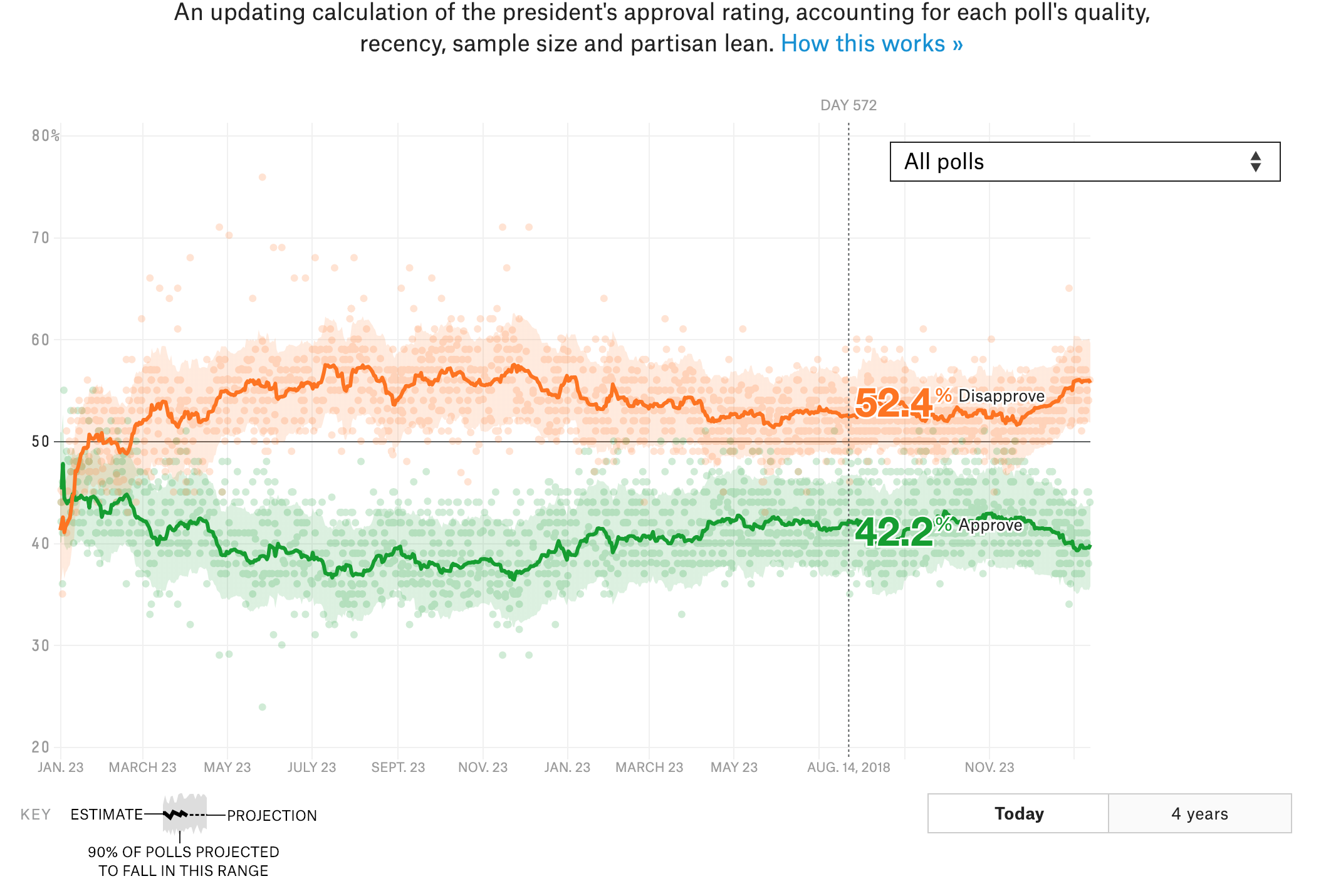
How popular is Donald Trump?
Presidential approval ratings are mentioned pretty much anytime something major happens in national politics. They’re a simple shorthand for the national mood, and 538’s constantly updating presidential-popularity rating tool is a piece of evergreen content that politics nerds will be coming back to again and again — at least for four years.
[Source]
The tool is simple and interactive, and it’s an easy pit stop for anyone wondering what the polls are saying about Trump’s popularity.
One shrewd move here is the choice of colors. Green and orange are colors that don’t have a major political association. It would have been easy to make “Approve” red and “Disapprove” blue, but doing so would have falsely equated approval with Republicans and disapproval with Democrats, which is not necessarily the case.
This is a great example of a functional piece of data viz that is, in itself, a story to be told.
Sports
Sports fans who are also data nerds are a picky bunch. If they don’t like your analysis or visualizations, they’re likely to go out and make their own, better, graphs as they roast you. 538’s made a name for themselves off of pleasing this finicky group because they do everything with the precision of a sports fan.
March Madness predictions
March Madness is as high-stakes a sporting event as any in college sports. Brackets abound among friends, coworkers, and random groups of strangers on the internet.
538 dominates March Madness because of its slick predictions tool. It not only gives probabilities for each game but also ranks an “excitement factor” that helps you choose what to watch.
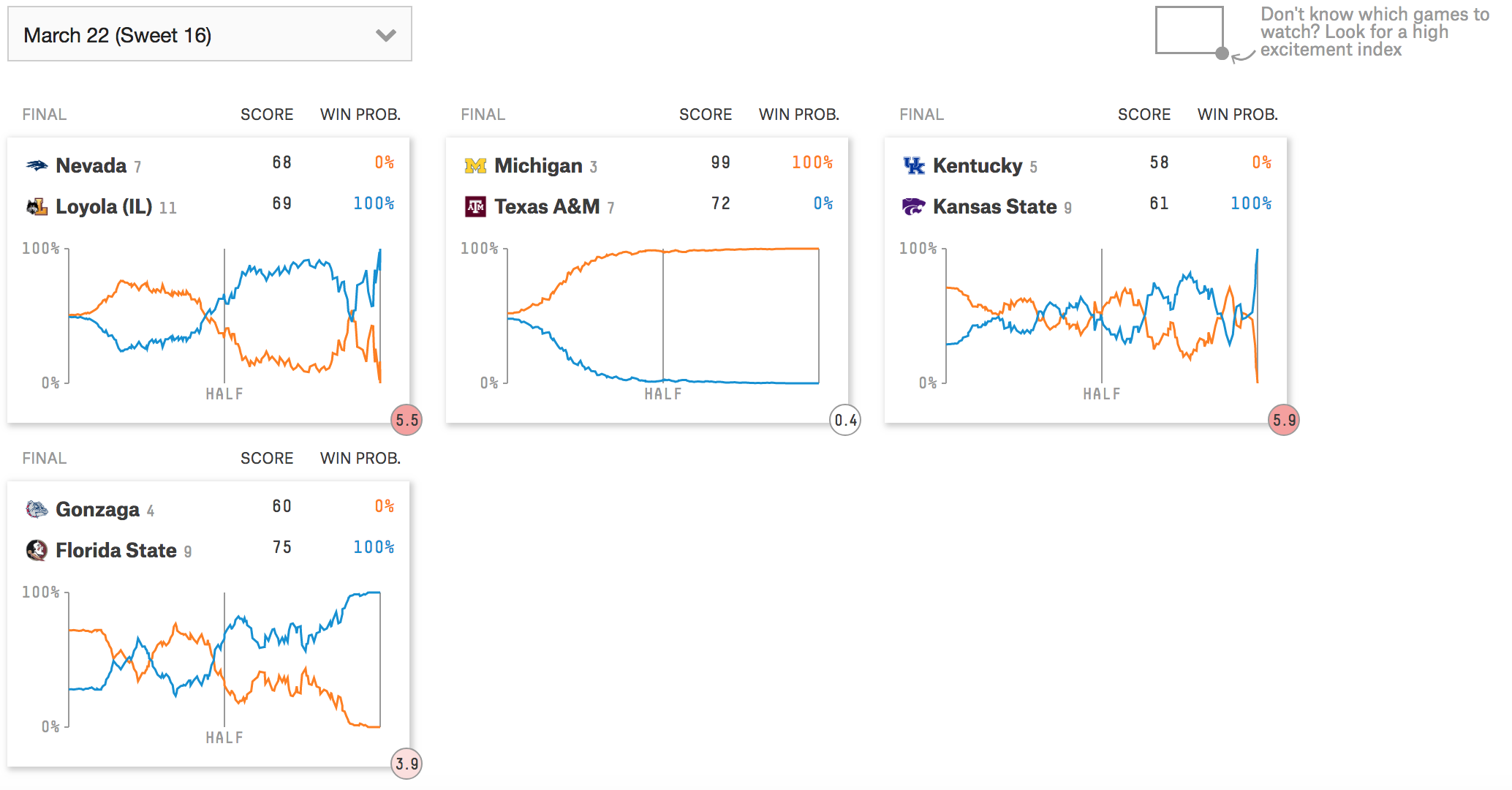
[Source]
You can also track games as they happen to see how your bracket is faring in real time. It’s a super user-friendly tool that is accessible to anyone who is even vaguely interested in NCAA basketball, but its methodology and interface is solid for superfans as well.
The age-old question of sex segregation in sports
Using their usual data-driven approach, 538 asks whether or not men and women could compete together on the ski circuit.
This is a highly effective take for a divisive topic. Rather than posit what-ifs and debate pundit points, they simply present evidence: In some events, men are faster than women, and in some events, women are faster than men. And this depends on the year, as well — which could correlate to fields of competition, rule changes, etc.
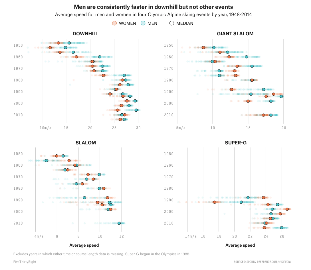
[Source]
This breakdown puts to rest questions about historical or by-event data and allows the reader to draw their own conclusions. This question definitely has a lot of angles, and 538 gets away with the minimal, graph approach because most of those questions have been discussed endlessly. Rather than do something everyone else has done, 538 offers a clean and concise take that puts readers in the driver’s seat.
Science and Health
Telling a whole story with graphs is harder than it sounds; it’s why so many outlets use charts and viz as a way to supplement their stories, not tell them.
When 538’s science and health graphs are the focus of the story, it works because they’re informing with rich graphics that benefit from description, not ones that are just props to back a main point.
Why California’s wildfires are so destructive
California’s recent wildfires were a tragedy that drew attention from news outlets coast to coast. 538’s coverage was set apart by their graphical coverage of the wildfires, as well as the fires’ causes and destruction.
The main points of the articles — that an extra-dry California, with a population in proximity to deadwood, caused the fires to be so destructive — is clear from the graphs alone:


[Source]
The commentary expands on the graphs with quotes from experts and additional information on the situation, but doesn’t add much to what can be found in the graphics. It’s the charts that are telling the story here, and that makes for a concise, informative article on a topic with which most readers will already be somewhat familiar.
Gun violence from an intersectional perspective
This interactive viz and the article that goes along with it make a powerful statement on how limited the American discourse on gun violence can be. The article is mainly focused on presenting a short history of gun violence, including some statistics. The meat of the argument comes in these two sentences:
“You could, theoretically, cut down on all these deaths with a blanket removal of guns from the U.S. entirely — something that is as politically unlikely as it is legally untenable. Barring that, though, policies aimed at reducing gun deaths will likely need to be targeted at the specific people who commit or are victimized by those incidents.”
What the viz in this piece does, in a way that breaks down major causes, is demonstrate the different people who are involved in gun violence. There are animated slides you can click through and a tool you can manipulate yourself:
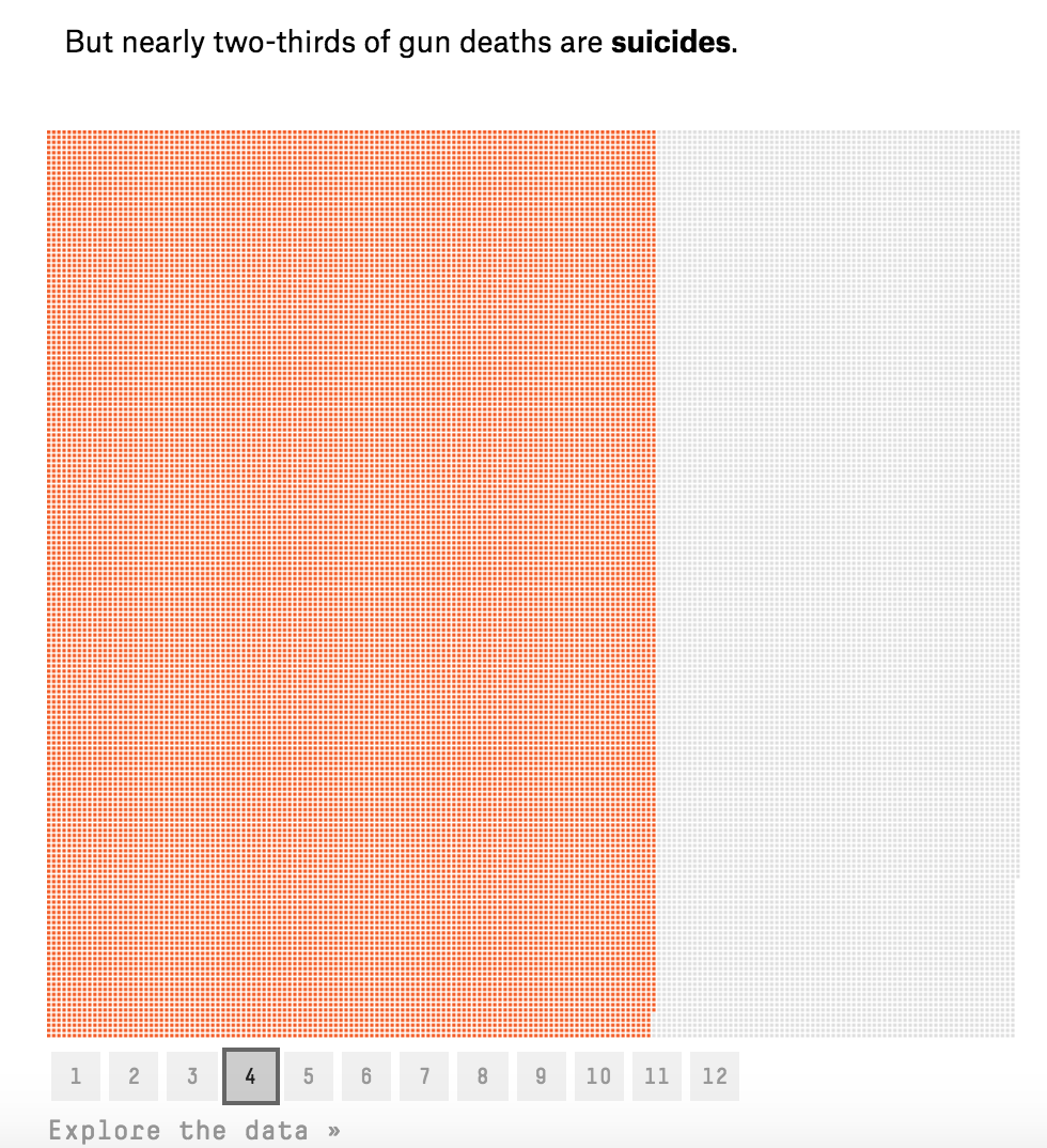
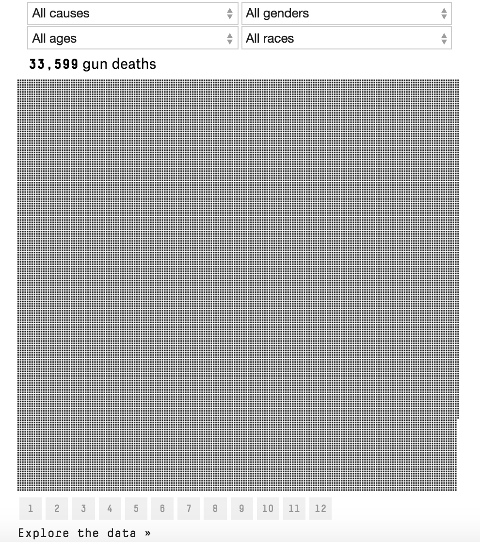
[Source]
Breaking up a heavy topic with an informative graphic means that readers can take in 538’s argument at their own pace. It’s a much more powerful way to present information that breaks down gun violence by different characteristics than even more statistics written out in a row.
This article is a great example of how interactive tools can add valuable perspective to serious topics in a way that enhances the reader’s engagement with the ideas presented.
Economics
Where there are numbers, there is data viz, and economics means numbers. But the best of economics isn’t raw data or numbers — it’s the effects of those numbers. Humanizing economics makes it a story that readers are interested in. 538 covers sports, culture, science — it isn’t purely focused on economics like The Economist, say. Its readers are interested in more than economics for economics sake.
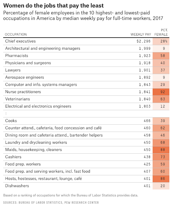
Stop telling women to fix the pay gap
This article is a great example of effectively resting the weight of your argument on data. It primarily uses graphs to craft the argument that women alone can’t fix the pay gap because it’s an entrenched, systematic problem. The surrounding text gives color and helps readers work their way through a divisive topic.
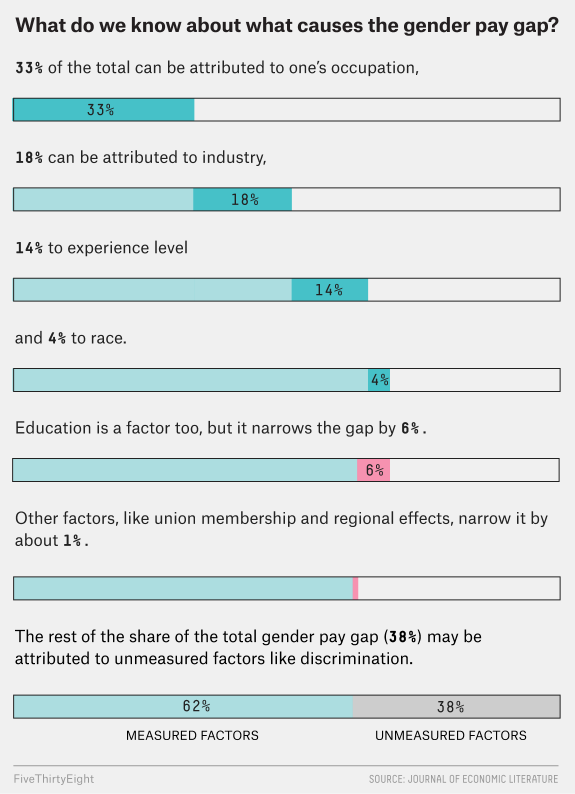
[Source]
Having extensive data to back up a claim roots an argument in authoritative facts. The graphics that 538 presents here dismantle the argument that the pay gap exists only because women work in lower-paying jobs quite effectively, showing that only 33% of the gap can be attributed to profession.
This frees the commentary to focus on expert analysis and additional studies. The table and infographic are what makes this possible because 538 doesn’t have to waste words going over all of that data.
How to win a trade war
Yet another way that 538 has effectively capitalized on hot-button issues in the news is their trade-war simulator, which allows people to craft a strategy and then see how it plays out in a trade war.
Trump’s ongoing trade wars are big news, and this piece humanizes what’s happening by allowing people to understand what factors affect a trade war and how trade wars play out.
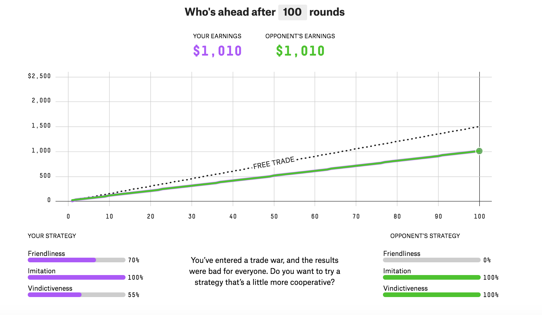
[Source]
It gives a concise package of how actual economic and political policies affect outcomes. And it’s fun to play because you feel like you’re actually getting to use, in a tangible way, what you’ve read about trade wars. 538 explains how everything works after the interactive viz, but for anyone who has been following the news, the interactive tool is front and center.
Culture
538’s culture section is mostly reserved for its “significant figures” feature that gives an overview of events by the numbers. But when it does foray into culture, 538 creates interesting pieces that capitalize on topical issues.
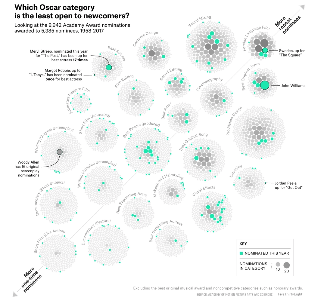
New kids on the Oscars block
This graph is outstanding. It tells a whole story as a stand-alone piece of data representation — so much so that there are only two paragraphs of text accompanying it.
It tells the story of which Oscar categories are dominated by repeat nominees, and which are more “open” to newcomers.
[Source]
We like that the graph is annotated with people of interest and that they’re effectively clustering bubbles in a way that isn’t overwhelming. The bright mint-green and grayscale color scheme feels fresh and provides enough contrast without turning into color overload.
That’s all we have to say here. This is a clean graphic. Enjoy it.
The doomsday clock would like you to be concerned
This is a simple chart that shows the positions of the Doomsday Clock throughout its history. The chart is easy to understand and provides a quick bird’s-eye view of how dire a situation we are in right now.
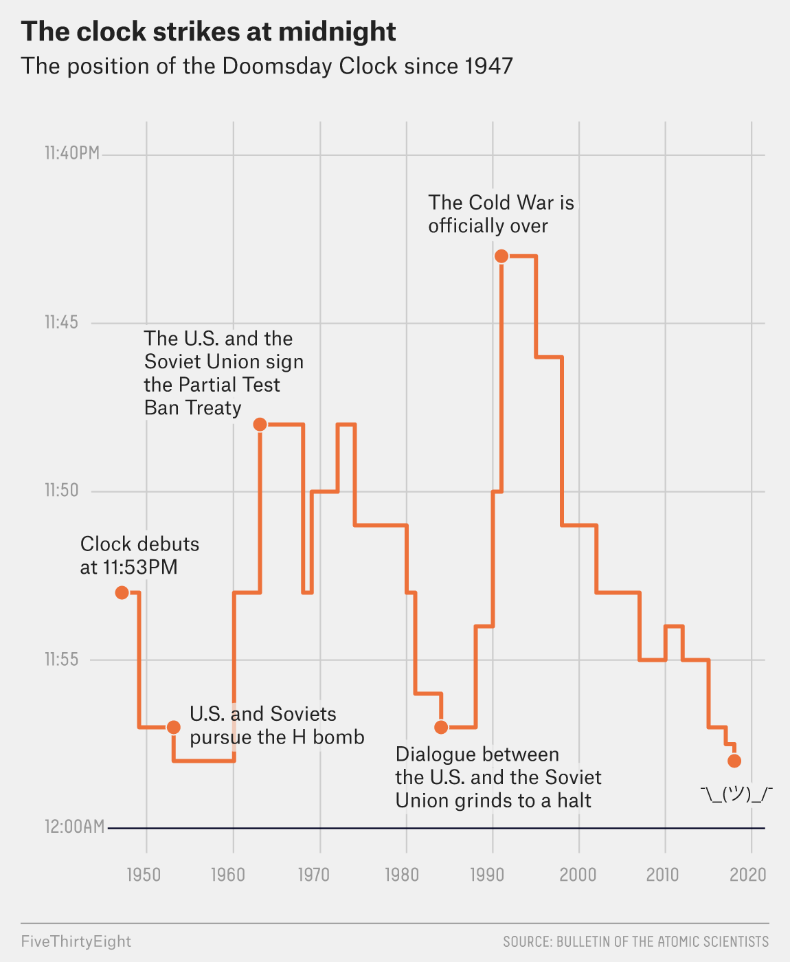
[Source]
The text of this article pretty much just explains that the position of the clock is currently down to nuclear threats and global warming. While it’s always news when the Doomsday Clock moves, giving such a stark contrast of where we are now versus where we were at the beginning of the ’90s really highlights the threats facing our society.
The only thing you might be able to criticize this graph for is its truncated scale. But given that the Doomsday Clock has never been set before 11:40, and given that the point of our situation is that we’re approaching Cold War–era levels of doom, the scale isn’t hiding any data or making it appear more dramatic than it is.
Bonus Chart:
It’s Nic Cage, y’all.
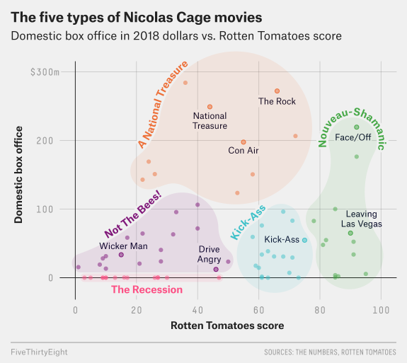
[Source]
In all seriousness, 538 has figured out a formula for good data viz. Their charts are crisp and readable, and they understand how to rest articles on data in an effective way. It is, after all, what they do.
H/T to 538 for the great work they do in data viz, and happy reading to all. Data viz responsibly.
