Charts for Uncharted Territory: Trump’s Collusion
You sit down with a friend at a cafe and start to chat. Eventually, as it always seems to, politics comes up. “Hey, so I really don’t know anything about politics but, what’s up with that whole Russian collusion thing? I haven’t been able to catch up with that — can you help me understand what’s’ going on?,” they ask.
Cue the lump in your throat and the pounding of your heart. Where do you even begin? How do you explain all the people at play? How do you explain that collusion, conspiracy, and criminal activity are related but not exactly the same? How do you crush over a year’s worth of news into one concise explanation?

Not even Chrissy Teigen can save you now.
This is the scenario that news organizations have been staring down every day for months on end. People don’t have a lot of time, they’re oversaturated with political news, and they want a clear explanation of difficult and interlocking topics that involve dozens of people — most of whom nobody had heard of before last year.
Words alone are not enough.
Video clips can only go so far.
When you’re crafting a piece of content that is dealing with a multifaceted topic, you need to strategically deploy the best tools you have at your disposal. And for most topics, including Russian collusion, this means relying on charts and diagrams. They give context and include historical data and trends, which are often critical for proving a point. They are a clean way to organize factual information in a way that makes intuitive sense for readers.
Beyond partisan politics and he-said-she-said, there’s a lot to learn about how to present complex relationships and information from news coverage of Trump’s collusion.
Context is king
In the potential Russian collusion by the Trump campaign and administration, backgrounds and relationships are some of the most important pieces of information to give. Each player has their own unique ties to Russia, and working through all of these links has been a huge part of this story.
This context, in other words, is both a lynchpin of discussion and a difficult thing to lay out. There are dozens of people who all need to be accounted for and situated in their political and professional roles, and news organizations are turning to charts to do this. Without knowing who they are or how they’re connected — both to Trump and to any number of Russians — a reader simply will not understand what is happening in a discussion about potential collusion.
It’s so important to know and contextualize the major players that Politico has an article that is simply seven charts of who’s who. Let’s take a look at one and break down how it is a superior tool for contextualizing information.
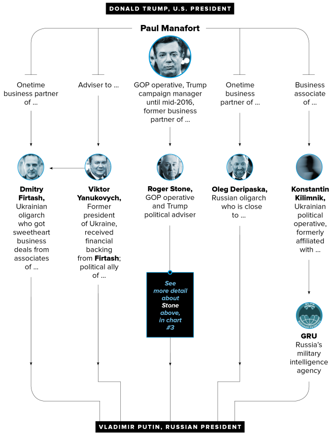
This chart shows degrees of separation from Paul Manafort, a Trump campaign manager and Vladimir Putin, the president of Russia. It’s a condensed way of getting Manafort’s major connections in one fell swoop, and this particular series of charts is an excellent example of a visualization.
- The faces help a reader recognize how key players return throughout the series of charts. Using symbols or photos to accompany names, objects, or ideas is a great way to make things more skimmable and more memorable.
- The color scheme doesn’t distract from the information. Notice how they put all of their photos in grayscale? This color choice cues to the reader that it’s not clear who is the most important link here. It neutralizes the inferences that a reader might make from full-color photos — like paying more attention to someone who is wearing a bright color.
- The layout is the epitome of “Keep it simple, stupid!” When you’re looking at this graphic, it almost seems like this is the only way to lay out the information, because it’s so intuitive. There are no crazy lines, no weird shapes — it’s compact and super easy for the eye to follow.
These qualities make this chart an efficient choice for showing a lot of information in a digestible way. Think of how much you would have to write to explain all these connections, and how dry it would be. Imagine how long it would take you to watch a video of someone explaining Manafort’s context in the collusion investigation. Would it take longer than the 30 seconds that it takes to read this chart?
Another great example of explaining context in the collusion is a clarification on the investigation itself from the LA Times:
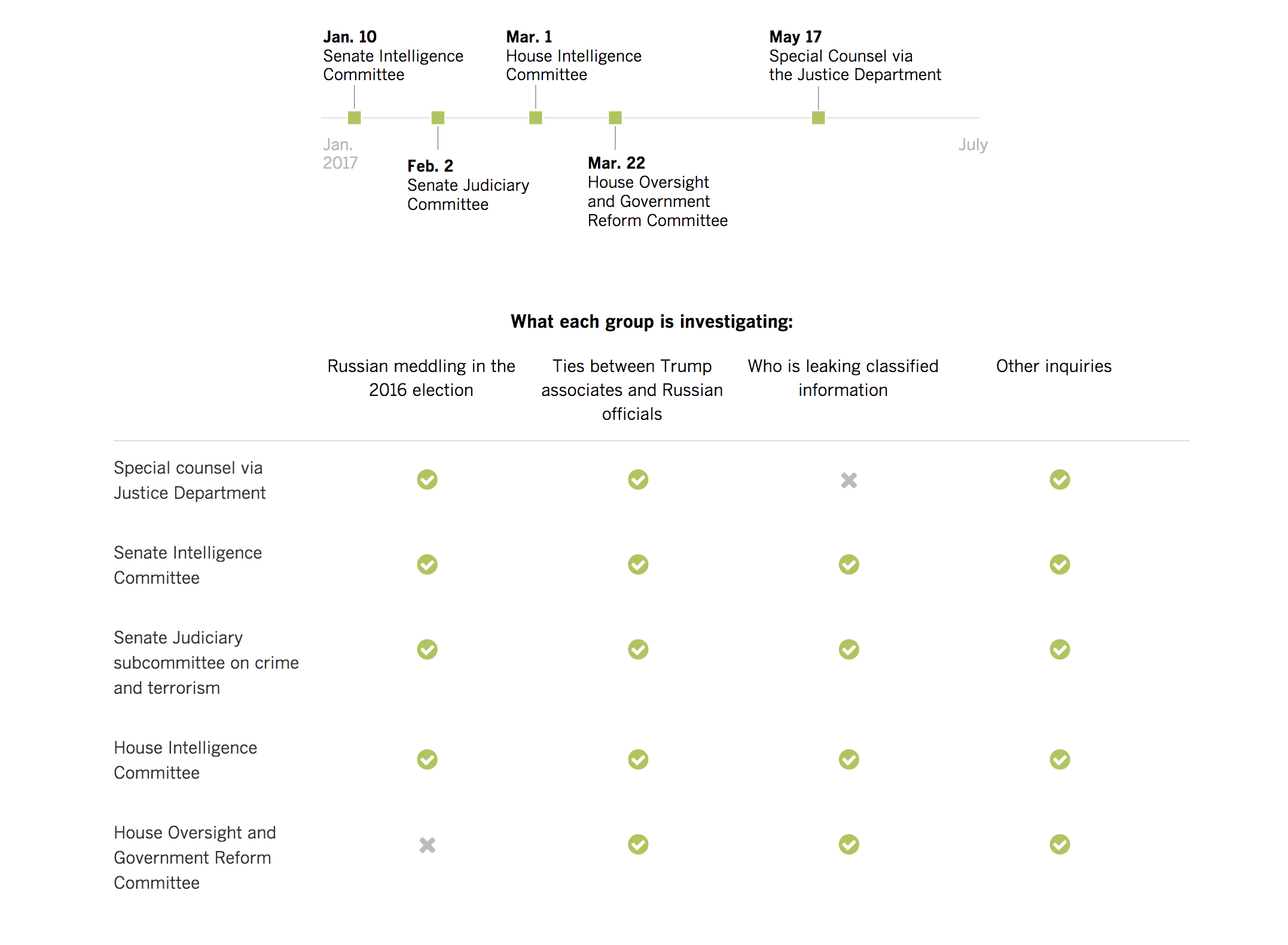 This chart provides a quick checklist for what each group is investigating. This is a crucial piece of context for anyone following the collusion story. A visualization of this keeps repetition to a minimum — imagine reading “Ties between Trump associates and Russian officials” four times — which makes things easier on the reader.
Because this graphic gives context to each different investigation, it is a great takeaway for readers and a good visual to use again. If you were doing a series on Russian collusion, for example, you would be able to pull this in as a refresher for a reader. That’s no extra work for you, and a great reinforcement for a reader’s understanding.
Laying out your context in the clearest way you can is the best way to help inform your readers and give them the tools they need to understand the nuance of your content. Charts and other graphics can be an excellent way to distill even complex webs into digestible formats.
Trends, or, how to actually prove your point
Once is an accident, twice is a coincidence and three is a pattern, and patterns often do reveal the truth. That’s why, many times, arguments and proof for those arguments have to include trends of behavior. And one of the best ways to display those trends is, you guessed it, charts.
For example, asking who the best basketball player of all time is would require you to look at their entire career, not just one phenomenal game. Looking at what the best marketing channel will be for 2018 requires you see recent historical change in ad revenue from different platforms. As for determining how likely it is that the Trump campaign and administration colluded with Russia — that means looking at:
- Regularity of meetings
- Number of business interactions
- Frequency of statements
- Meetings’ relationships to other events (e.g., Trump starting to push Clinton’s emails)
Providing the data to back up these trends could be done with text alone, but a block of text is time-consuming to read and often dry. Worse, if you have more than a handful of data points, it becomes hard for someone to keep in their head how things are aligning to see a pattern. So, when you’re trying to show a trend involving many data points, it’s nearly impossible to do with text alone: humans need visuals!
A great example of how news outlets are using visuals to show trends in Trump’s collusion conundrum is this Washington Post visual on the frequency of Trump and the White House denying collusion:
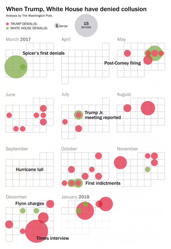 Note that the point of this chart is not to give exact numbers or information. You could guesstimate the exact number of denials from this graphic, but what’s really important is it shows a clear trend: Trump and the White House regularly deny collusion.
Note that this graphic is purely informational. Is this a case of President Trump doth protest too much? Is he being slammed by negative media and false allegations? You could use this graphic to support either case — that’s the beauty of it. It’s a whole bundle of evidence wrapped into a concise package. It’s a tool to use in conjunction with your argument. It makes your case more credible and more compelling. But it doesn’t do all the work for you, and it doesn’t have to.
Words can be persuasive to set up evidence, and graphics can be great displays of evidence. Use them as a one-two punch to pack the most oomph.
Organizing information when words fail
As more and more information about an event, place or person starts to compile, the more complex it is to organize. Humans spend a lot of time trying to make good categorial and organizational structures, from color coding to the Dewey Decimal system to project management tools.
Something as complex as potential collusion or illegal action by the Trump campaign and administration is going to be difficult to organize:
- It is a complex issue with dozens of players
- There are several years’ worth of data
- Readers need an overview of what’s in play to understand developments
- It can be hard to separate fact from fiction with news cycles shortening
- There are esoteric systems at play, like the legal system and the congressional systems, which are not widely understood
Representing some or all of this information visually can help people easily categorize and make connections that help your audience stay engaged. If someone doesn’t understand what’s going on, they will disengage and leave your content; visuals can quickly turn that confusion around.
One way to use viz and graphics to organize information is to link out catchup visuals. This keeps your readers on your site but allows you to write a streamlined piece without extraneous graph injections.
CNN did a great job of this in their article “One year into the FBI’s Russia investigation, Mueller is on the Trump money trail” from August of 2017. As they recapped an entire year of news on the collusion, they embedded links that would help readers quickly get up to date with the story. Some were timelines, some were videos or quotes, and some were more traditional charts and viz. They all appeared to the left of the text, and there was one for each different section of the article. Take this “Related Article” link:
It leads you straight to a Politico-esque visualization of who’s who in the investigation. For comparison, here’s part of Paul Manafort’s:
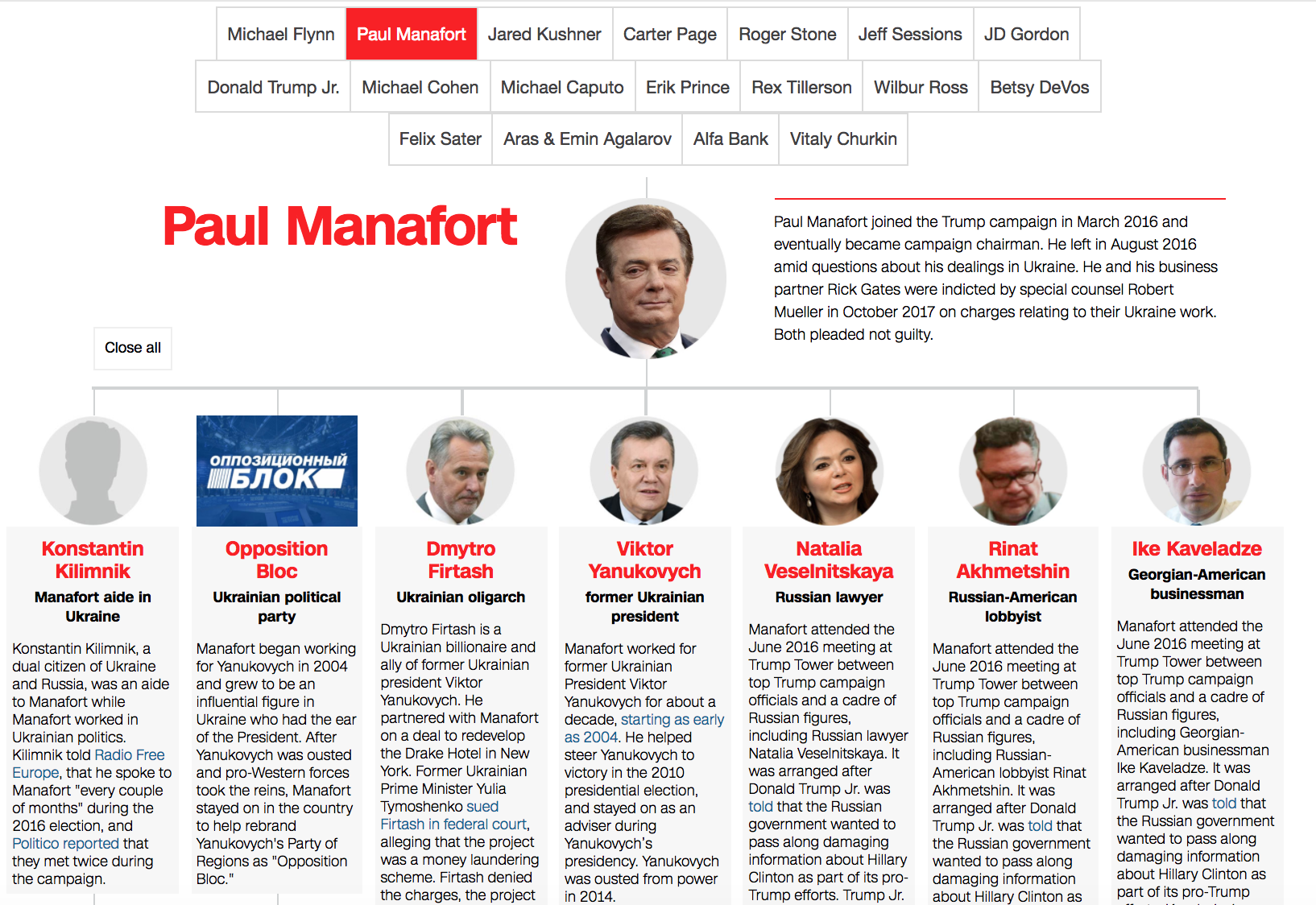
Notice how the same clean flow is used in CNN and Politico’s pieces? It makes for a quick skim for readers to catch up. We also like that there are bold colors for the names of each person or organization, which makes it easily skimmable, even as it packs a little more information than Politico’s.
Using this kind of backlinking can keep visitors on your site while giving them the information they need. If it interrupts your article’s organization to pull in a whole recap of something you’ve already covered, having a bold call-out that links to a relevant piece of viz keeps your reader on your website and engaging with your content.
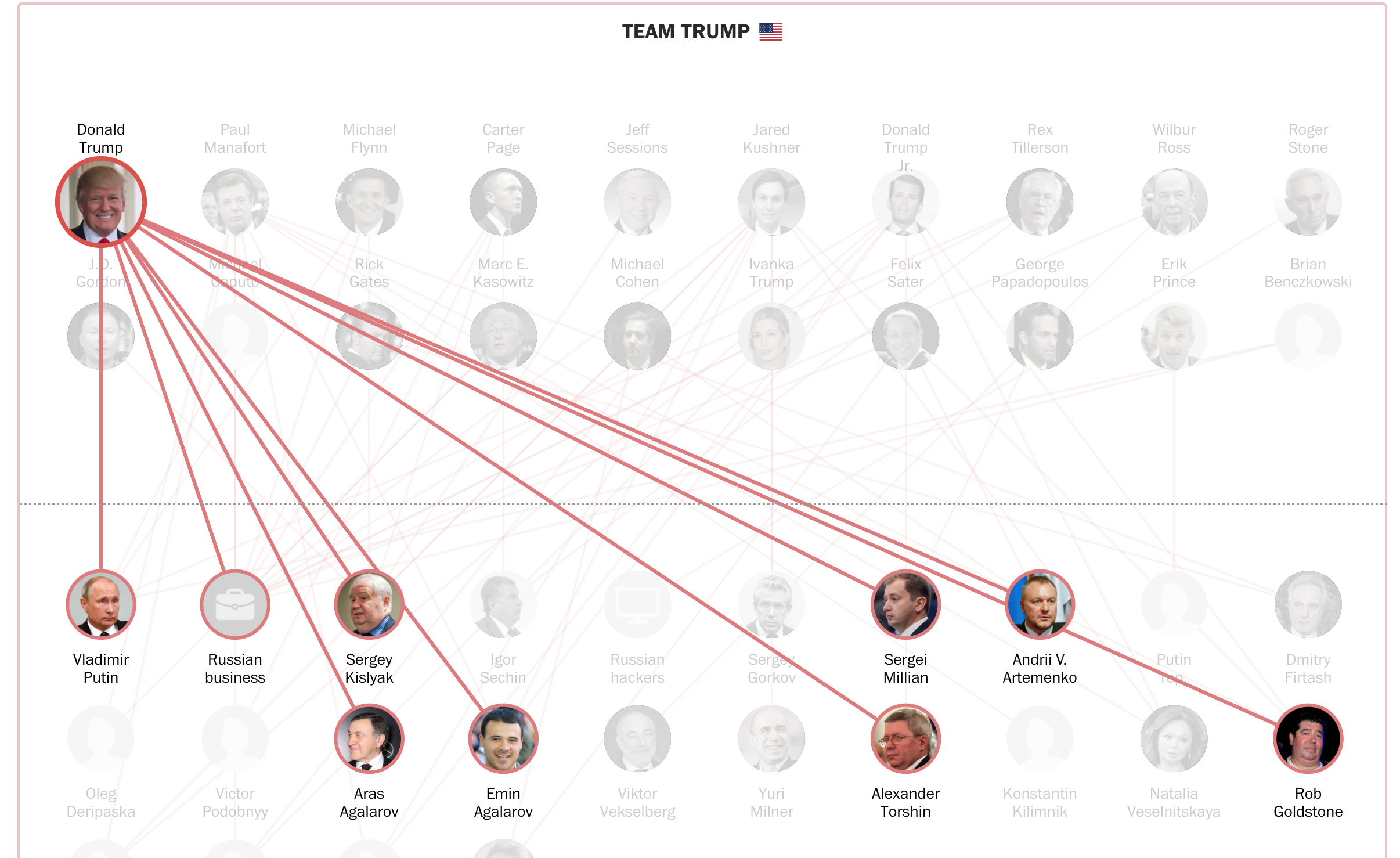
Then, there are embeds that use features to help organize information within a piece itself, instead of linking out. Take the example from the Washington Post below. When you scroll over this piece of viz, you can see how one person from Team Trump links to a “Russian tie” or vice versa. Right off the bat, you start to get a sense of who the major players are.
When you click on any of these figures, you’re taken to a brief bio, a timeline of their actions and an interactive element that shows a bio of every person they’re tied to:
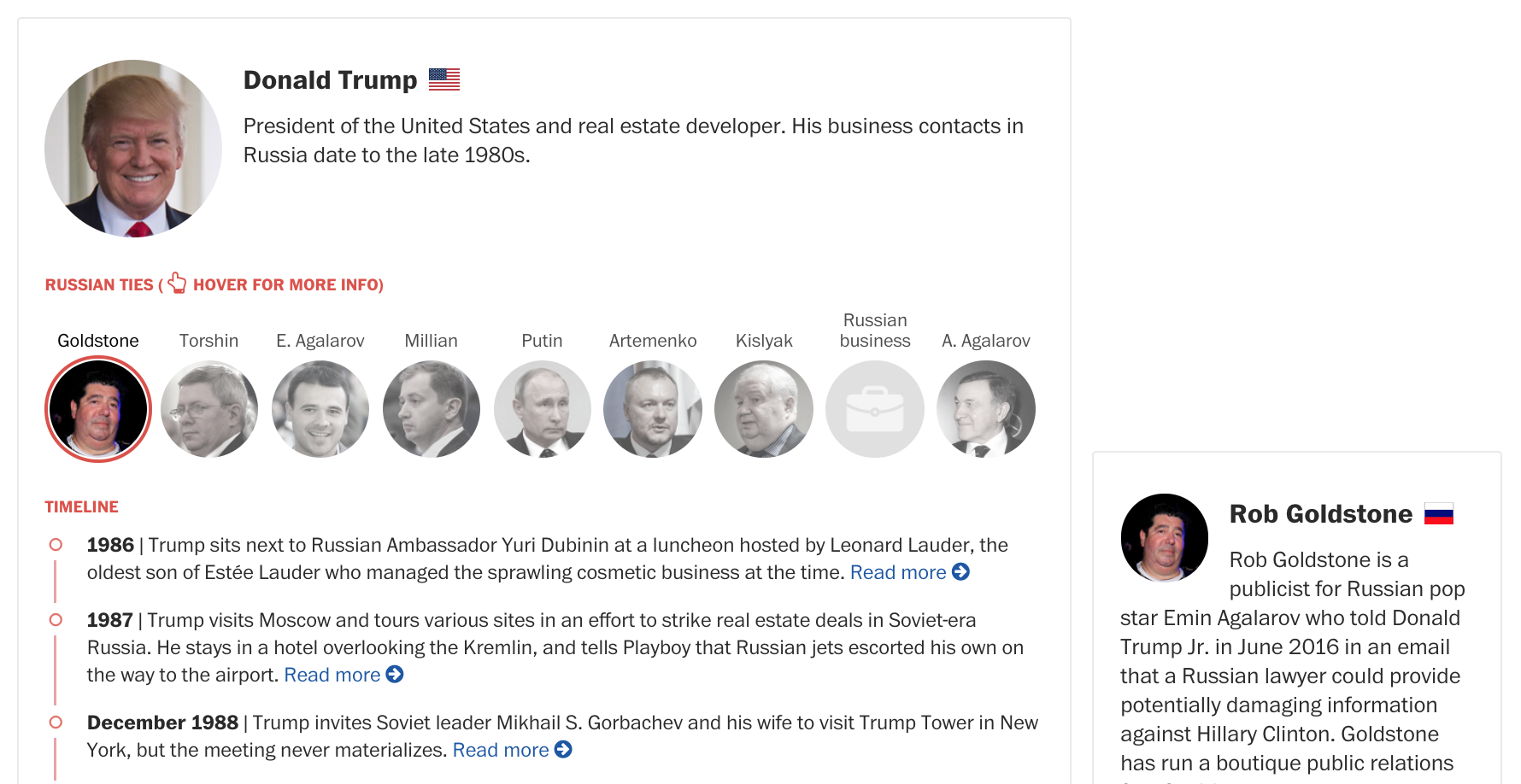
This viz is the structure and organization of the article. It empowers readers to choose their own path and explore at their own pace, and packs a huge amount of information into digestible pieces. Without the central organization of the viz and the organizational, readable timeline element, this would be harder to get through than the Econ 210 readings you never did for class.
Both of these prove that charts, interactives, and visualizations can do more than just organize their own information well. They can be a foundational element around which you design a piece of content and one that helps give your readers a true, deep understanding of a complex topic.
So, did Trump collude with the Russians?!
Of, course we don’t know! If we could, rest assured we’d be making some pretty amazing infographics about it.
But what we do know is that news organizations are using charts to make complex topics legible for readers. The story of Trump’s Russian collusion has been one that’s dominated headlines for a year, and it’s not going away. As it grows and grows, media outlets will continue to use viz to help readers understand what’s going on. Keep an eye on how they’re doing it — you can definitely learn a thing or two.
And, when creating your own content, remember that charts, graphs, infographics and other data viz are tools that you can use to shape your content, not just additions. They solidify your point, provide critical context, and drive the organization of your information. All of this makes what you put out there easier for readers to digest and more compelling for them to come back to.
