What is an infographic? It’s your business’s secret weapon.
No matter what type of business you run or where you are in the world, you need to be able to communicate with your audience. It’s your most basic ingredient for success. But even though it’s a simple idea, it can play out a lot of ways. Businesses today do so much more with communication than just delivering services or merchandise. They’re on social media, in email campaigns, on websites and working with influencers.
Each of these mediums demands its own type of content. You wouldn’t try to put a video ad in a newspaper. You wouldn’t try to mail Instagram ads to someone’s house. Creating the right content for those channels is obvious.
And yet, many marketers, bloggers and businesses have no idea what they’re doing with one of the most informative types of content—infographics. They may as well be printing out tweets and dropping them from a plane.
[Source]
That’s because a lot of people struggle with the basics — what is an infographic? How is it different from other types of data visualizations? What are the best ways to create infographics? Where is the most effective place to use them?
Today we’re taking it back to basics to lay out exactly what an infographic is, how to make one, and how to use it appropriately. When done well, infographics can be amazing additions to your content that drive home a message and engage your audience. They make great marketing materials for your business and can even help you build up your SEO juice.
So, what is an infographic? It’s your business’s secret weapon, and we’re going to show you how to harness it.
What is an infographic? How is it different from other visualizations?
An infographic, like a chart or any other data visualization, is a graphic representation of data. It can include text, numbers, data visualizations, pictures, drawings, links, and even footnotes, if you really want.
This means that one difference between infographics and other visualizations is the number of elements involved. On a chart, you might have data, a title, and a key. But you can put that whole chart into an infographic next to a timeline with an accompanying photo to tell a fuller story.
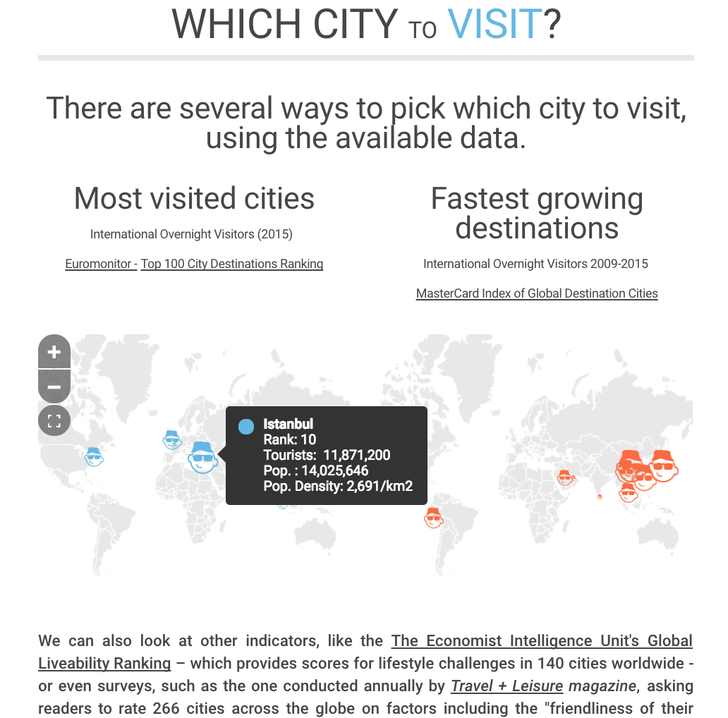
An infographic on which city to visit combines a discussion question with an interactive piece of viz and a description.
And that’s what infographics are really all about: telling a story. Because you can combine elements, you can craft a narrative that is concise and powerful. The elements you choose to put in your graph can connect to tell this narrative in any number of ways. They could be arranged on a timeline, in a workflow, or in a story arc with a beginning, middle and end.
This is the main reason that you don’t use infographics like you would use a chart or a graphic. A graph might be used to support or demonstrate a point in an article. An infographic is much more likely to stand on its own, rather than being embedded. You could embed a short infographic to replace part of an article, but you wouldn’t put a full-sized infographic into a full-length article.
Alright, so we’ve got down what an infographic is — now it’s time to figure out how to make a good one.
What makes an infographic successful?
To create a successful infographic, you need to nail down to two main points: narrative and design. This narrative drive means infographics can be easier to make than something like a flowchart, which lives or dies on conceptual structuring. To get good at infographics, what you really need is an attention to detail and a strong sense of the story you’re telling. Let’s break down how to do it.
What is an infographic? It’s a narrative.
What ties all the elements of an infographic together is the narrative that it tells. This can be broken down into three parts:
- Story. What are your readers going to grab onto? What is exciting about your topic? How would you tell your point to someone else in the most interesting way possible? That’s the meat of your infographic: the story. It doesn’t need to be breaking news, but you should identify the hook that will pull your readers in. This should inform your title and your copy.
- Context. What information do you need to present for a reader to understand your infographic? Can it stand alone, or does it need a preface to connect it to a larger, more complex topic? What is the importance of your topic? That’s the context of your piece. It can often be worked into the infographic itself with a good subtitle and informative copy.
- Argument. What are you trying to get your readers to see with your infographic? How can you present your information in a persuasive way? What are the stats, the pictures and the words you will use to get there? That’s the argument of your infographic, and it will drive your editorial and content decisions.
Don’t psych yourself out! Pulling these elements of an infographic together is the same as pulling together the outline for a piece of writing or a presentation. You want to know what to argue, how to support it and how to get people to pay attention to your point.
What is an infographic? It’s a well-designed visual.
The other big element of an infographic is the design. This is where attention to detail really comes in. Three of the biggest elements you need to consider are:
- Color. Picking a cohesive color scheme goes a long way towards readability for infographics. Color scheme generators can help you make palatable choices that are more exciting than black and white but don’t push you over the edge into unattractive combinations.
- Flow. You can’t simply plop down your elements in any random order. Think about how your story arcs and how your elements interact. Does your chart read from the top down, or from side to side? How does your reader’s eye know where to go next? Is it clear what descriptions and titles belong to which elements? You want your graphic to have as intuitive a flow as possible.
- Audience. Is your infographic designed to be shared all over Twitter or is it being used in the boardroom? You need to tailor your design to play well with your audience. While professional pieces might have more muted colors and straightforward copy, social pieces should be a little bit more exciting.
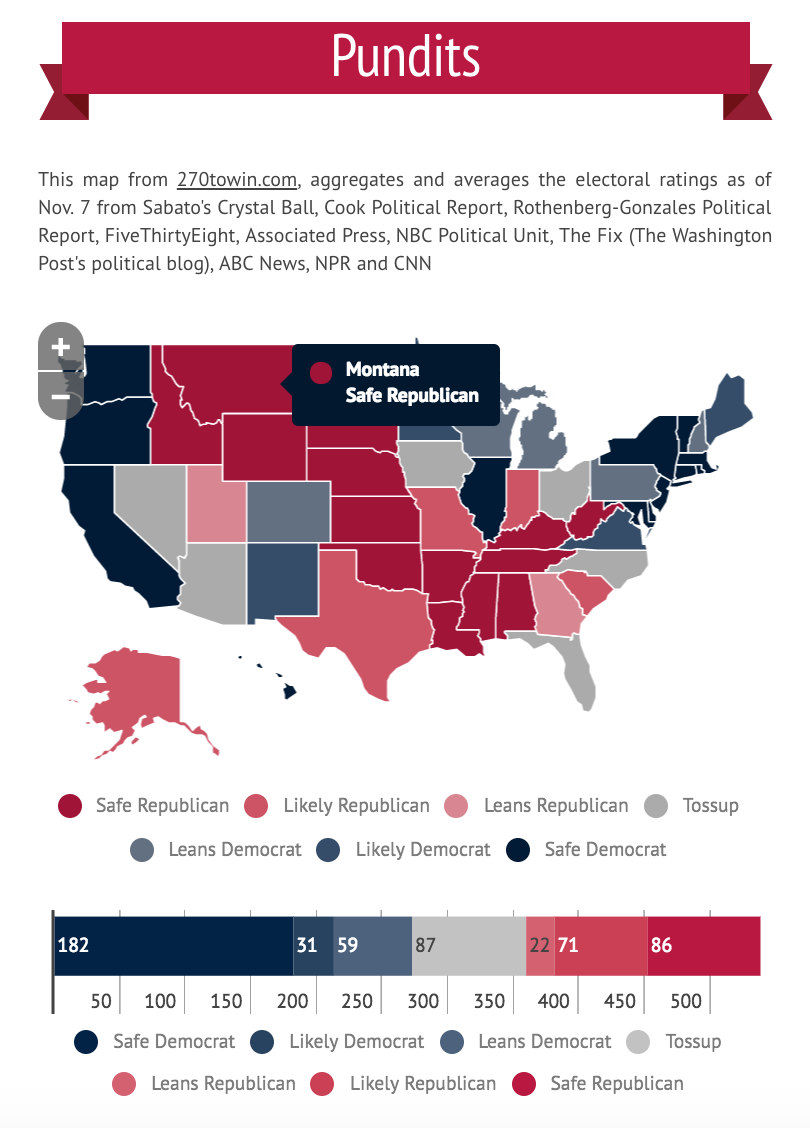
Part of a FiveThirtyEight infographic on the election shows a strong color scheme, readable data and crisp visual header that separates it from the previous section.
Remember: stick to your strengths. If you aren’t a graphic designer, don’t go crazy on the graphics. If you aren’t a great writer, don’t use text as the primary source of information on your infographic.
To help you play to your strengths, you can consider outsourcing the creation of your infographic to another company or a freelancer. This is a good option if you lack the tools or skills to put everything together, but you have a strong vision to execute.
Another option is to get a task force together. Making infographics is interdisciplinary — you can’t just ask your design team or your ad manager or your blogger to throw something together. Instead, take your strongest writer, your best designer, and your social media star and let them knock it out of the park.
How can you use infographics as marketing?
Alright: you know what an infographic is, you know what makes an infographic successful. Now let’s dig further into why they’re your business’s secret weapon, and how you can actually use them as a communication and marketing tool.
Driving value
Infographics that are genuinely valuable are genuinely marketable. When you are sharing knowledge about your industry, helping someone accomplish a task, charting a new season’s trends or examining the history of a political scandal, an interesting graphic that presents readers with new information will inspire people to check out and share your content. Nobody wants a branded infographic with two stats and a giant company logo smack dab in the middle.
A great way to start using infographics to drive value is to supplement your existing content. Maybe you have a blog post or two that you wrote, but weren’t the strongest. Could you remake those into killer infographics? Are you going to a conference and looking for an easy takeaway from your presentation? Maybe the graphs and copy of your presentation would work well as a PDF infographic that you can give away in exchange for lead information. Get creative and use what you’ve already worked on to spark your design dreams.
Driving views
Use them as a takeaway to share. A big advantage of infographics is you can share a lot of information at once. Unlike sharing an article, where you get a one-sentence slug, the infographic will remain robust even as it’s placed in different contexts. Know where to share your infographics to get the most bang for your buck.
Where is your community? Is there a hub of ad execs on Twitter? Are product guys hanging out on GrowthHackers? Is Reddit teaming with skincare lovers? Where your tribe lives is a great place to share an infographic. Make sure that it’s an organic part of the conversation — use your infographic to back up a point or a stat in a discussion, for example, instead of shoving it in people’s faces. Again — nobody wants to feel like they’re just staring at a giant company logo.
 Tweets with an infographic photo + link are more engaging than an article slug. | Source
While sharing organically is great, don’t be afraid to use infographics in your ad campaigns. They’re highly visual and super valuable, which makes them great for most online ad platforms. Plus, then you don’t have to design yet another graphic for a new campaign.
Oh, and one last thing: don’t forget about the SEO potential of infographics. Infographics are shared widely and can bring you those sweet, sweet backlinks from all corners of the web.
There’s no time to waste!
Those infographics aren’t going to make themselves — what are you waiting for? Go forth and create beautiful infographics for your business. They’re effective, they’re handsome and they’re a great way to spice up your content. Whether they’re on your blog or in an ad, they’re sure to catch the eye of your readers.
