19 Flowcharts That Will Actually Teach You Something
Flowcharts — we’ve all seen them, and we’ve all made one. They’re everywhere from government websites to the backs of receipts. You’ve probably found cause to use one for your content every now and again, as well.
But most flowcharts suck. The visual components are terrible to look at. The layout is hard to follow. The progression doesn’t make sense, or people are jamming way too much info into one chart. Before you know it, you’ve got something that just looks like a pile of spaghetti.
Here’s a secret: that’s probably not the flowchart’s fault. Flowcharts can be a great way to synthesize information and are a valuable takeaway from a piece of content. So where are you going wrong? What can you do better? When should you actually take the effort to make a decent flowchart instead of just writing something out?
Within the 19 examples of flowcharts that we’ve gathered here today are the answers to your questions. Read on.
What Makes Flowcharts Good? When Should You Use One?
The basics of a good flowchart can be split into two parts: visual and conceptual. The visual concerns are pretty basic: plain color schemes, easy to read arrows, and a decent organizational layout.
The conceptual is really what makes a good flowchart stand out. Unlike something like an infographic, where you’re just assembling facts, or a timeline, that has an easy logical progression, flowcharts are only as good as the ideas they represent.
As you’ll see in our examples, this doesn’t mean that the concept has to be something complex. If you have a strong concept, using a flowchart can pack a punch, even when its simple. It also means that sometimes that flowchart is more than just the information represented. It’s a piece of content in and of itself that is layered with its own meaning.
When should you use a flowchart?
You should consider using a flowchart if:
- you have a complex structure to represent
- you are representing a sequence of events with multiple outcomes
- you are explaining a concept that is predominantly modeled with “if… then” statements
- you have a strong conceptual idea that can be represented through two or more connected nodes
In general, flowcharts are helpful when you can synthesize and map everything in a reasonably neat sequence. If there are too many caveats, too much information in a single step, or too many disconnected elements, a flowchart is not for that topic.
To help you visualize how this actually plays out, let’s get into examples. We’ve split them into sections, with the charts split loosely by the type of organizational structure they use, so you can see the different ways flowcharts can help you model arguments and processes. It isn’t all about getting from point A straight to point B — there’s a lot you can do to make a flowchart a great piece of content in a number of different ways. We’ll cover spiderweb flowcharts, choose your own adventure charts, linear representations, hybrid flowcharts, and a few extras just for fun.
Spiderweb Flowcharts
The spiderweb flowchart shows many things branching out from one or more central hubs. Generally, there are connections between the items that are branched out from the hub, but it’s not strictly necessary. Spiderweb charts are good for project planning, mapping connections, and making a point about a concept’s centrality.
As you’ll see in our examples, there’s a lot of flexibility in spiderweb-style flowcharts to add in different elements, and to have fun with the form.
1. The History of Alt Music
This Wired chart on the history of alt music designed by James Quail at Dorothy Studio is a great blend of the aesthetic and the interesting. No, this isn’t something that you can get a clear message from with a quick glance, but it is a great example of how to trace the influences of groups back to their predecessors.
In tracing influence, there’s an inherent notion of time, where the newer bands tend to be further from the hubs and stem from more connections. This is easy to grasp and adds an extra dimension to this spiderweb. We also love the strong aesthetic and high-contrast colors here.
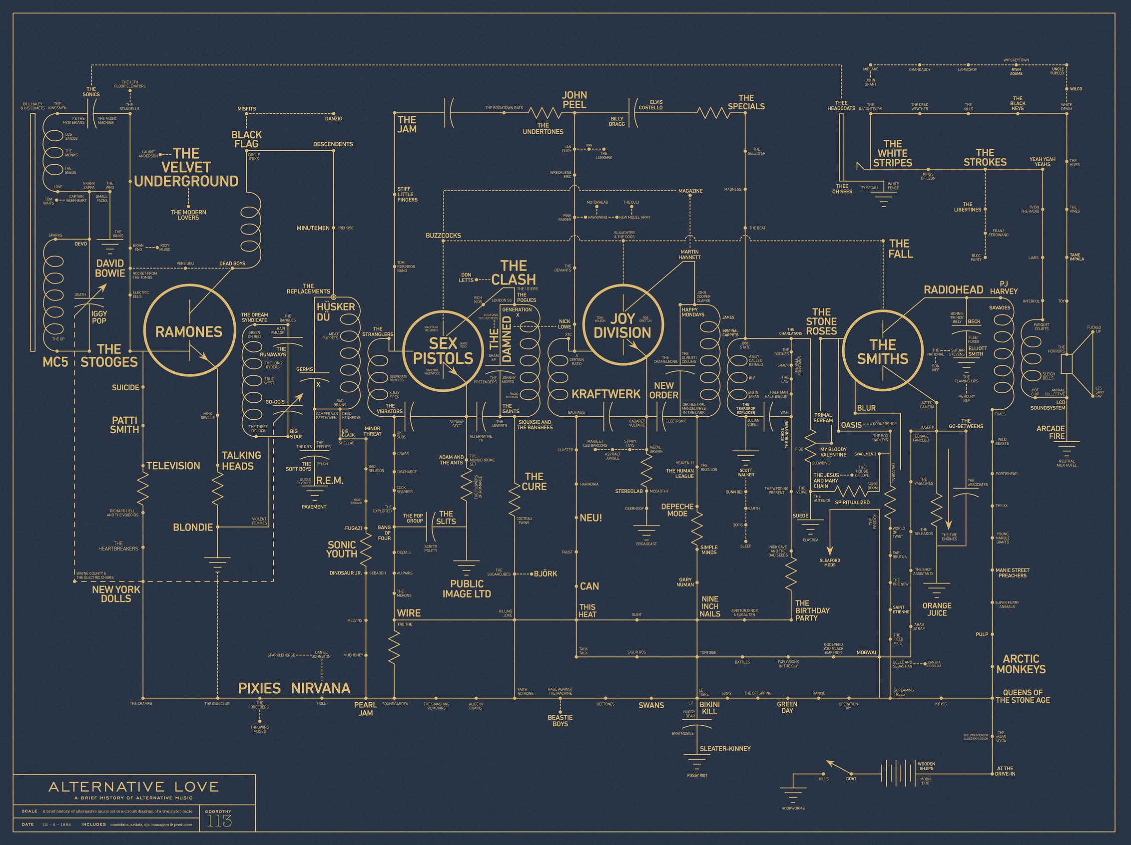
What this chart could improve on is its use of symbols. It is not always clear what the different connectors mean in relation to the information they’re representing. Take the arrow that breaks off into nowhere on the bottom right — are we supposed to infer that it is pointing back to a particular artist? That it represents a general trend? A key explaining different symbols would be a great addition here.
2. How to Speak Tech Jargon
This is a chart that spiderwebs out from the hilarity that is “tech jargon”. We like how the six primary categories are next to each other in the middle of the chart in green, making it easy to see how each section of the chart unfolds.
Another thing we like about this is that all the furthest elements are in black, making it easy to spot the jargon and trace this chart backwards as well as out from the center. This improves readability dramatically without making a mess of things.
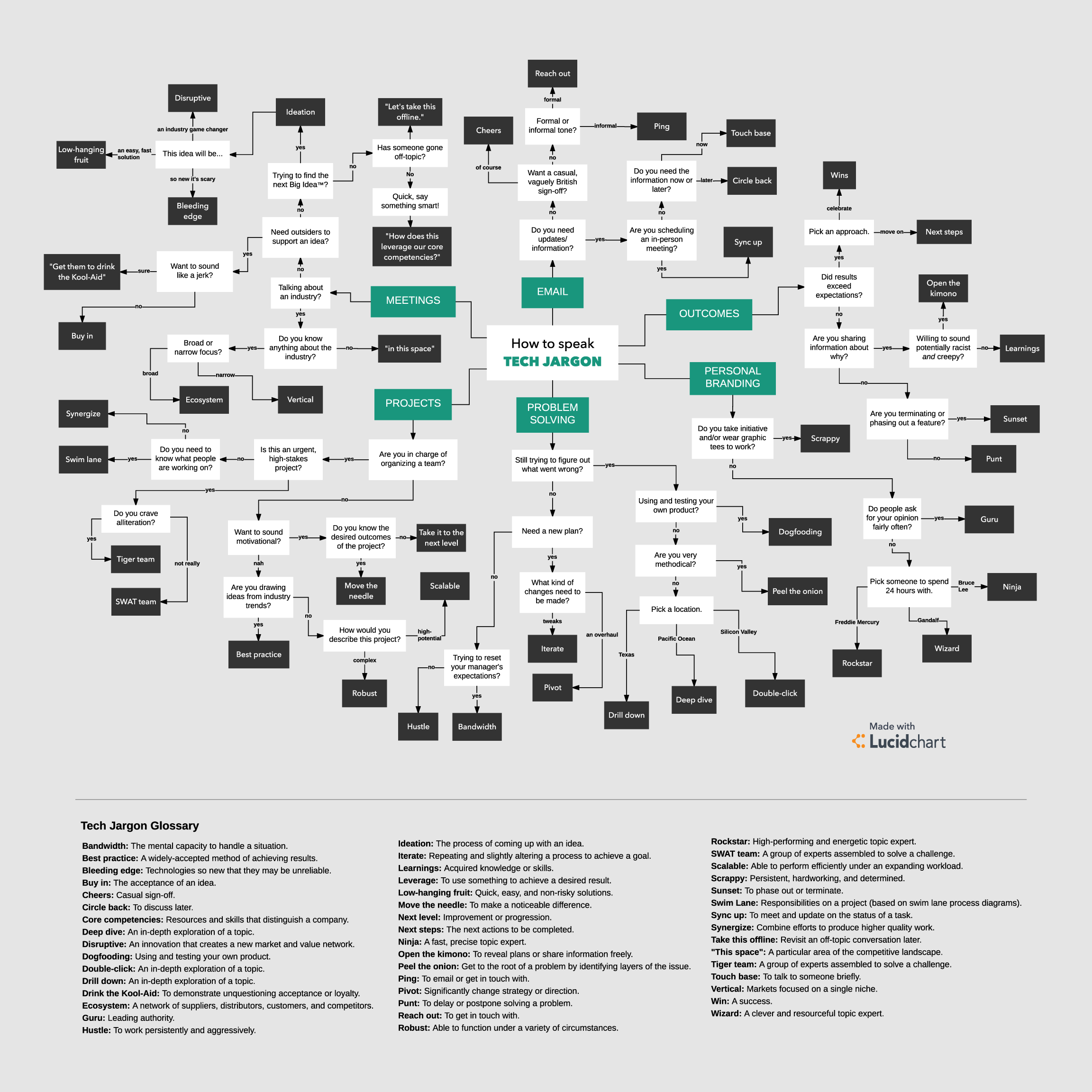
Another thing that’s well done here is the glossary at the bottom. As funny as this chart is, it’s annoying if you have to keep opening another tab to google what a term means. This way, people stay on your website reading your hilarious content, instead of getting sucked into some other guy’s piece on why “move the needle” is passé.
3. Data Security
This spiderweb on data security is a great example of how concept and form can play together to make a really clever statement. Instead of having everything branch out from “NO”, everything feeds into it. When you see “NO” surrounded by tons of arrows, you almost don’t need to read the chart to get the content.
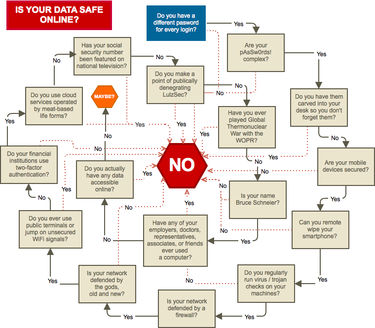
Another thing we like about this chart is that the copy within each stop on the journey to “NO” (or, in one rare case, “Maybe?”). The point of this flowchart isn’t to do an actual checkin on your online data — it’s that nobody’s data is safe. The humorous copy keeps people going through the chart, even though they know that some of the questions, like Is your network defended by the gods, old and new?, are facetious.
Choose Your Own Adventure
The choose your own adventure flowchart is a classic. It’s what most people think about when they think about flowcharts, and it seems like it should be relatively straightforward to create. But to really knock it out of the park, there are a few things you need to consider.
To transform this classic chart into a truly useful tool, it’s best to think about what types of additional elements to include. This is a great format to add in additional graphics, extra pieces of information, and even templates or links to other content that will help the reader with whatever square they land on in their “yes / no” journey.
4. Should Your Business Be on Pinterest?
This chart about Pinterest marketing is a good example of how to go beyond the yes/no question format while maintaining a chart’s clarity. Each question has extra information that helps people understand exactly what it takes to market on Pinterest. Since this flowchart is obviously aimed at someone who isn’t familiar with Pinterest or Pinterest marketing, qualifying what each step means is a great way to pack in information.
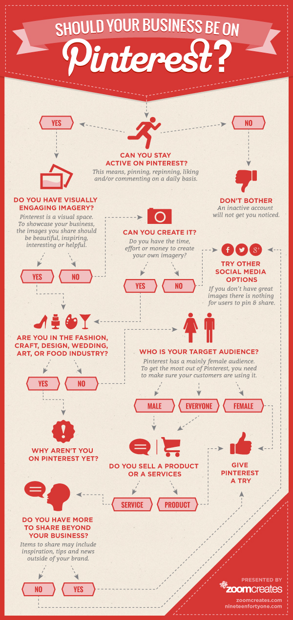
The thing that could really be improved here is there’s essentially two paths that end in ‘don’t put your business on Pinterest’ — “Don’t Bother” and “Try Other Social Media Options”. And there’s also two that end in ‘try Pinterest’ — “Why Aren’t You On Pinterest Yet?” and “Give Pinterest A Try”. For a chart this simple, we would recommend that there’s only two endpoints to the chart.
5. Design Process
This chart about the design process is beautifully designed, and the color coordination of blue = yes and red = no is a really clear way to guide people through this at-a-glance.
But what makes this stand out is the integration of a clear, linear timeline comprised of several different flowcharts that come together in this piece. The line running through the middle represents all parts of the design process, and each is elaborated further to the left and right.
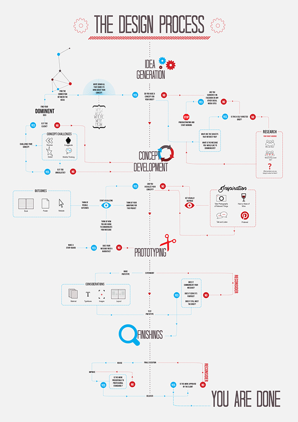
This chart is also a good example of having whimsical touches without overwhelming content. The creator, Noura Assif, included symbols and illustrations that make this flowchart nice to look at without turning it into a circus.
6. Sending the Right Email
This chart explaining email marketing is a simple questionnaire that helps people decide how to structure an email campaign. The real prize here is the explanation of types of emails and more information about how to make those emails effective.
And yes, this could have just been written out. But making this into a flowchart adds interest and makes the content here much more dynamic. Not to mention, a chart is more likely to become an evergreen tool than a written piece. People can easily save a graphic, but don’t often return to bookmarked articles.
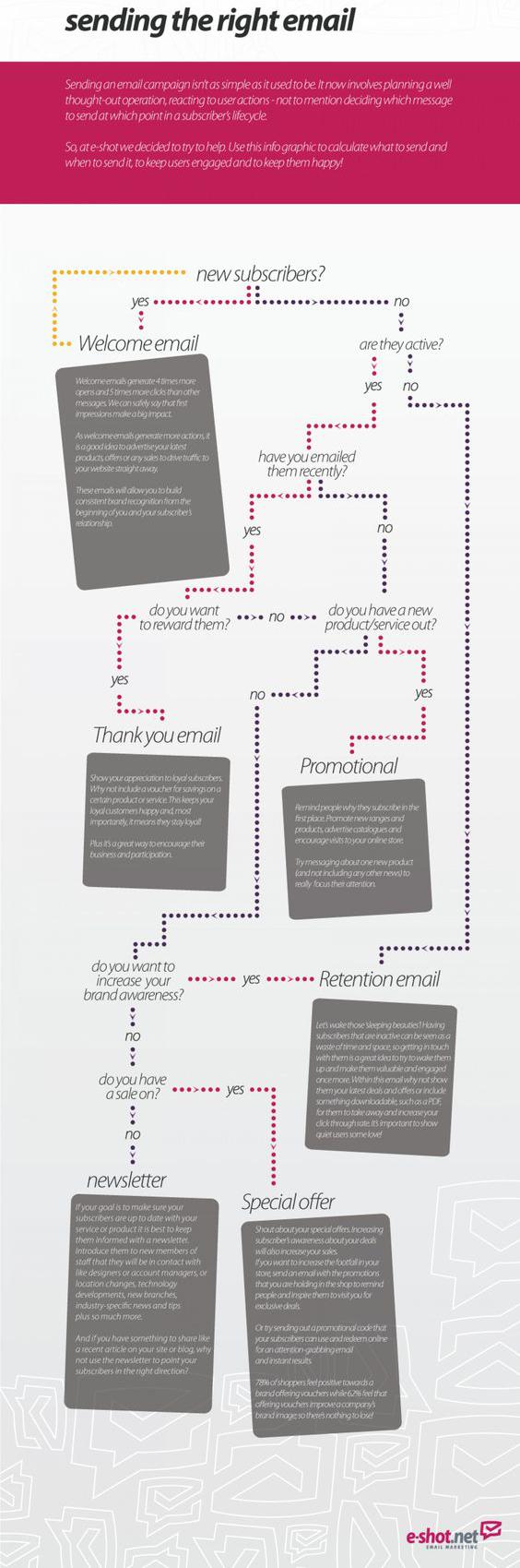
What we would have liked to see was a bit more pop. The grayscale feels tired and the text that’s giving the meat of the advice doesn’t pop off of the text boxes. The random yellow line at the top should also probably go — a good reminder to have someone double check your final design.
7. Political Scandals
This chart from Slate is a cheeky way of showcasing political hypocrisy. You can easily imagine a simple statistic like “only x% of politicians who were embroiled in a scandal resigned,” but seeing side-by-side examples really hammers home the point: there’s not a lot of rhyme or reason to who survives the scandal.
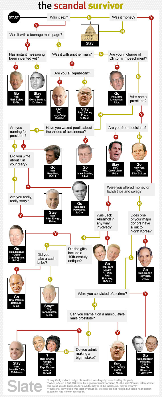
The choose your own adventure form works well here because the flowchart adds an element of satire in and of itself. That’s the kind of punch you can get from thinking about your message as content rather than writing.
8. What Form of Communication Do I Use If…
This flowchart is another one that has good copy and content, but suffers from a low-contrast color scheme. The chart itself is a playful way of saying you can’t just Gchat everyone everything — but it’s more humorous than it would be if it were, say, a two-thousand-word “think piece”.
But its low readability and confusing design really let the concept down. There are too many lines, too little contrast, and too many random graphics that don’t add value and just clutter up the space. Even changing the background to stark white would be a big improvement.
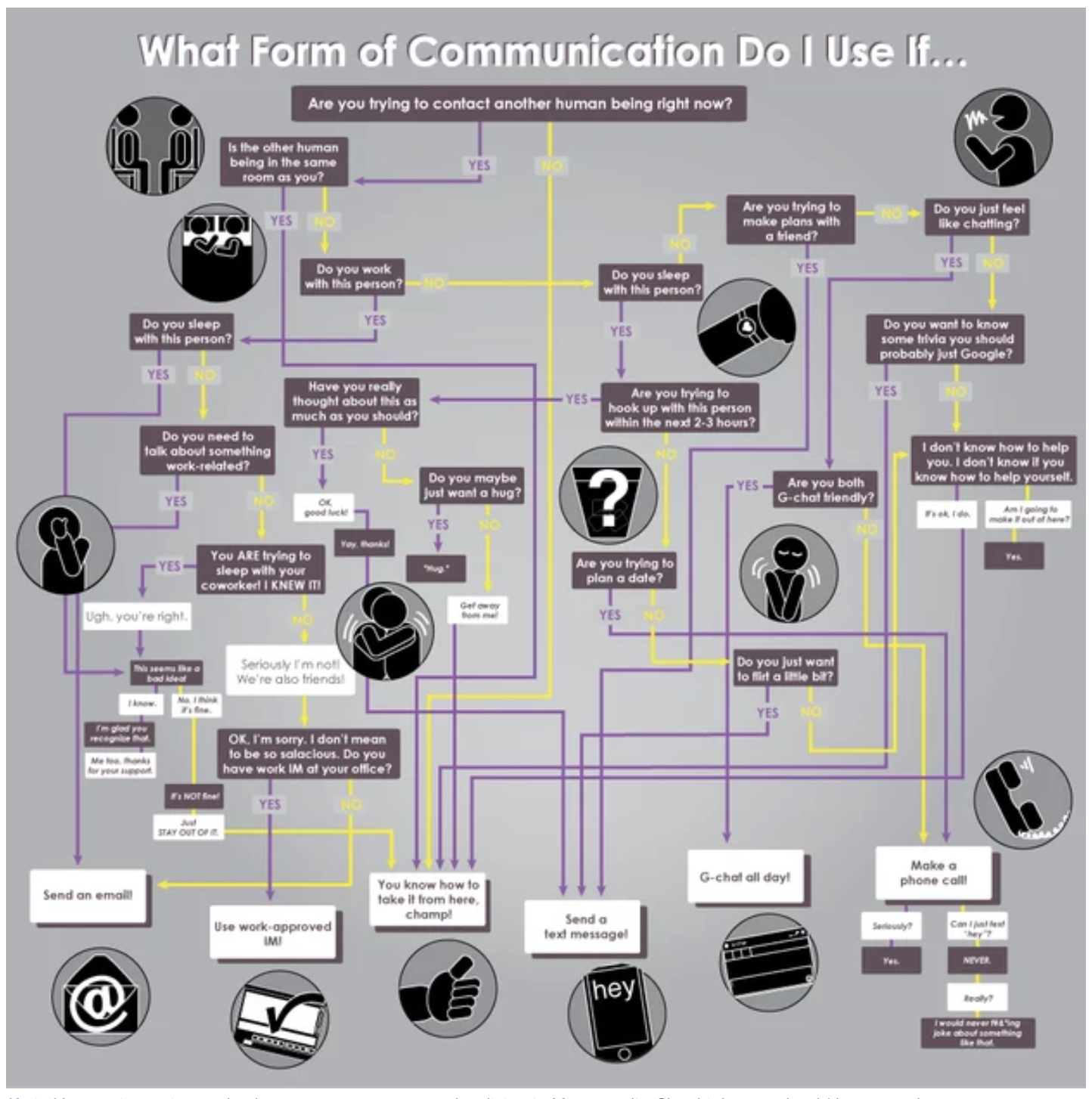
One last thing that could be improved — and something you should watch out for — is all those crisscrossed lines. It can make it difficult to see where lines are going and coming from, and if they’re supposed to intersect with other options. A classic way to circumvent this visual confusion is to break up the straight line with a half circle where it intersects with another.
10. Does Your Horse Need a Blanket?
This chart from Auburn Dept. of Animal Sciences is a great example of how to blend humor and actual information. While some previous examples used the flowchart as a lighthearted medium for a larger concept (like the tech jargon chart), this one is a good example of blending humor and information in a highly effective way.
![]()
That being said, they don’t nail the color scheme. It’s not super clear if each color has a specific meaning. They might have been better off sticking with colors for “your horse needs a blanket” and “your horse does not need a blanket”, rather than trying to somehow separate a bunch of different topics through color coordination.
11. How to Have a Rational Discussion
From mansplaining to internet troll fights, poor discussion is everywhere, and this chart aims to correct that. What we like about this chart is that it’s jam-packed with information, but it still feels organized and easy to follow as you select yes or no. Each point is clearly explained, and it even comes with an “introductory paragraph” and a “conclusion” — making it a full argument in and of itself.
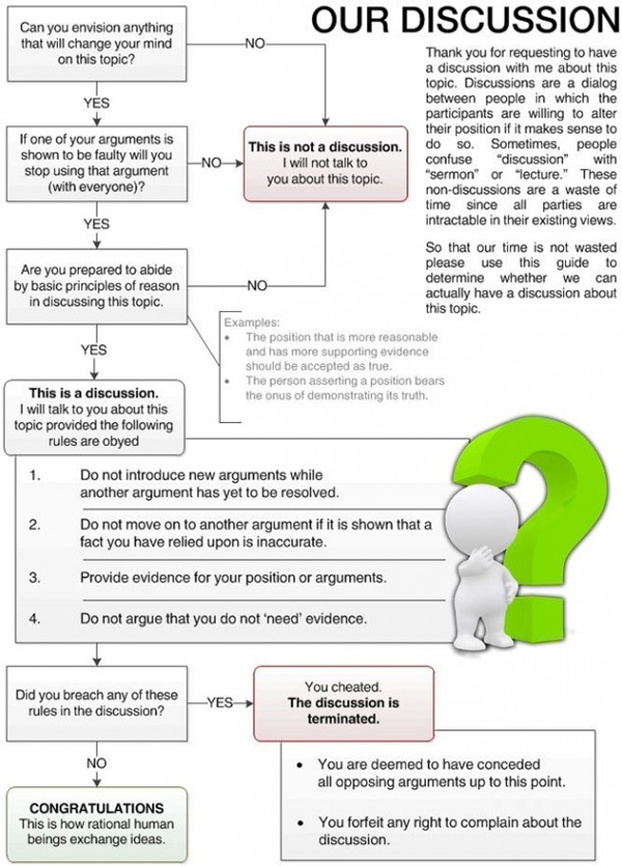
We also like that they weren’t afraid to put a little personality in this chart with the copy, while keeping the chart itself clean and legible. But we could do without that weird white figurine — adding graphics is fine, but they should enhance the content, and this is neither informational nor aesthetically pleasing.
12. So You Want to Buy an Election?
Even at a glance, this chart is super clean and readable. We love that they use both different colors and different shapes to represent different parts of their flowchart — this is a common technique that is standard practice for making flowcharts that a lot of people overlook.
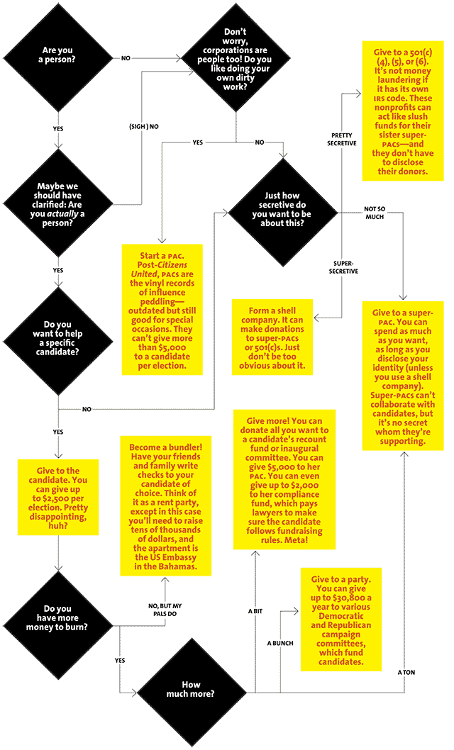
The organization of the arrows here is also very well done — it’s easy to tell where each arrow goes and what options are coming up. There aren’t any ambiguous crossovers or symbols that make this hard to read. As a bonus, the copy is light but informative. Overall this is a winning flowchart.
13. Need to Pick an Insurance Plan?
This is a great example of a killer idea for a flowchart that just couldn’t quite make it happen. Everything starts out well, and we like that there’s a progression downwards through the chart instead of having the choose your own adventure spiral outwards. There’s a bit of humor in there to spice up the unsexy prospect of deciding on an insurance plan.
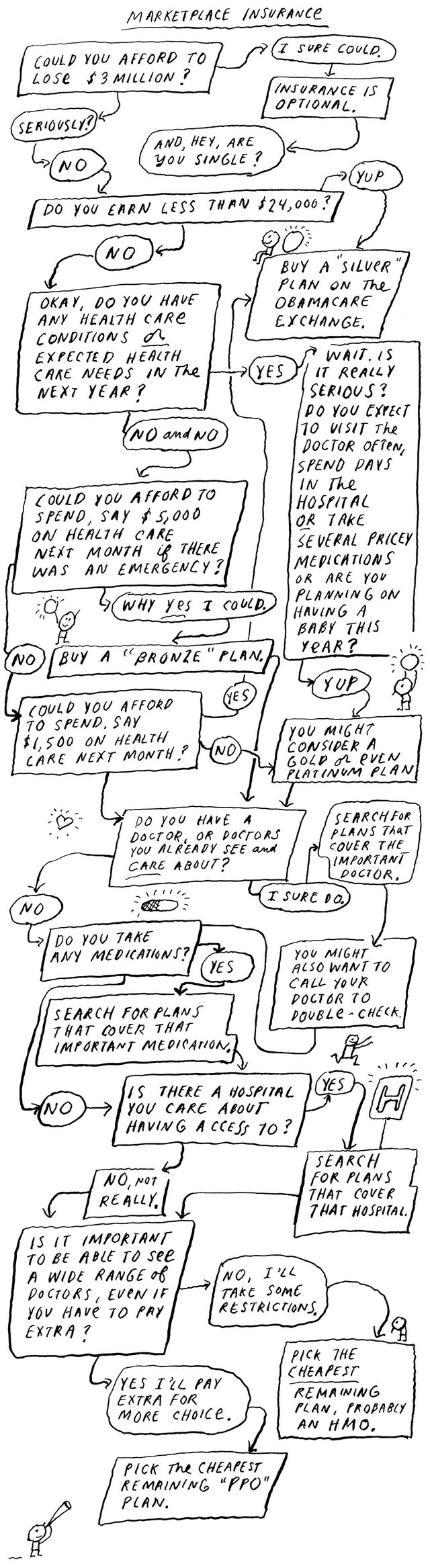
But the information is squished and some of the lines are hard to follow. It’s nice to have something feel hand-drawn, but when you’re trying to pack as much actual information in as this chart does, it’s imperative that things are easy to follow. While it’s good that they’re trying to make insurance plans a bit more lively, sometimes utility has to come first.
Linear Representations
Flowcharts are great for making a representation of a series of actions or decisions that have a linear connection or process. This can be a way of organizing an argument, like you’ll see with the net neutrality chart, or it can be a way of laying out each step in a sequential process, like the website launch chart.
The key with linear representation charts is giving a lot of thought into the organization of the chart. When you’re representing a process, ample space, color coordination and a clear progression of getting from point A to point B are what make your chart worthwhile.
14. Net Neutrality
This chart on net neutrality is both a way of making an argument and a way of showing a linear sequence of consequences, albeit somewhat facetious ones. But it’s extremely effective, because the argument is that net neutrality will be bad for your enjoyment of the web, and this chart shows that, without getting into any giant paragraphs about corporations and bottlenecks and so on and so forth.
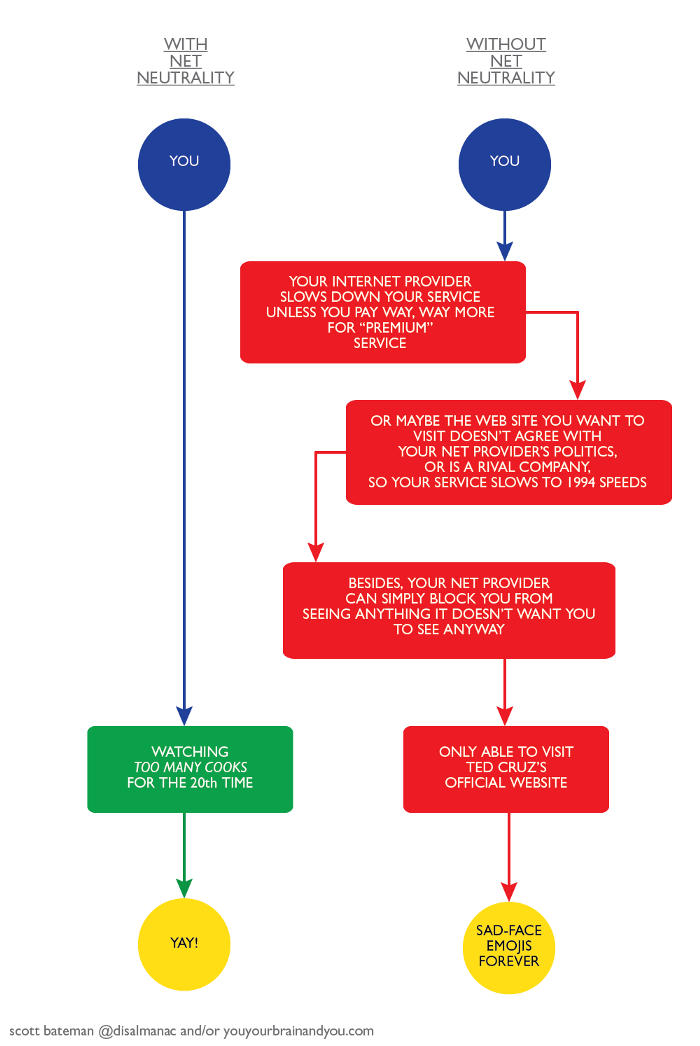
The bold colors also work well here, and, if it weren’t obvious from the text of the chart, you could probably get which position the chart maker thinks is the better one without reading a word. In contrast to some of the previous charts we’ve seen, this uses color to enhance the point.
15. Website Launch
This chart on launching a website is a great resource. Each section is split by color coding, which makes it easy to see the phases of the project. There’re suggestions about when to get client approval and when to have meetings, specifics on what types of materials you need for each stage, and all this in just a few boxes and arrows.
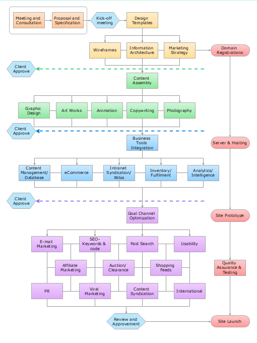
To write out all of this information — say, with bullet points under subheadings — would take up a lot more space and would encourage people to scroll through it quickly. While we can see that using this in a piece of content could include explanation and tips in writing, the fact of the matter is that the chart does the bulk of the work.
Hybrid Flowcharts
When you’re making a flowchart, you don’t need to stick to just one format or type to display your argument. Once you’re comfortable with making clear flowcharts, you should feel free to get creative and ramp up your flowchart abilities to combine different styles.
There are a lot of hybrid flowcharts out there, but we’ve only selected one example because they aren’t nearly as common as the other types of flowcharts we’ve seen here today. However, they are valuable, and if you can master the flowchart, going hybrid will make you a true expert.
16. How to Change a Habit
This chart combines several different elements that we’ve already seen. There’s a linear element of each step in sequence, and there’s the linear representation of what happens in each step. But there’s also little mini charts inside steps two and three that need to be completed before their linear progress finishes.
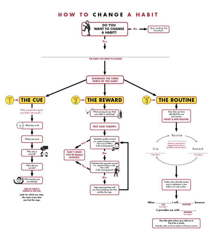
While not every flowchart needs to combine different styles or be complicated, if you’re going to do it, take a cue from this chart and keep things simple: plenty of space between elements, simple color scheme and symbols that are easy to follow.
Everything but the Kitchen Sink
Of course, when we’re talking about how graphics, charts, gifs, and anything else can enhance content, we’re not just talking about the presentation of business information. Flowcharts can be used in humorous ways, and adding a quick joke into your article with a funny flowchart is a lot more doable for most people than, say, drawing an original comic or finding that one scene from The Office that would be just perfect but isn’t on YouTube!!!
You’ve probably seen some more lighthearted flowcharts in your time, but here are three examples that show different ways you can bring something extra to the party.
17. Should You Say Goodbye at a Party
This charming chart by Wendy MacNaughton is a fresh take on whether or not you should make rounds and say goodbye or do the classic Irish goodbye and just leave. Creating or finding a flowchart that’s lighthearted but still well-made and easy to follow can be a good way to inject levity, spur shares, or endear readers to your point of view.
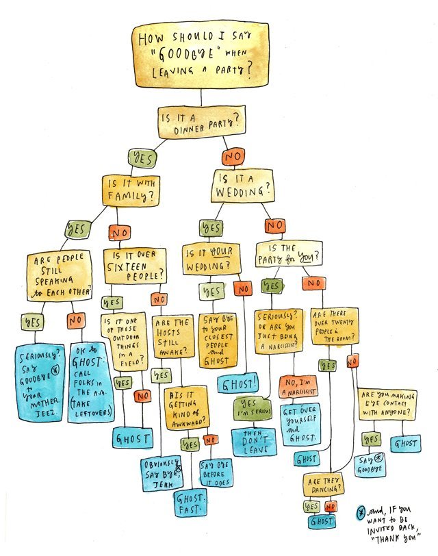
A note of caution here is to make sure that your images are tonally appropriate. The handwritten feel and rougher appearance do well for this chart, but it’s not the easiest thing to read. If you’re giving a presentation to your boss or representing your company, you want to nail the content and the presentation, which means paying attention to things like fonts.
18. How to Play Pictionary
This chart is a classic example of how having only a few elements can make a strong point, and can add to your content. There’s any number of frustrations, processes and jokes that can be played out with just a few nodes that take almost no time to make but represent a huge boost to how engaging your content is.
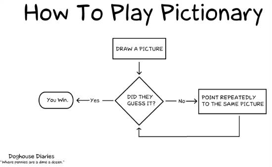
After all, nobody these days has the attention span to read through huge chunks of text. We’re looking for images, charts, jokes, even a set of bullet points to break things up and keep us in an article.
19. A Wildly Detailed 100 Year Plan for Getting Humans to Mars
We couldn’t write a listicle on flowcharts and not include this gem. The “Integrated Space Plan” is an insanely complex chart that takes you through all the steps it will take for humans to expand society into the cosmos.
This is, in some ways, a cautionary tale. We would recommend giving each part of the chart it’s own chart, with a key that indicates it is part of a larger scheme, instead of shoving all of this together. That is, in terms of true functionality, this clearly fails.
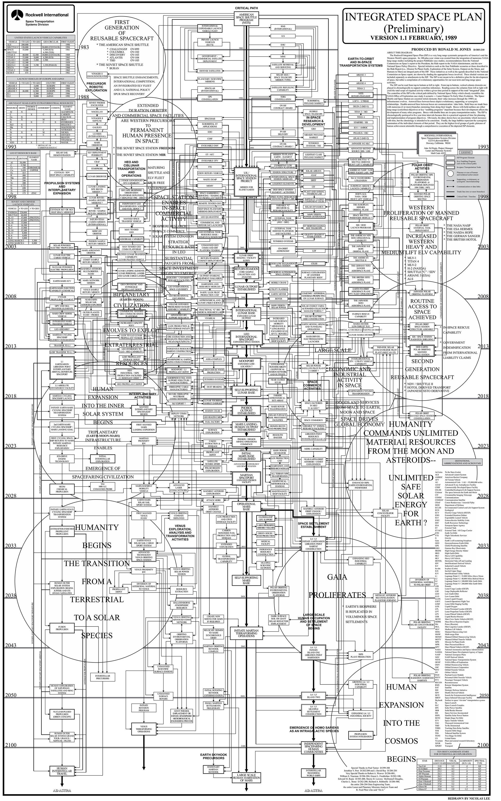
But in another way, it’s a great example of how you can make a point about complexity and the difficulty of a topic you’re talking about. Using a flowchart to do that would be a very effective way of showing why, for example, a particular approach was too labor intensive.
It is also an aesthetic object beyond whatever information it holds. It’s a good reminder, as was our first flowchart, that sometimes stepping back and looking at how your chart appears as a whole is a necessary step to create something that’s enjoyable to interact with on more than just the informational level.
Get Started
There are a lot of tools out there to create flowcharts. To get you started, here are some flowchart creators, including some, like Gliffy, that were used to make the charts in today’s post:
Of course, you can also use pen and paper, pretty much any simple drawing program, or another method that strikes your fancy. Whatever you use, make sure to take your time, have fun, and play around with the different ways you can structure your arguments, jokes, and other content through flowcharts.