Worst Graphs of 2018
Well, well, well. It’s that time of year again. Time to look back on all that was accomplished in 2018… and all that wasn’t. Unfortunately, as the years pass, the same graph mistakes come up again and again. As we saw with The Worst Graphs Of 2017, the internet abounds with subpar graphs. This year was no exception and so, Dolphins presents: The Worst Graphs Of 2018. (Bugle noise.)

Why do we harp on bad graphs so continually? Because communication now is more visual than ever before. On Twitter, a graph does wonders for supplementing 280 characters. In articles, data viz makes valuable information legible for readers. In politics, graphs can make liars out of candidates and news sources in a split second. (Remember Dean Lockhart MSP?)
Anyone can create informative, engaging, and accurate graphs with any number of user-friendly programs. So for all you writers, data-lovers, content experts, journalists, statisticians, and internet trolls out there: this one’s for you.
Where The Worst Graphs of 2018 Go Wrong
What the graphs we’re about to present prove is that it’s about more than just forgetting to label an axis. These worst graphs suffer from a variety of mistakes that aren’t just limited to what’s going on in the graph itself. They represent wider mistakes about interpreting and presenting data in order to prove a point. Look out for:
- Insufficient, misleading or missing titles
- Going after Chrissy Teigen on Twitter
- Pretending 3% is above and 97%
- Burying good charts with unreadable bubble disasters
- Satire gone wrong
Read on, brave friends. Have a blast, and we’ll see you on the other side.
Line Graphs
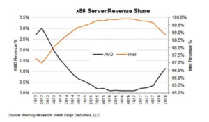
1. 3% is more than 97%, right?
This graph has two lines and two scales, which can be an informative way to give multiple pieces of information on one graph.
It can also be a really easy way to manipulate data and Reddit commentators are quick to point out that this graph is doing just that. Both of the scales are the same thing — percentage market share — and by using the same percentage in two different ways, they make it seem as though a 3% market share looks bigger than a 97% market share:
[Source]
The fact of the matter is that this graph should have both these lines at a scale of 0-100 if they wanted to prove a point about market shares. It’s deliberately misleading, and there’s no denying it.
Additionally, if we’re going to nitpick — and we are — the Q in the bottom scale looks like a zero. So “1Q13” (meaning first quarter of 2013) looks like 1013, and so on. Easily avoidable with another font.
Lastly, there’s no reason to put the key in the middle of this graph. It could easily be on the side, and not distracting from what’s actually happening in the data. A more complicated graph could have data obscured by slapping a legend in the middle.
2. Ideological Lines
Following politics can be confusing enough in our 24-hour news cycle world. Each day, another story breaks and with it comes another deluge of charts and graphs and interactive viz.
But if you make enough graphs, eventually one will be bad — like this one from Vox. Take a look at this electric line graph:
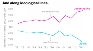
[Source]
At first blush, this graph makes it look like there are more and more Conservatives, while the Liberal ideology is rapidly decreasing in popularity. But the chart is a mirror image — both are actually going up. Negative percentages and mirroring used as a way to show a rise is counterintuitive. When someone sees -60%, they think something is going down, not up.
But perhaps the biggest problem here is that the information presented is not actual numbers, but relative percentages. When looking at a split between Conservatives and Liberals, one would expect that a) those are the only relevant political ideologies and b) as the only relevant ideologies, the total would be close to 100%. Instead it starts at… well either 30% or 0% if you’re factoring in a negative, and ends up at over 100%.
Contrast that attempt to interpret this graph with this intuitive graph from Gallup, which shows a similar data:
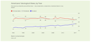
[Source]
Should have done that in the first place.
For what it’s worth, Vox’s bad chart is surrounded by a sea of good ones — in that very same piece, no less. But it only takes one bad or confusing graph for a reader to start doubting your information.
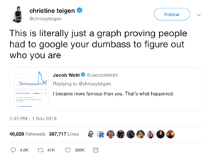
3. Don’t go after Chrissy Teigen. we repeat: Don’t go after Chrissy Teigen!
Sometimes your graphs are good, but what you do with them gets you in trouble. That’s the whole story of these graphs, showing the number of Google searches for right-wing fraudster Jacob Wohl compared to the number of searches for model and author Chrissy Teigen:
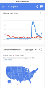
[Source]
In an exchange on Twitter, Wohl used this graph as quote-unquote proof that he “became more famous” than Chrissy Teigen. Her response says it all:
[Source]
There are two morals to be learned here. One is that bad faith claims made from a graph that you present readers will never pay off.
The other is: do not attempt to one-up or troll Chrissy Teigen on Twitter. She’s mastered the platform, and we salute her.
Pie and Bar Graphs
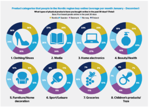
4. Nobody gets 100% of the pie
Comments from our Dolphins researcher about these graphs we “A bunch of pie graphs and none of them add up to 100 lol,” and that pretty much sums up what is wrong with this infographic.
If you’re going to put statistics in a circle, people will expect that you are dividing 100% into something. But these graphs? Each of the percentages is measuring a different whole, with one statistic representing an average. So why not just use a bar graph? H/T to CB Insights for shedding light on this… creation.
[Source]
The problems continue from there on this cluttered graphic. The ring shape makes it look like roughly the same percentage of people are purchasing items in every category. That’s because these numbers don’t add up to 100%, and therefore the space they take up is pretty arbitrary. How else could you explain the 37% of Swedes purchasing clothing and 8% of Swedes purchasing child toys being represented by the exact same proportion of the circle?
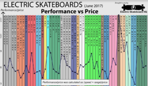
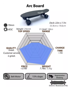
5. Electric skateboard Overload of the Year
This is a front-runner for worst graph of the year, courtesy of the bad stats Reddit.
In theory, it’s an amazing concept: Compare all the major electronic skateboards to help people figure out what’s the best board for them to buy. In reality, it’s more headache-inducing than useful.
[Source]
This would have been better as a simple table that people could sort by price high-low, speed high-low and range high-low. A scatter plot with an interactive component to show board information as a user hovered over a dot would have been great as well.
As it stands, the color makes this jarring and hard to interpret. The labels on each bar conflict with the lines and, to be honest with you, there’s no reason to connect these dots. Each data point here is completely separate.
Additionally, combining speed and range doesn’t make a ton of sense. Speed is a unit of MPH and range is either in miles or time — they don’t combine intuitively. And it doesn’t make sense to combine them from an information standpoint, anyway. If I want a super-fast board and don’t care about range, that stat means nothing to me.
Dot Charts and Maps
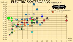
6. Too MAny Dots To Handle
Alright, so you were discouraged by the previous electric skateboard chart, but you still want some info about an electric skateboard. When you come across this, you may give up on electric skateboards altogether:
[Source]
This chart is borderline unusable. There are simply too many different boards packed on it to help you identify what’s right for you. We like that they’re using dots with a clear legend to help you see the features you want, but unless the board you’re looking for is an outlier, good luck finding it or figuring out which dot its label goes with.
If this chart were interactive, and people could hover to get readable labels on the dots, that would have helped a lot. But quite frankly, this is difficult to use as it stands.
Electric Skateboard HQ’s individual board cards are crisp, informative, easy to read at a glance and even linked to the purchase page for every board — now that’s the way to do a graph. But, frustratingly, they put their worst graph front and center instead of featuring the more useful viz.
[Source]
7. Hey, it’s all relative, right?
This article by Business Insider has some truly bad graphs. The most glaring error is that these graphs present relative data for no real reason. A simple graph of approval rating state by state would have easily made the point these graphs are trying to make.
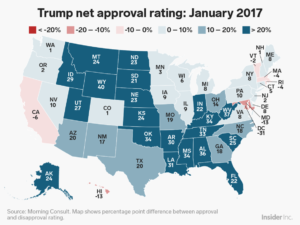
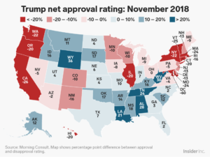
[Source]
Think about it this way: if a state is 55/45 for approval/disapproval of Trump, is it more intuitive to label that state “55%” on a graph of Trump’s approval rating, or “10” on a relative percentage graph? On this graph, it would be 10.
The final nail to the coffin here is that the colors are counterintuitive. Red is traditionally the Republican color and blue is the Democrat color, in American politics. It stands to reason that Republican-leaning states (“red states”) would be more likely to have a higher approval rating for a Republican president.
But this map has blue as higher approval and red as lower — the opposite of what an average reader would expect.
Infographics and Miscellaneous Charts
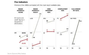
8. Tipping the scales
We love some good New York Times data viz, but this series of graphs is seriously misleading. The problem here is that there are several graphs in a row, each with a very different scale. However, side-by-side, it seems like there should be a relation in scale between these graphs:
[Source]
That’s especially true when you look at Median Household Wealth and C.E.O.-Worker Pay Ratio. A quick glance at the graph makes it seem like median wealth is rising at about the same rate as the pay ratio, which is not true. This is partially because the wealth statistics are in dollars, but the pay gap statistic is a ratio.
This series of graphs would be clearer if similar graphs were grouped together, rather than being a block of five. Median household income and median household wealth could be paired, as they’re both in dollars. Home ownership and unemployment could be paired as they’re both in percentages. The pay ratio should be standing alone. This is important data, and the NYT should do it justice.
9. Are you… Are you kidding?
We all like to have a bit of fun with a graph now and again. Satirical graphs and data sets that are obviously falsified can be a source of levity, or a good way to prove a hypothetical point. In theory, that’s what this graph is doing — it falsely correlates the height of the Fed Chair and interest rate fluctuations, i.e., when the Fed Chair is shorter, interest rates are lower.
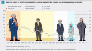
[Source]
Of course, the height of one person has nothing to do with interest rates, but this chart is presented so earnestly that it’s not immediately obvious that it’s satire to someone who is scrolling quickly or not familiar with correlation/causation mix-ups. It even has two legitimate research sources.
The only indication from the graph itself that this is satire is a low-contrast sentence under the bottom of the source attribution. Quite frankly, it’s somewhat funny but not crisp enough. Having strange cartoon people isn’t working, the line for the 10-Year Yield is not fully visible everywhere and seems to have a strange shadow. The satire should be about the height/interest rate correlation, but it’s bogged down in how strange the graph is.
Wha’d we miss?
The internet is a big place, and we’ve definitely missed a graph or two. If you have a good one, drop us a line any time or tweet us @getdolphins.
Otherwise, Godspeed, get dolphins, and may your life be free of data-skewing eyesores until our 2019 round-up.
538’s Best Data Visualizations
Folding context, arguments, and data into one graph to tell a story is devilishly difficult. It is a challenge that requires not just creating a clean, accurate graph but also thinking about data and storytelling as inherently intertwined.
538 is a masterclass of data visualizations. In every category they cover, they find ways to make stories out of data interesting, accessible, and interactive. They have figured out how to present data through (interactive) graphics in a way that folds in discussion and narrative.
Politics
Leveraging politics as a key part of the 538 site is a shrewd move. Many political situations can be represented in graphs, charts, timelines, or other interactive viz. 538 distills commentary down to a “just the facts, ma’am” article without manipulating readers or leaving them short.
Answering voter what-ifs
After Trump’s election, questions about who, exactly, voted him into power have been bubbling up all over left-leaning news outlets for two years. The question of whether or not white women were particularly to blame was a particularly hot take from an exit poll that is still being disputed.
Before all of this happened, 538 preempted this discussion in a data-visualization-driven article that showed a likely breakdown of voters:
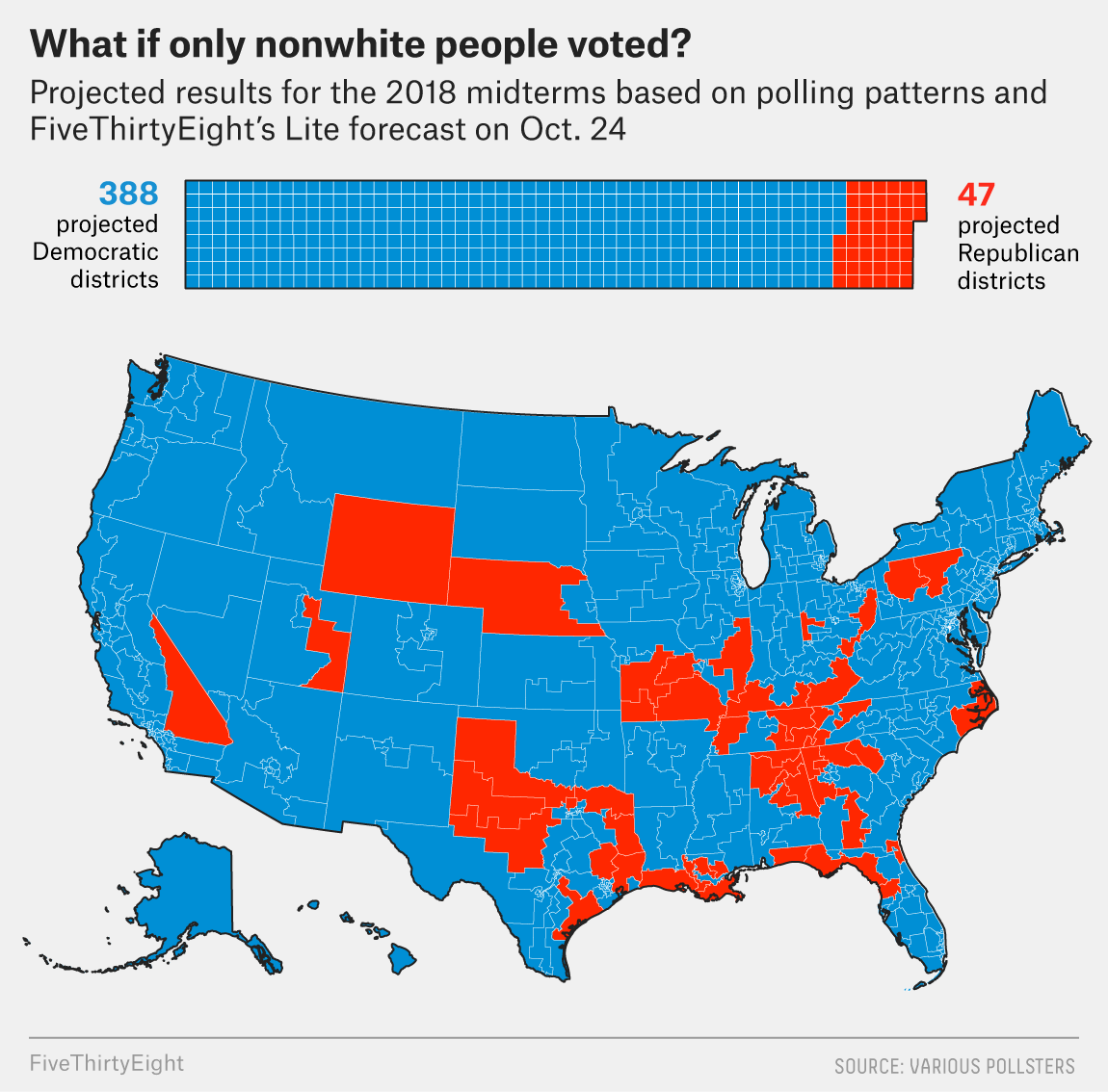
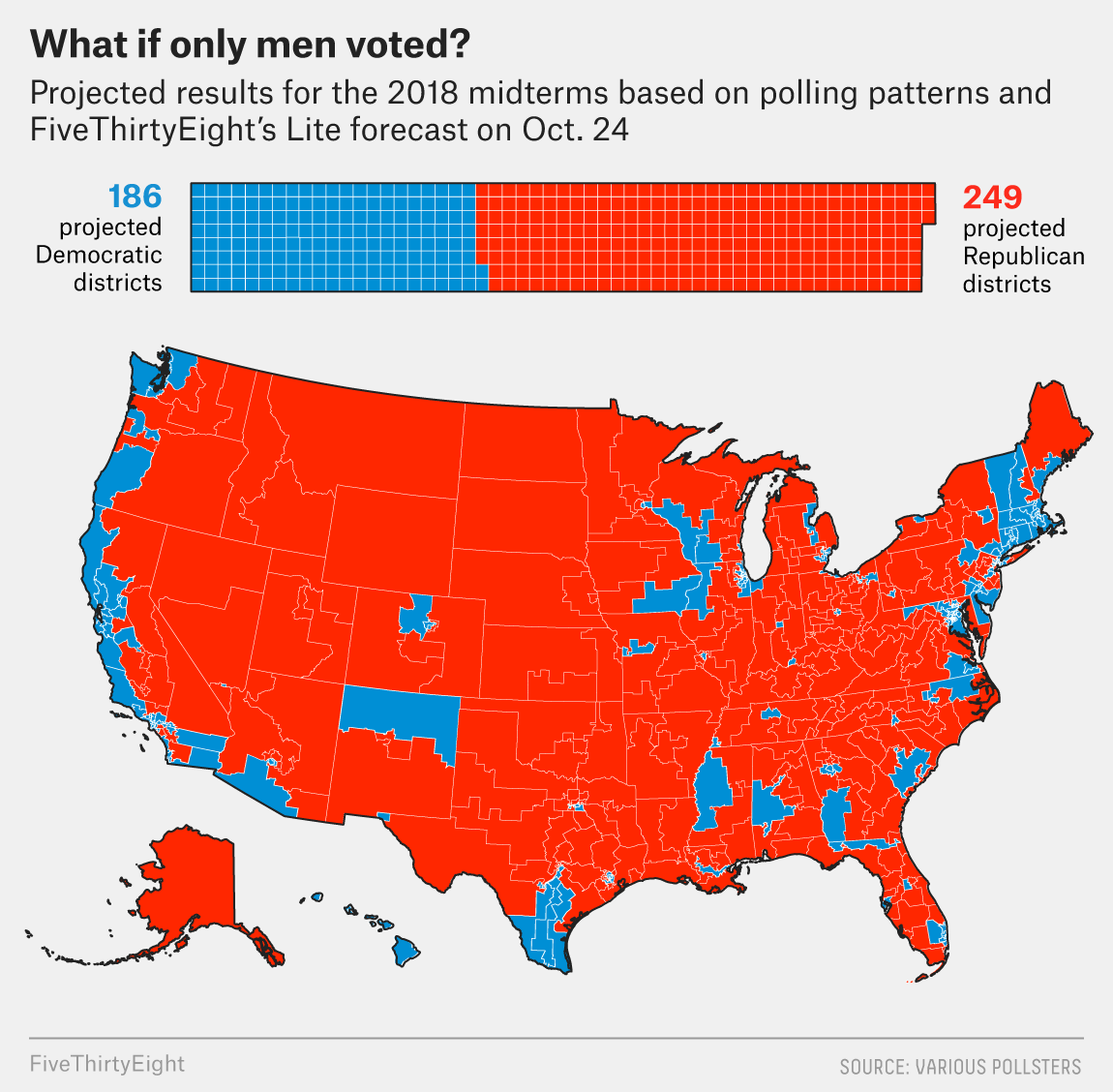
[Source]
The viz pulls no punches and offers easy-to-digest graphics. Critically, they include both projected seats and a map figure. Because the number of congressional seats is related to population and not to land area, a map alone could have been misleading. But having geographic information adds a layer of information about which regions lean one way versus another, even given demographic breakdowns.
The text that accompanies these graphics offers commentary and additional historical information but supplements the bold graphic takeaways. This is a clean, crisp political article.
How popular is Donald Trump?
Presidential approval ratings are mentioned pretty much anytime something major happens in national politics. They’re a simple shorthand for the national mood, and 538’s constantly updating presidential-popularity rating tool is a piece of evergreen content that politics nerds will be coming back to again and again — at least for four years.
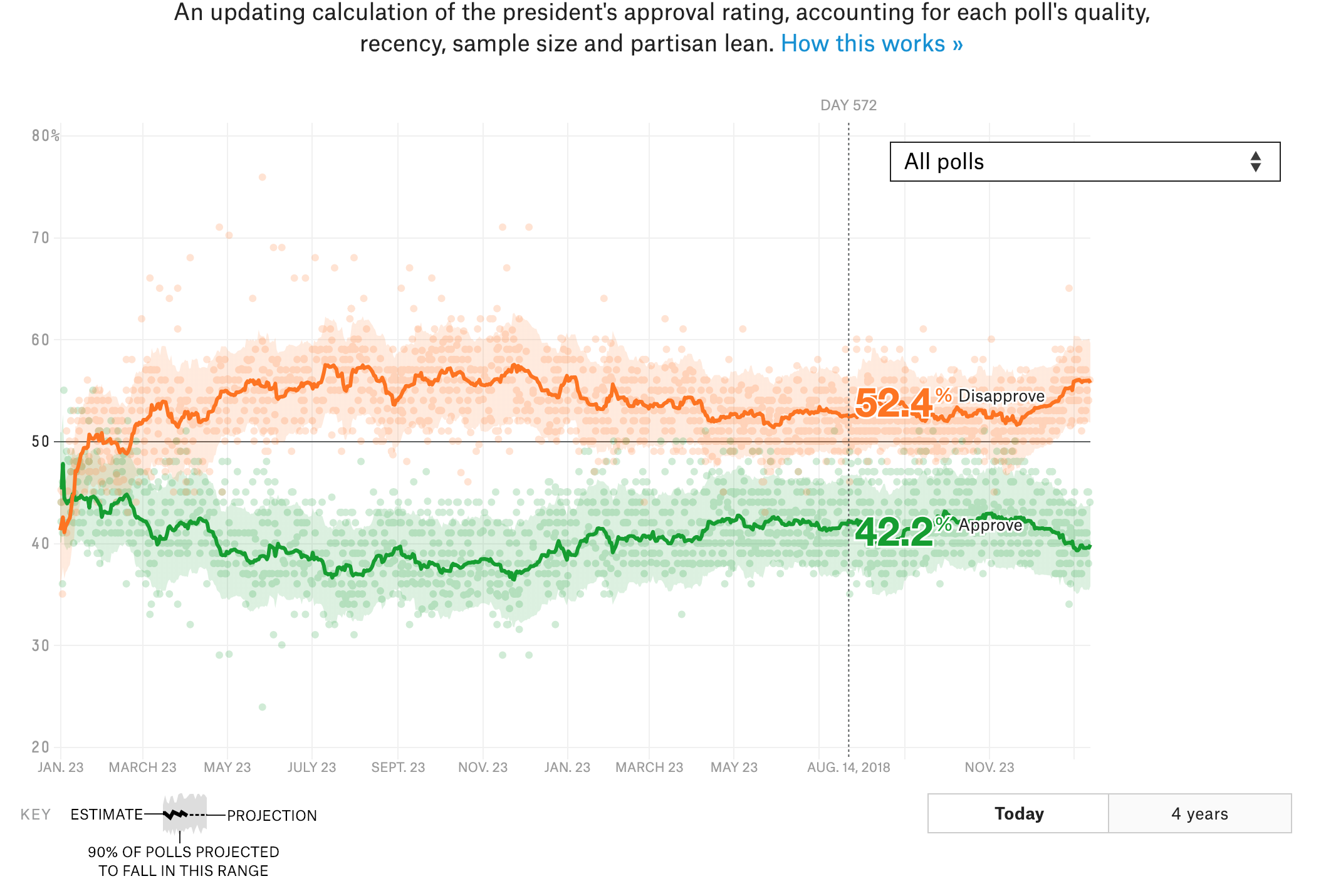
[Source]
The tool is simple and interactive, and it’s an easy pit stop for anyone wondering what the polls are saying about Trump’s popularity.
One shrewd move here is the choice of colors. Green and orange are colors that don’t have a major political association. It would have been easy to make “Approve” red and “Disapprove” blue, but doing so would have falsely equated approval with Republicans and disapproval with Democrats, which is not necessarily the case.
This is a great example of a functional piece of data viz that is, in itself, a story to be told.
Sports
Sports fans who are also data nerds are a picky bunch. If they don’t like your analysis or visualizations, they’re likely to go out and make their own, better, graphs as they roast you. 538’s made a name for themselves off of pleasing this finicky group because they do everything with the precision of a sports fan.
March Madness predictions
March Madness is as high-stakes a sporting event as any in college sports. Brackets abound among friends, coworkers, and random groups of strangers on the internet.
538 dominates March Madness because of its slick predictions tool. It not only gives probabilities for each game but also ranks an “excitement factor” that helps you choose what to watch.
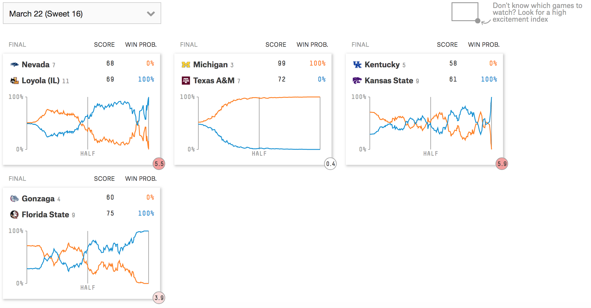
[Source]
You can also track games as they happen to see how your bracket is faring in real time. It’s a super user-friendly tool that is accessible to anyone who is even vaguely interested in NCAA basketball, but its methodology and interface is solid for superfans as well.
The age-old question of sex segregation in sports
Using their usual data-driven approach, 538 asks whether or not men and women could compete together on the ski circuit.
This is a highly effective take for a divisive topic. Rather than posit what-ifs and debate pundit points, they simply present evidence: In some events, men are faster than women, and in some events, women are faster than men. And this depends on the year, as well — which could correlate to fields of competition, rule changes, etc.
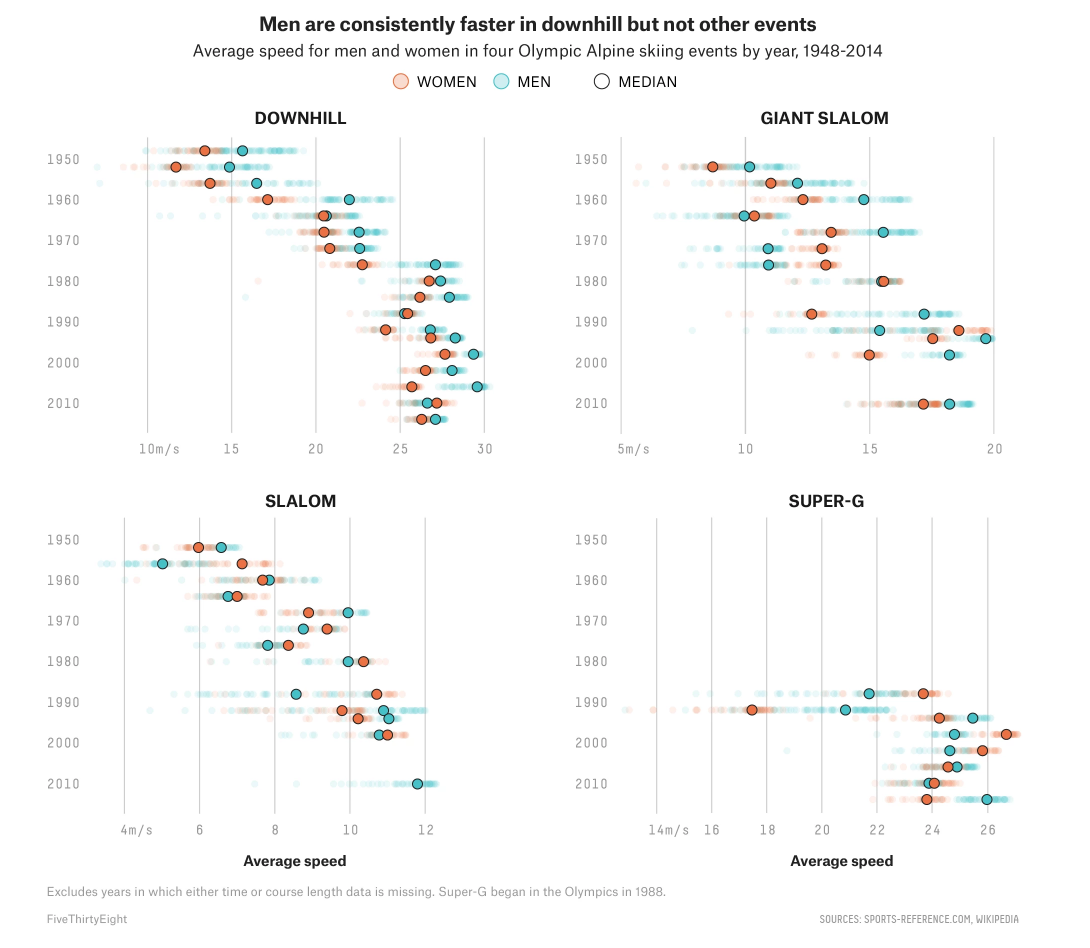
[Source]
This breakdown puts to rest questions about historical or by-event data and allows the reader to draw their own conclusions. This question definitely has a lot of angles, and 538 gets away with the minimal, graph approach because most of those questions have been discussed endlessly. Rather than do something everyone else has done, 538 offers a clean and concise take that puts readers in the driver’s seat.
Science and Health
Telling a whole story with graphs is harder than it sounds; it’s why so many outlets use charts and viz as a way to supplement their stories, not tell them.
When 538’s science and health graphs are the focus of the story, it works because they’re informing with rich graphics that benefit from description, not ones that are just props to back a main point.
Why California’s wildfires are so destructive
California’s recent wildfires were a tragedy that drew attention from news outlets coast to coast. 538’s coverage was set apart by their graphical coverage of the wildfires, as well as the fires’ causes and destruction.
The main points of the articles — that an extra-dry California, with a population in proximity to deadwood, caused the fires to be so destructive — is clear from the graphs alone:


[Source]
The commentary expands on the graphs with quotes from experts and additional information on the situation, but doesn’t add much to what can be found in the graphics. It’s the charts that are telling the story here, and that makes for a concise, informative article on a topic with which most readers will already be somewhat familiar.
Gun violence from an intersectional perspective
This interactive viz and the article that goes along with it make a powerful statement on how limited the American discourse on gun violence can be. The article is mainly focused on presenting a short history of gun violence, including some statistics. The meat of the argument comes in these two sentences:
“You could, theoretically, cut down on all these deaths with a blanket removal of guns from the U.S. entirely — something that is as politically unlikely as it is legally untenable. Barring that, though, policies aimed at reducing gun deaths will likely need to be targeted at the specific people who commit or are victimized by those incidents.”
What the viz in this piece does, in a way that breaks down major causes, is demonstrate the different people who are involved in gun violence. There are animated slides you can click through and a tool you can manipulate yourself:
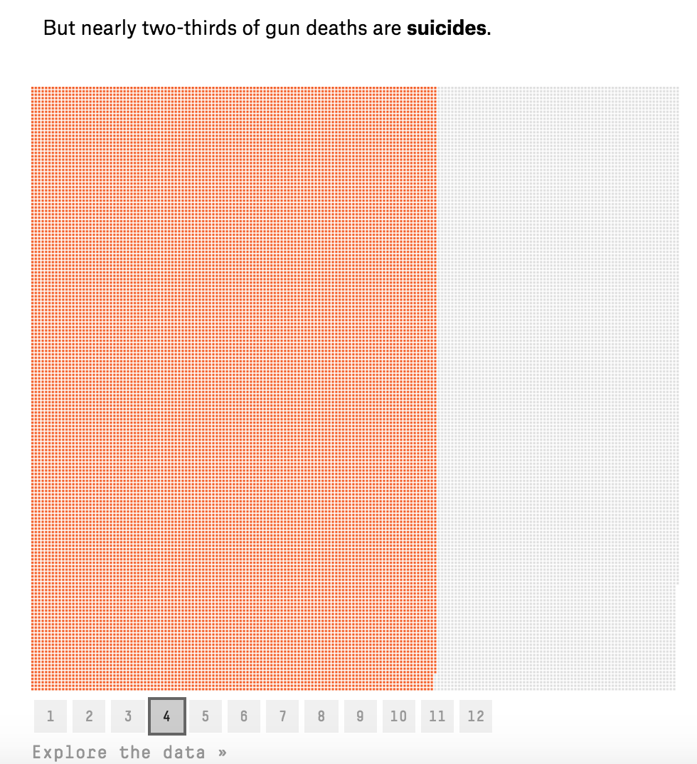
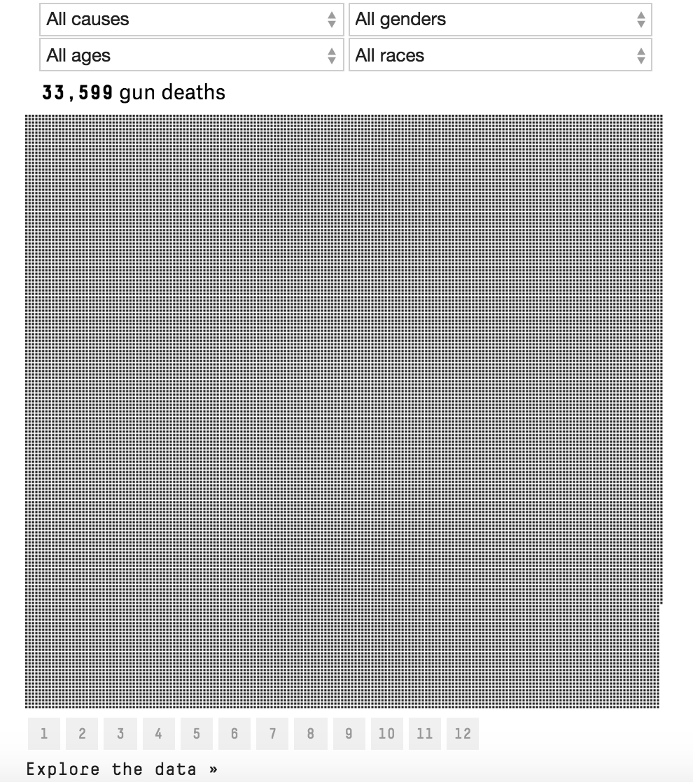
[Source]
Breaking up a heavy topic with an informative graphic means that readers can take in 538’s argument at their own pace. It’s a much more powerful way to present information that breaks down gun violence by different characteristics than even more statistics written out in a row.
This article is a great example of how interactive tools can add valuable perspective to serious topics in a way that enhances the reader’s engagement with the ideas presented.
Economics
Where there are numbers, there is data viz, and economics means numbers. But the best of economics isn’t raw data or numbers — it’s the effects of those numbers. Humanizing economics makes it a story that readers are interested in. 538 covers sports, culture, science — it isn’t purely focused on economics like The Economist, say. Its readers are interested in more than economics for economics sake.
Stop telling women to fix the pay gap
This article is a great example of effectively resting the weight of your argument on data. It primarily uses graphs to craft the argument that women alone can’t fix the pay gap because it’s an entrenched, systematic problem. The surrounding text gives color and helps readers work their way through a divisive topic.
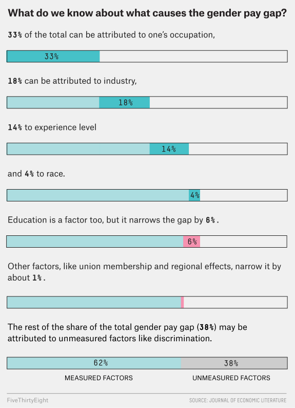
[Source]
Having extensive data to back up a claim roots an argument in authoritative facts. The graphics that 538 presents here dismantle the argument that the pay gap exists only because women work in lower-paying jobs quite effectively, showing that only 33% of the gap can be attributed to profession.
This frees the commentary to focus on expert analysis and additional studies. The table and infographic are what makes this possible because 538 doesn’t have to waste words going over all of that data.
How to win a trade war
Yet another way that 538 has effectively capitalized on hot-button issues in the news is their trade-war simulator, which allows people to craft a strategy and then see how it plays out in a trade war.
Trump’s ongoing trade wars are big news, and this piece humanizes what’s happening by allowing people to understand what factors affect a trade war and how trade wars play out.
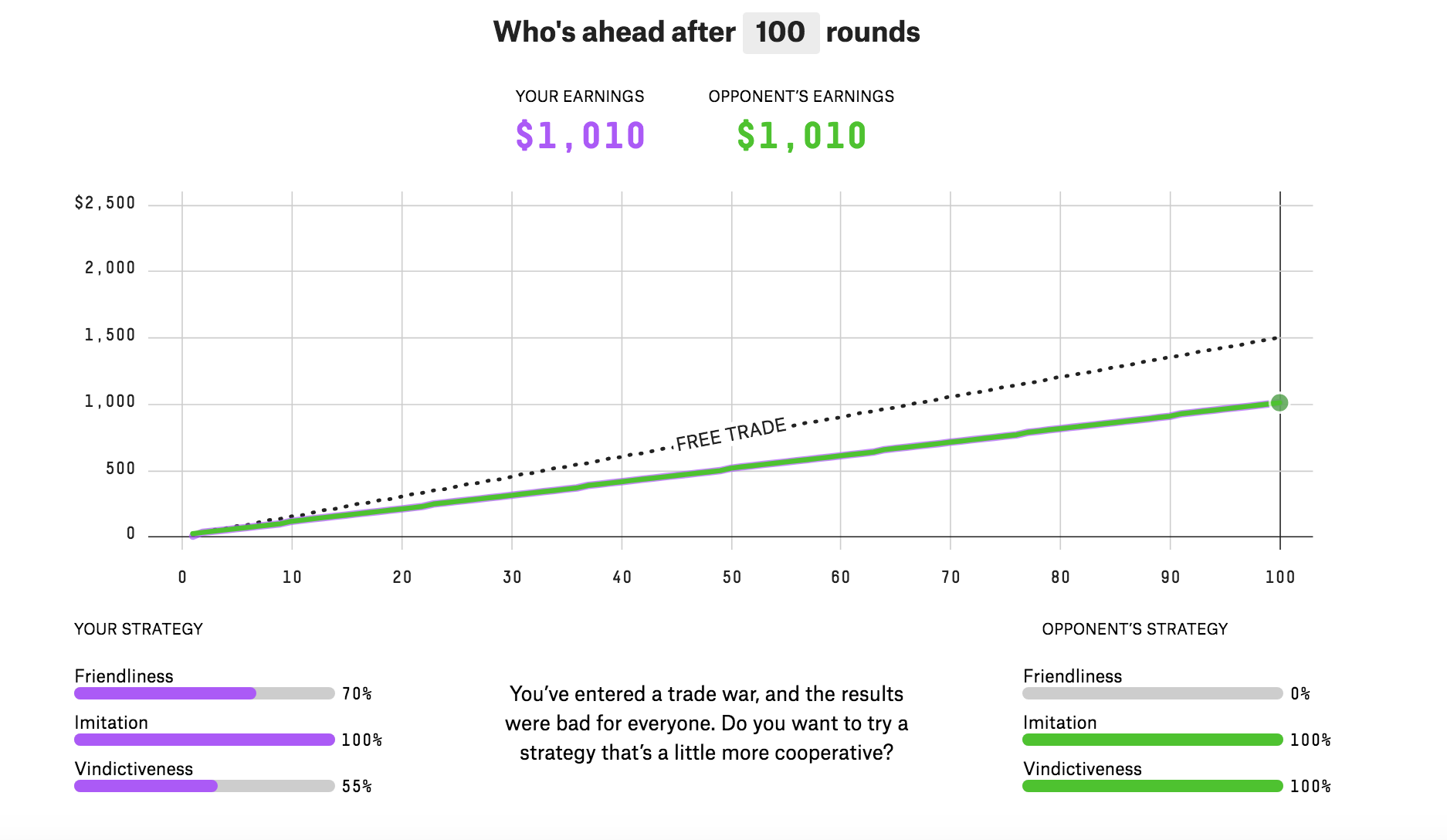
[Source]
It gives a concise package of how actual economic and political policies affect outcomes. And it’s fun to play because you feel like you’re actually getting to use, in a tangible way, what you’ve read about trade wars. 538 explains how everything works after the interactive viz, but for anyone who has been following the news, the interactive tool is front and center.
Culture
538’s culture section is mostly reserved for its “significant figures” feature that gives an overview of events by the numbers. But when it does foray into culture, 538 creates interesting pieces that capitalize on topical issues.
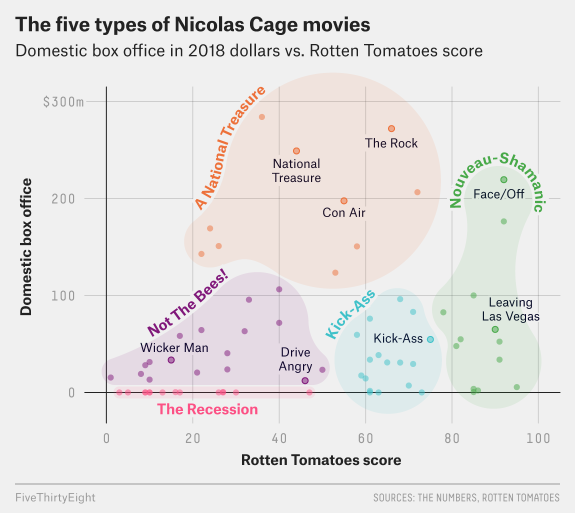
New kids on the Oscars block
This graph is outstanding. It tells a whole story as a stand-alone piece of data representation — so much so that there are only two paragraphs of text accompanying it.
It tells the story of which Oscar categories are dominated by repeat nominees, and which are more “open” to newcomers.
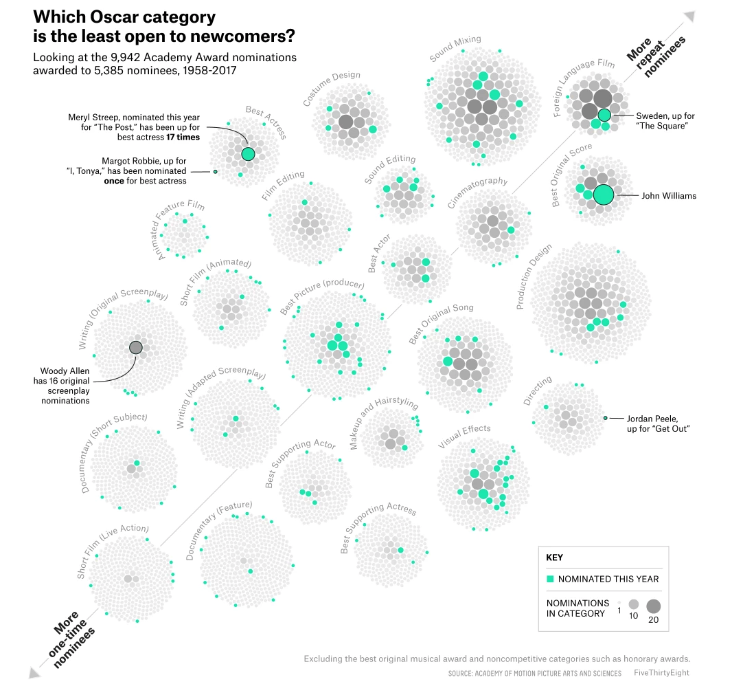
[Source]
We like that the graph is annotated with people of interest and that they’re effectively clustering bubbles in a way that isn’t overwhelming. The bright mint-green and grayscale color scheme feels fresh and provides enough contrast without turning into color overload.
That’s all we have to say here. This is a clean graphic. Enjoy it.
The doomsday clock would like you to be concerned
This is a simple chart that shows the positions of the Doomsday Clock throughout its history. The chart is easy to understand and provides a quick bird’s-eye view of how dire a situation we are in right now.
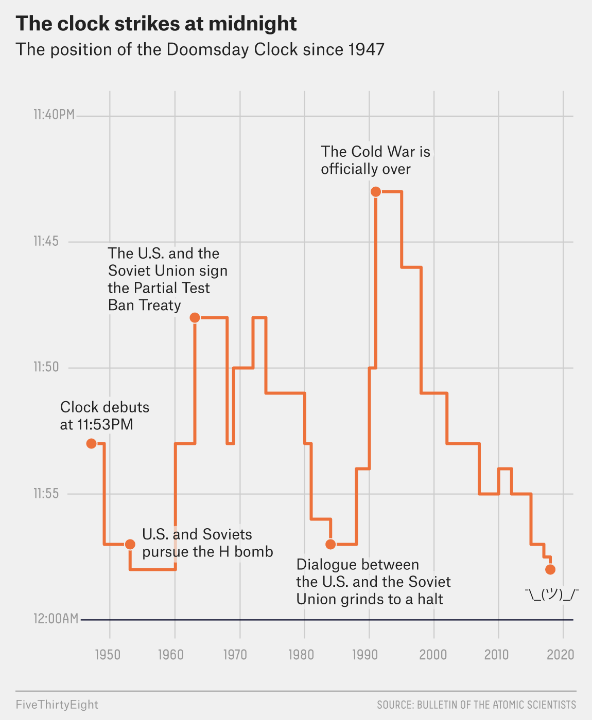
[Source]
The text of this article pretty much just explains that the position of the clock is currently down to nuclear threats and global warming. While it’s always news when the Doomsday Clock moves, giving such a stark contrast of where we are now versus where we were at the beginning of the ’90s really highlights the threats facing our society.
The only thing you might be able to criticize this graph for is its truncated scale. But given that the Doomsday Clock has never been set before 11:40, and given that the point of our situation is that we’re approaching Cold War–era levels of doom, the scale isn’t hiding any data or making it appear more dramatic than it is.
Bonus Chart:
It’s Nic Cage, y’all.
[Source]
In all seriousness, 538 has figured out a formula for good data viz. Their charts are crisp and readable, and they understand how to rest articles on data in an effective way. It is, after all, what they do.
H/T to 538 for the great work they do in data viz, and happy reading to all. Data viz responsibly.
15 Interactive Infographic Examples
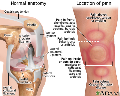
You’re sitting in the doctor’s office, legs kicking the back of the exam table. The nurse has just left and promised the doctor will be in “in a minute” — ten minutes later you’re so bored you’re actually reading a laminated infographic about the human knee from 1997. And it sucks. The graphics are terrible. There’s so much information packed into one image. You don’t know half the words. By the time the doctor arrives, it’s actually a relief.
[Source]
Much like your doctor, we’ve got some good news and some bad news. The good news is that not all infographics have to be as confusing and boring as the laminated pamphlet that made your eyes bleed! You can make good, interesting infographics.
The bad news is you probably aren’t. And one big reason is that you’re still thinking about an infographic as a static image instead of an interactive element.
Some infographics are complex and animated. Some are simple. Some pack in a huge amount of information and some just give a basic overview. No matter what you’re trying to accomplish, you should take a good hard look at these interactive infographic examples before you end up with yet another boring doctor’s office disaster.
What to look for in these interactive infographic examples
We’ve said it before and we’ll say it again: making good visualizations are one part conceptual and one part design. If either falls short, you’re going to have a mess on your hands. You need:
- Clear scope. You need to know exactly how much info is going in your graphic before you start.
- Consistent design elements. Especially for longer graphics, visual consistency is important.
- At-a-glance takeaways. While some people will love interacting, others will skim. If you hide all your information, you’re making a half-brochure half-picture hybrid, not an interactive infographic.
- Sharp copy. This is where you can hone in on your usefulness for a reader. Copy should be short but impactful.
- Big takeaway. When you’re planning an infographic, you need to keep that big takeaway for your readers in mind. Every element should go towards helping someone understand it.
And as for the interactive elements, they should:
- Enhance your point. While some aesthetic interactions or animations are ok, adding bells and whistles just because you can is a waste of everyone’s time.
- Be intuitive. Rage clicking should be avoided at all costs — and there should be no tutorials needed. If it can’t be figured out intuitively, leave the interaction out.
From the just alright to the very good, here’s a look at 15 interactive infographic examples that hit some or all of these criteria, why they work, where they fall short and what you should look for when getting into interactive infographics.
Infographic timelines: more than just BCE to CE
No offense to timelines, but they’re generally… pretty average. Nothing to write home about. Still the temporal organization of information is key to understanding many concepts and a great way to layer a story.
The nature of a timeline is that it’s hard to cram the necessary information in because a single line doesn’t have much space. Some people try to get around this by making snaking lines that weave down an eternity of scrolling. But even the tightest layout will be a-clutter with text boxes.
So, when you’re building a timeline, interactive features can be a godsend. Animations, popups and interaction bring a classic way of displaying information into the 21st century.
1. Market research made riveting: the Evolution of Insight
This interactive timeline from Vision Critical explains the development of modern-day market research. It combines great visuals with animations and an interactive element.
One reason this timeline works so well is that splitting up information by decade allows for extras that enhance the information. You get historical photos, portraits of notable figures, and a reminder of how technology changes over the years. That’s right — that fun background is actually adding to the timeline by helping readers make historical associations between the technology of the time and the market research innovations.
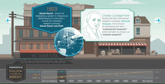
Not only that, but the timeline makes it easy for a reader to flip back and forth. No endless scrolling, no flipping back through web pages. You can just click on the decade you want at the bottom and boom: the information you want.
There’s not much to pick apart in this timeline. The only thing that you might be able to take away from it is that there’s pretty much no background going on — it’s up to the reader to connect the dots to market research. But given that there’s a professional audience for this piece, the copy is at the appropriate level. Well done.
2. Walkthrough of how to dismantle a nuclear weapon
Some timelines are historical, like the one above. Some are theoretical guides. That’s what the International Partnership for Nuclear Disarmament Verification shows in its extremely detailed infographic walkthrough of how to dismantle a nuclear weapon.
This is a great example of how a timeline can pack in a ton of information and read like a checklist of steps that need to happen in order rather than a list of events that have already happened. The temporal aspect is integral — you can’t jump around in the sequence or remove a step when disarming weapons — but it isn’t the focus here, it’s a framework for the information to be organized.
Take a look at how they’re organizing information. When you scroll through, you’re given an overview of a particular sequence of steps:
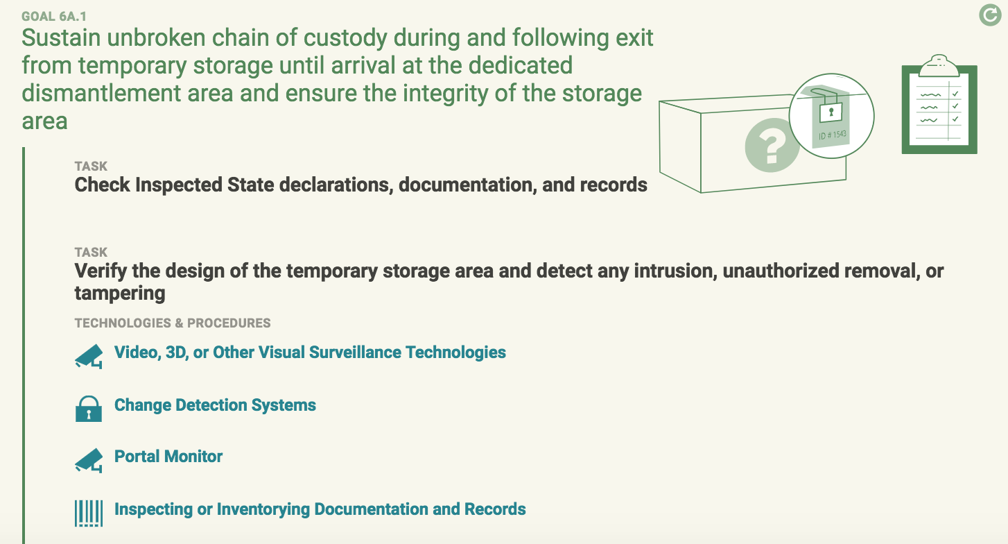
When you click on one of the bullets, it opens up additional information that helps you understand why and how that step is completed:
![]()
Now that’s what I call packing a huge amount of information into an infographic. The interactivity here makes the infographic readable. And it allows readers to pick and choose how much they want to know. The key here is that you get a good overview of what the timeline of dismantling a nuclear weapon is without opening up all the asides. They’re packed with information for the serious reader, but they don’t impede the laymen.
Don’t stop scrolling!
The web is a particularly good place for infographics because it is a near-100% scrolling-based medium that builds in a layout for infographics, and gives companies a lot of options for how they want to host and produce interactive infographics. Animations and interactions make a good play on the length of infographics.
That is if your audience is going to have to scroll anyway, making things interactive can be a good way to keep them scrolling through and paying attention rather than just zooming to the bottom.
The examples below are creative ways that you can make the scrolling motion integral to your infographics.
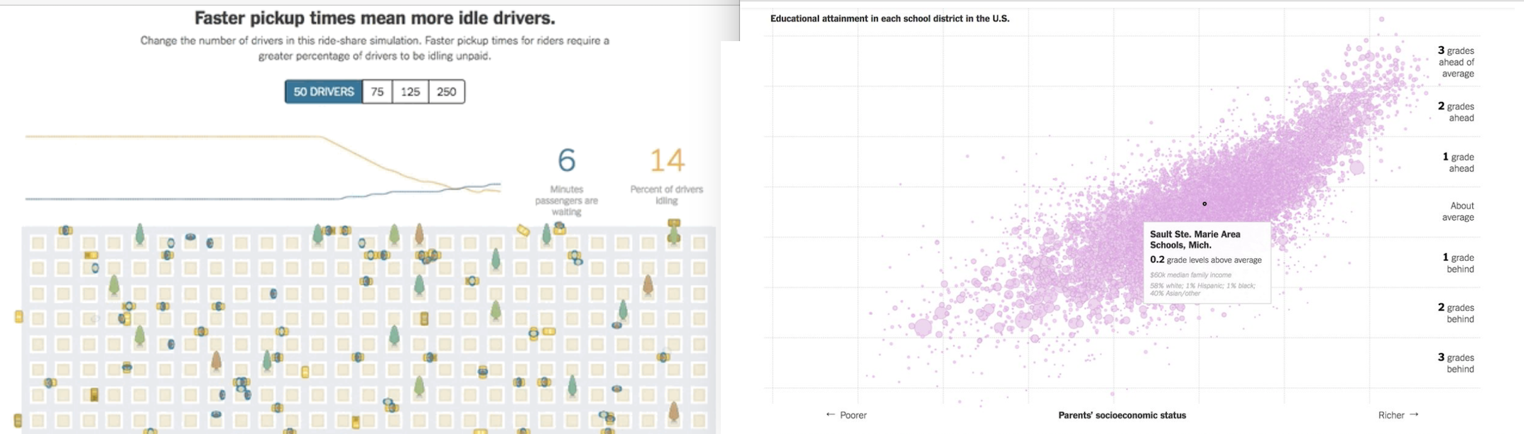
3. You vs John Paulson
What we like about this infographic is it is completely unique to the user. At the beginning, you put in your annual income — say, $40,000. Then, as you scroll the infographic tallies itself to correspond to your exact situation:
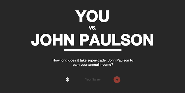
That means that a user is invested in what the infographic is saying because it directly applies to them. There are also interactive elements within the infographic that prompt the user to further engage and see how they “stack up.”
Its bold colors and clear contrast make it easy on the eyes, and the striking graphic design pairs well with the slap in the face that the infographic delivers: that your salary is not even a drop in the bucket for John Paulson.
But mostly what we like about this is that it’s a brilliant piece of marketing. MahiFX is trying to get people to try its new online forex trading system and it’s using an infographic to do it. If these types of informational infographics are appealing because they directly relate to the user, and this infographic is telling the user that their income is paltry compared to a trader, then it makes sense it would be a great piece of marketing.
4. Home protection gets stylish
Speaking of great marketing, take this scroll through this infographic resource from home security system provider SimpliSafe. It offers a burglar alert system, which is only one part of a robust home defense system. So, on its website it offers a full guide of tips to keep your home safe — from storing valuables inside to the height of your garden fence.
This infographic has two different forms of interaction. One is that it changes as you scroll through to take you on a tour of different layers of security. The second is that you only get information about how exactly to improve security when you scroll your mouse over, for example, the safe:

The reason why this works so well as marketing is twofold. First is that thinking about home security is not fun and it’s not sexy. It’s boring at best and frightening at worst. So turning this topic into a cute and well-designed graphic takes the intimidation out of things. It breaks up what is essentially a laundry list of tasks into digestible bites that you actively engage with.
The other reason this works so well is presented as a whole web page, not just as an embed. While we love embeds, getting this front and center as a resource, without any caveats or text explanations, centers the immersive experience of the graphic.
5. Minimize the risk of healthcare-associated infections
This is a simple graphic that combines scroll and hover to make a punchy presentation. One thing that it does really well is provide information about healthcare-associated infections in an engaging way while still presenting the material in an appropriate matter. Healthcare isn’t the place for gimmicks and tricks.
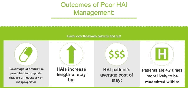
Instead, what makes this graphic work is a bold color scheme and crisp copy. The graphics are appropriate and informative, and the use of negative space alongside primary colors draws the eye in and keeps the graphics, which appear as you scroll, from feeling cluttered.
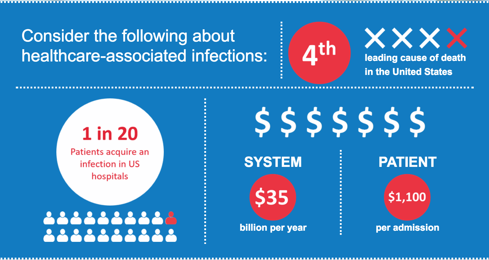
This is a great example of how good, simple designs can provide that visual pop that keeps readers scrolling without coming off as too gauche. Even serious presentations can benefit from clean, strong design. And, when you aren’t creating a whole animated scroll-through of something like a house security system, you’re saving on time and costs as well.
Popups: packing in the info
The easiest way to kill an infographic is to pile on so many graphics and so much text that it becomes an incomprehensible jumble. Where this once may have been a cruel necessity of the infographic, you can now make your information dense without sacrificing that sweet, sweet aesthetic. Thank you, digital graphics, for giving us annotations and popups. Let’s see how it’s done.
6. Inequality is fixable
Turning a complex issue like economic inequality into an infographic would be a daunting task for anyone, but the Economic Policy Institute knocks it out of the park. It uses a background graphic of Washington, DC, to display the five major factors of economic inequality in a circle. Each provides a brief overview of the issue when you hover:
And when you click a bubble, you get a popup with more information: graphs, text, and a call to action:
This is a great way to provide both an easy overview and an in-depth review in one graphic. A key to getting people to click on this infographic is sound and animation. Each bubble makes a little noise as you pass over it, and it becomes slightly bigger. Though these are small cues, they encourage the reader to give a click around and see what happens.
7. Goldman Sachs’ millennials page
Goldman Sach’s infographic on millennials is a great combination of the scroll features we’ve already explored with some classic data viz annotations. As you move through, you’re provided with graphs that come alive with information as you move over them. Why these annotations are a brilliant move comes down to this: it makes the information actually digestible, instead of being overwhelming.
There’s a lot going on in this infographic, and if it didn’t provide an annotated option, the data would get lost. It was a smart idea to keep things uncluttered and let people interact with data at their own pace.
But in our opinion, this infographic is trying to pack a bit too much into one web page. If Goldman Sachs was intent on giving this much information out, a key or a guide at the top with hyperlinks to take you to the different parts of the infographic would’ve been key. That may have provided the overview needed to make this feel less overwhelming.
8. Basic functions of the brain
On the other end of the spectrum, this graphic from Online College Courses keeps it short and simple. It’s an overview of the different parts of the brain that provide an annotation on their functions when you click on an area of the brain. It’s got some good contrasting color and a nice vintage graphic feel.
Overall, this is an excellent example of how to use annotations to make a quick-and-dirty guide to a single topic.
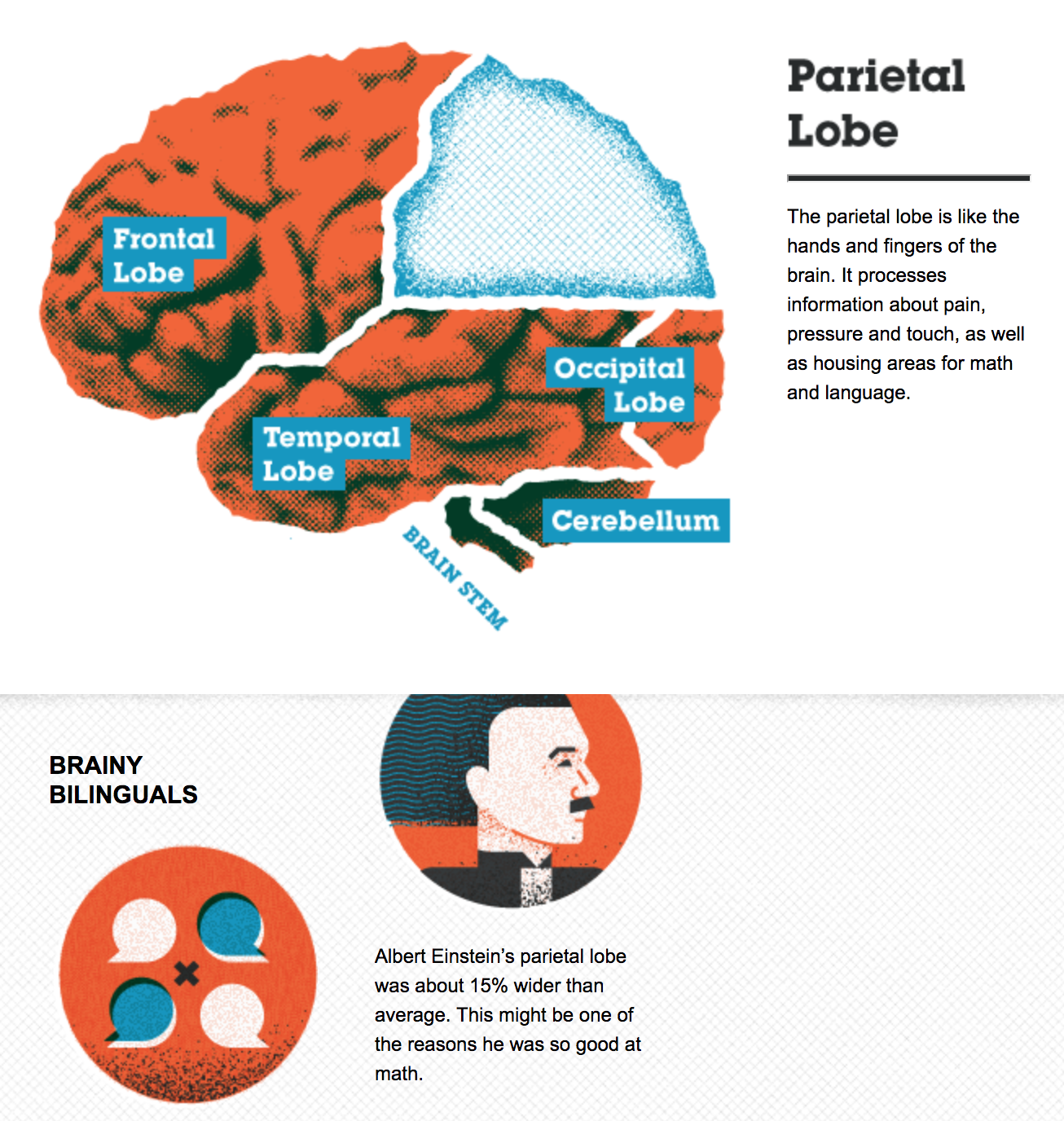
And, in a smart move, they include the embed code for this graphic at the bottom of their post:
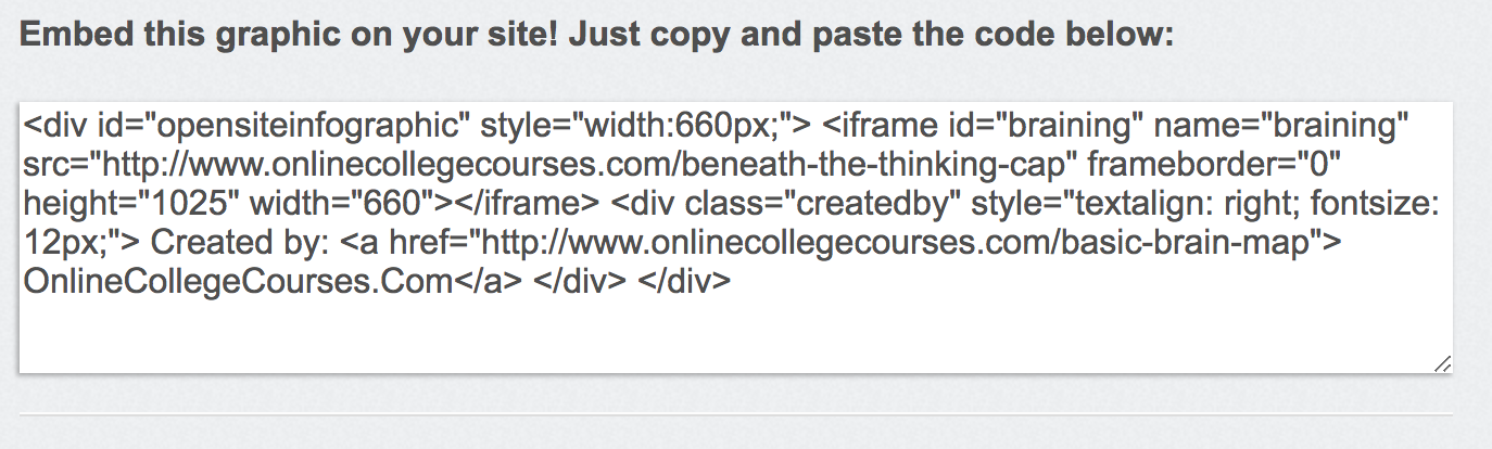
That’s right! This graphic was made for other people to share and use in their own content. This is a great recognition of how many graphics work as quick takeaways. Plus, most people feel much more comfortable writing than they do making graphics — why do you think we aren’t making up our own examples for each post? — which means they’re on the lookout to supplement their own content with other people’s visuals and graphs.
Making it easy for them to use your hard work is a great way to provide value to your readers and to get an all-important back link.
9. Walmart infographic
When you think big business, we’d guess that Walmart is one of the first corporations that comes to mind. It’s all about that corporate graphic, and we’re here for it.
Right off the bat, we like that it’s using something we haven’t seen a lot of yet: pictures of people. The smiling faces are reminiscent of the Walmart branding and underscore the message of empowerment Walmart is trying to send. Whether or not you’re buying its corporate message, it is very well done.
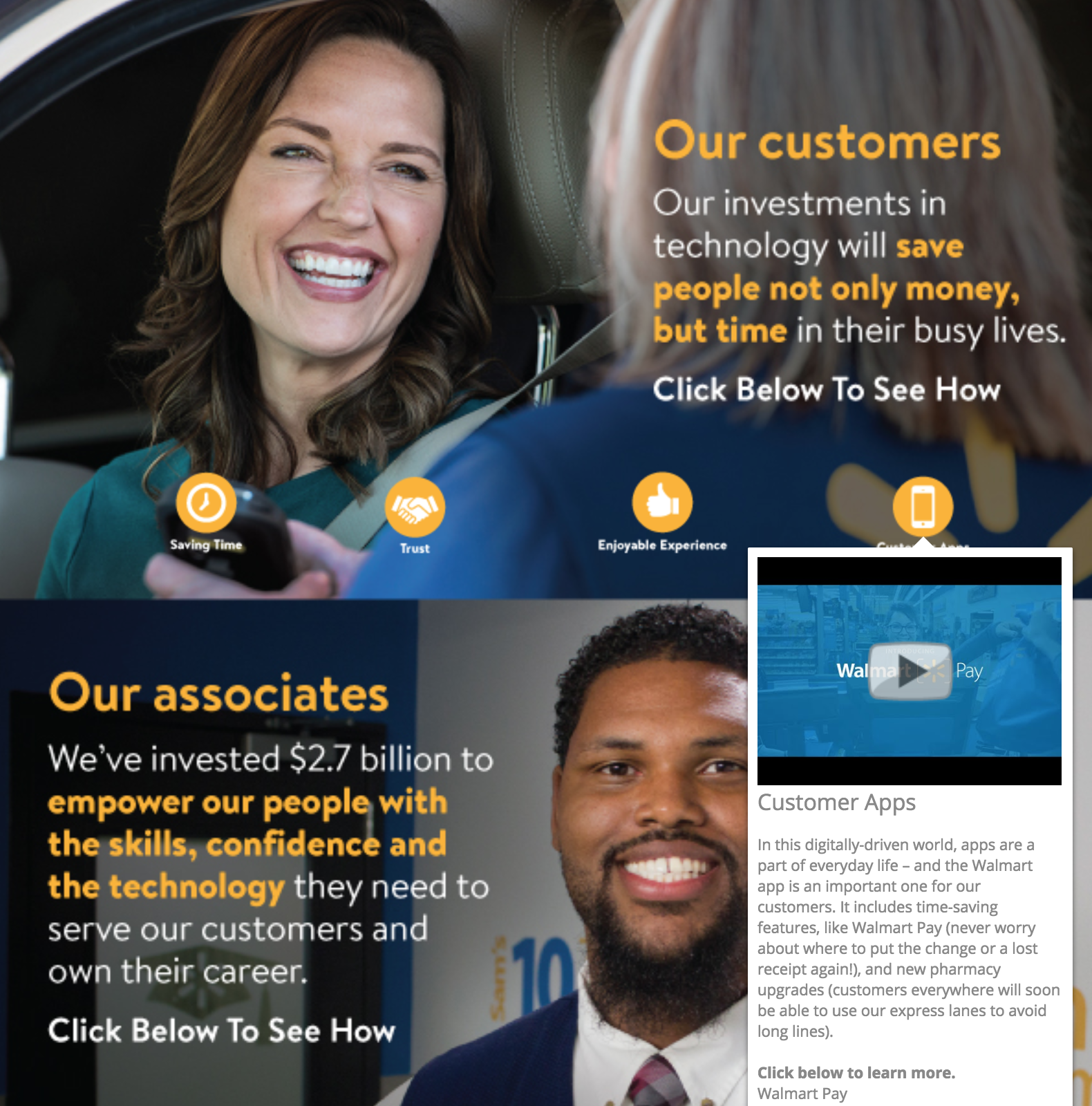
The annotations also incorporate another thing we haven’t seen yet: video annotations. Although it offers text annotations as well, Walmart allows you to play several videos in this infographic without leaving the web page. That’s cool. When you can use multimedia that’s embedded, you’re keeping your readers engaged and on your website, rather than on YouTube or Vimeo where related video links will lure readers away.
10. 12 ways to name your business
We’ve made it this far without encountering something that’s more miss than hit, but we can learn just as much from meh infographics as we can from good ones.
This interactive infographic from Ink and Key is a great example of something that would do better as another graphic type or even an article.
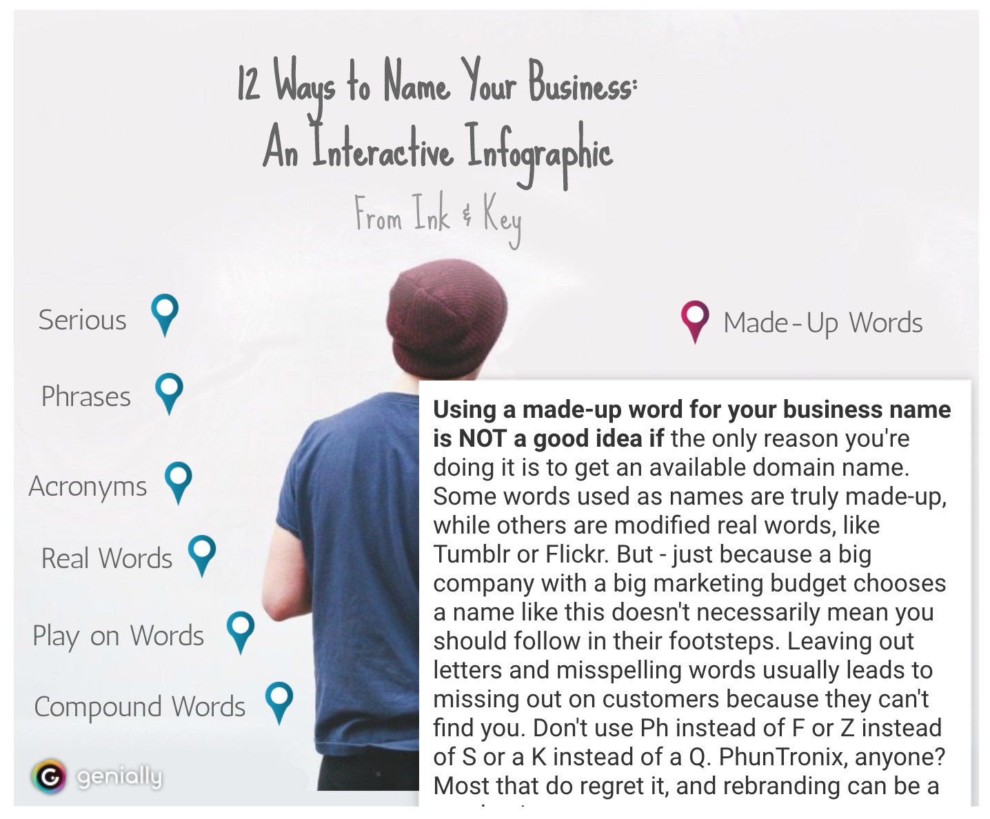
Why? Because it’s essentially just a list of bullet points where the text is hidden. The graphic has little relevance and none of the design elements are enticing or add to the experience of the piece. Actually, the star of this piece is the copy — it’s engaging, funny and actually gives helpful advice. And it’s buried under a boring graphic and clickable elements that, quite frankly, don’t even look like they should be clicked.
While we love to push graphics and mixed media as a way of hitting home with your content, sometimes you need to take a step back and hit the basics. This could have been a straightforward listicle piece with a hundred words per bullet point and some screenshots of examples and that would’ve been a better, more engaging piece.
11. Cybersecurity 2017
In direct contrast to the infographic above is this security infographic from NIST, which details some of the biggest digital security concerns for 2017. The content of this infographic is also basically a bulleted list, but this time there’s visual appeal and a bit of a story that goes on with the graphic.
Each area of concern is highlighted orange and corresponds to a physical object in the image. This is a simple way of adding some interest without investing in a big narrative or animated graphics.
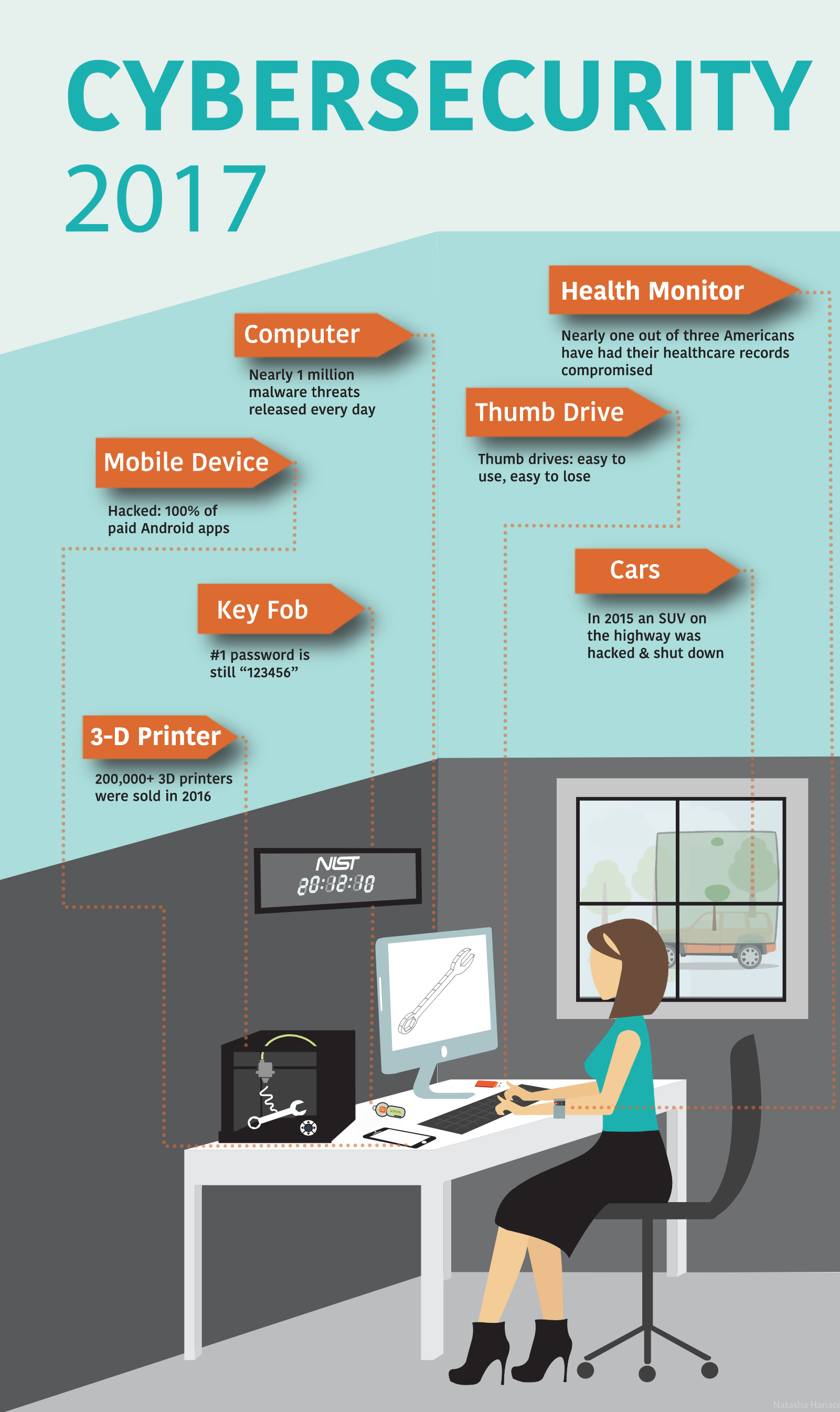
When you click on a subject, an annotation pops up that provides you with more information and links you to resources by NIST:

It’s great that NIST is using an infographic to get links going and direct people back to its website, but if you put in links do not have them open in the same page as your infographic, as NIST does here. That takes the person right out of your infographic. Setting your links to open in a new tab is definitely preferred.
One other linking note: keep your linkage obvious. In the screenshot above, it’s pretty clear where you’re going with “vet the security and risks” and “manage the security” links. But where will you end up if you click “employees”? The content of the page you’re redirecting people to should be obvious. If you are linking random words, take a more sparing and thoughtful approach.
Animations and annotations
Sometimes infographics are about more than just popups and small interactions. That’s what we have in this set: a series of infographics that have animation, swiping, sound, annotation, external links, popups, or any combination of those elements.
While some of the more complex infographics might be too much for your average company project, they’re good fun and an idea to keep in your back pocket when you can spend some more time and effort on spotlight content.
12. A Guide to 100 Musical Instruments
This is a fun, informal infographic that we could easily see in any elementary school classroom. But wait… what’s that? There’s a sample of an instrument that plays when you click on a square? Sweet. That’s a great use of an additional element that really makes this infographic pop. Full disclosure: clicking on the instruments is fun, and it is actually informative.
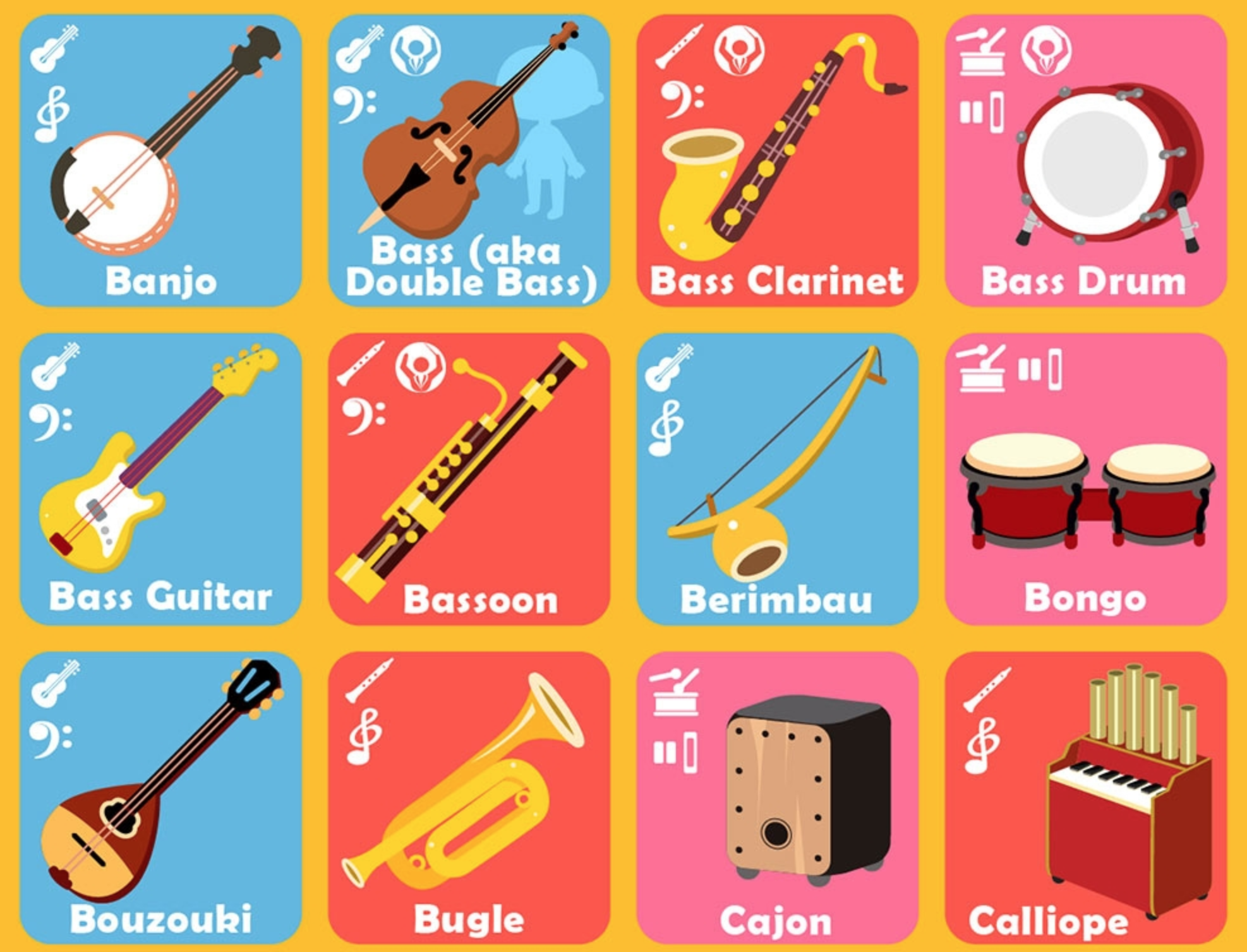
This is a great example of how adding one complex element to an otherwise simple graphic is just as, if not more, effective than making some of the more complex scroll + annotation + data input + popups that we’ve seen. It’s also a great reminder that what matters the most is that you’re getting the most relevant information to your readers in the easiest way possible.
13. Common mythconceptions
This is a great example of a piece of evergreen content. The interactive infographic is essentially a giant list of myths, like you shouldn’t wake a sleepwalker. For each myth, the bubble size corresponds to the prevalence of the myth, and when you click on a myth you’re taken to an in-depth explanation of why it’s false. You can sort by category and we’d bet you could lose at least half a workday clicking around before sending this to a friend.
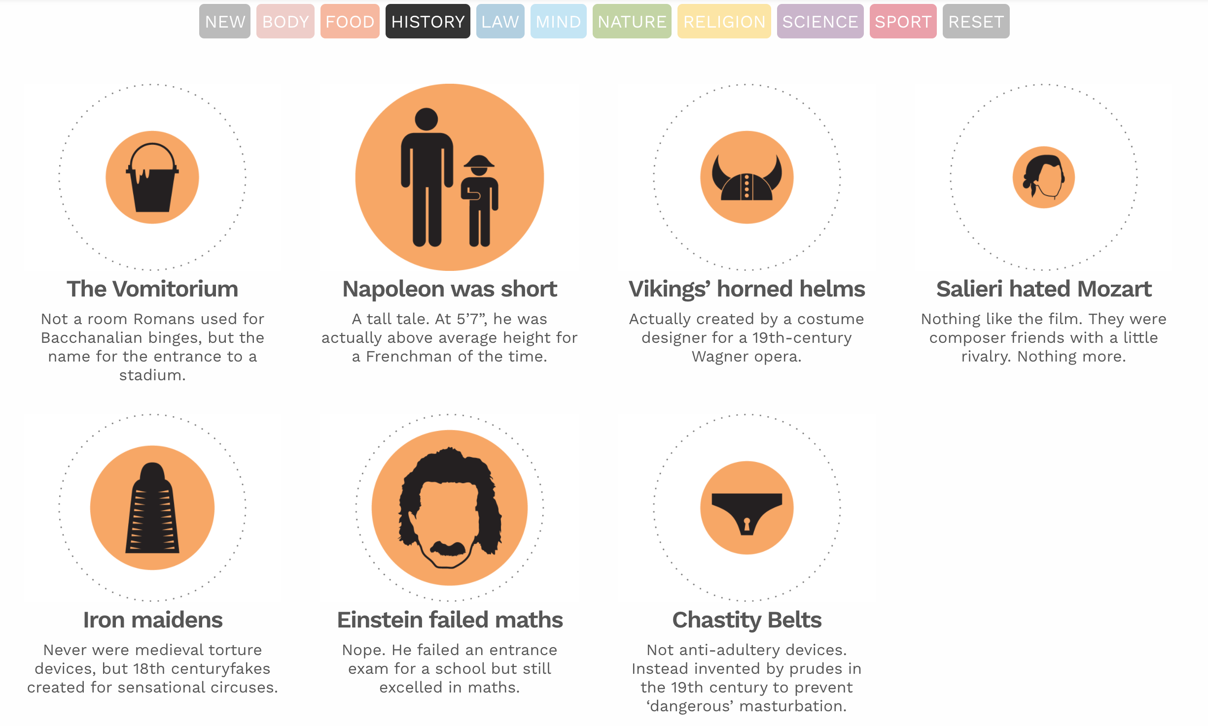
There’s enough information in the infographic that you don’t have to click through, and the clean graphics and saturated colors make for an overall pleasant experience for this infographic, and its topic is going to stand the test of time. Given that this site is dedicated to data visualizations in and of itself, this is a great representation of their work and their value.
14. How small businesses use technology
So far, we’ve pretty much only seen infographics that work in a linear manner from top to bottom, but this infographic breaks the mold. Instead of scrolling from one section to the next or clicking and having a popup, this infographic on how small business can use tech is more like a series of interlinked infographics.
You are presented with an opening page that acts as a three-item menu. As you click, it brings you to different areas in which SMBs can take advantage of technology. If you click on one, you’re brought to stats and facts about that area.
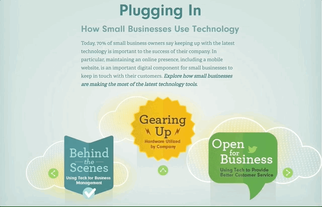
Rather than try and pack a bunch of information into an overly complicated web, this infographic acts as a series of interconnected graphics. With the digital age ushering in new and exciting ways to get from A to Z, to make art to display data, why not?
And if you don’t have the inclination to make this much information animated and easily readable, narrow your scope or consider making a series of standalone graphics instead.
15. Smarter schools
We’ll end on this infographic about schools, which is a similar graphic to the one above, but a bit more straightforward. Instead of being a continuous graphic that you scroll, this is a click-through from side to side.
Adding this animation might be a good fit for you if you have a series of items that’s linked that would become way too long if you put it all together from top to bottom. Nobody wants endless scrolling on an infographic — or anything else.
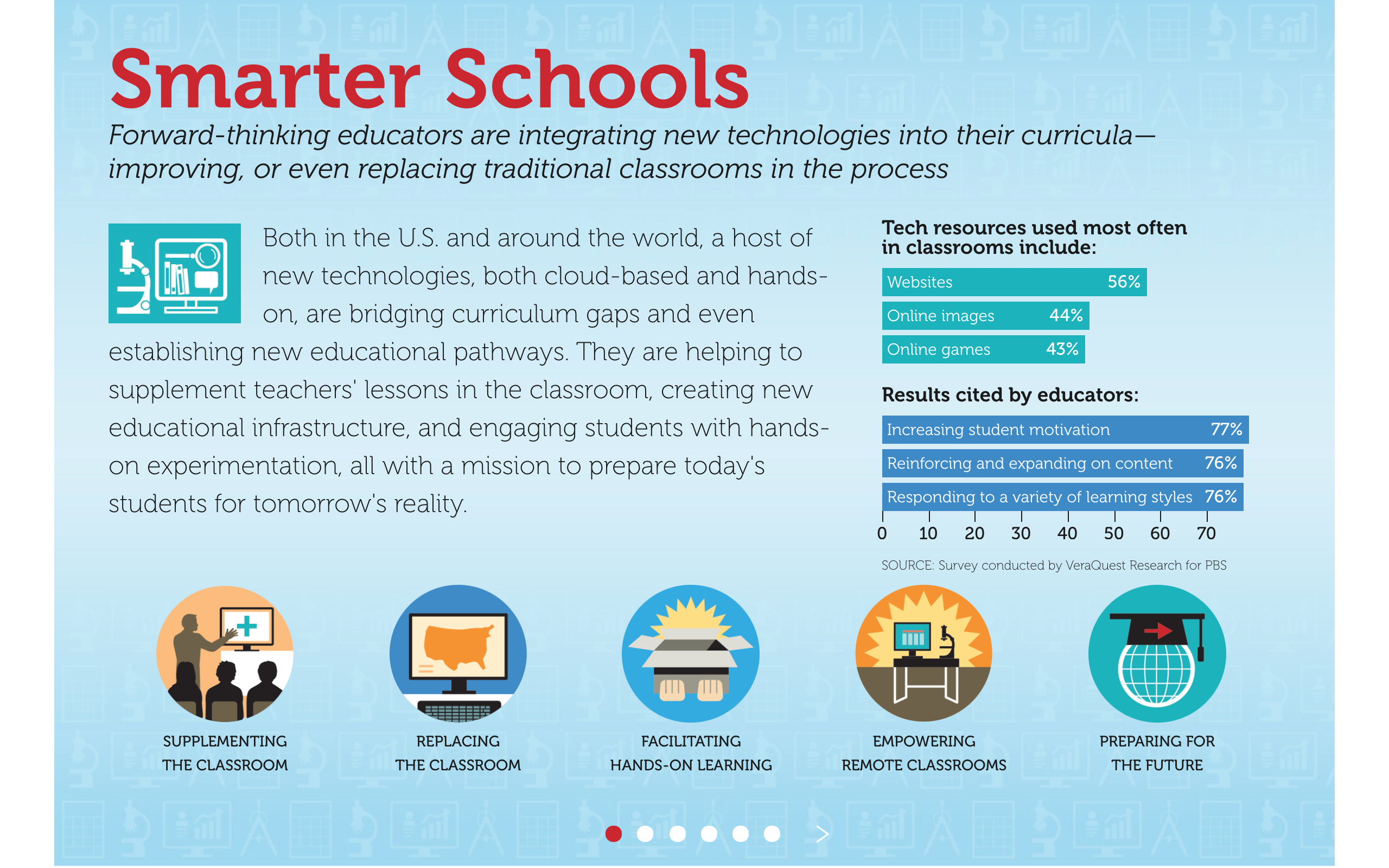
This is also a great way to think about the structuring of an infographic. Even if you’ve got animations that allow people to pick and choose where to go, you want to think about the best way to present information. Putting it in a slide form, like this, encourages you to think about an infographic more like a deck to go with a presentation, which is a great way to work through your concept and structure.
You’ve seen our interactive infographic examples, now it’s your turn.
Have something great? Terrible? In between? Let us know! We love looking at data viz and infographics, so never hesitate to send them our way.
What is an infographic? It’s your business’s secret weapon.
No matter what type of business you run or where you are in the world, you need to be able to communicate with your audience. It’s your most basic ingredient for success. But even though it’s a simple idea, it can play out a lot of ways. Businesses today do so much more with communication than just delivering services or merchandise. They’re on social media, in email campaigns, on websites and working with influencers.
Each of these mediums demands its own type of content. You wouldn’t try to put a video ad in a newspaper. You wouldn’t try to mail Instagram ads to someone’s house. Creating the right content for those channels is obvious.
And yet, many marketers, bloggers and businesses have no idea what they’re doing with one of the most informative types of content—infographics. They may as well be printing out tweets and dropping them from a plane.
The 34 Best Interactive Data Visualizations from the New York Times
The New York Times has nailed digital subscribers. Since they became an early adopter of the industry trend and started pushing a digital subscription model, they New York Time’s subscriber numbers have only grown, reaching their highest point in history this year.
One of the big reasons that the Times has been able to find and sustain this success is they’ve gone HAM with interactive data visualizations — sometimes allowing them to usurp the traditional article format to form an entire story altogether. The digital medium has allowed them to elevate their storytelling with viz that compels, engages and helps tell a story that goes far beyond words or pictures.
We’ve rounded up 34 of the best interactive data visualizations from The New York Times to show how they’re helping readers engage with data in their content to keep on subscribing year after year. We’ll break down what makes a successful data visualization, and then highlight what works about each example from the New York Times.
Here are the best of the best—anyone looking for inspiration or guidance for their own interactive dataviz needs to search no further.
Charts for Uncharted Territory: Trump’s Collusion
You sit down with a friend at a cafe and start to chat. Eventually, as it always seems to, politics comes up. “Hey, so I really don’t know anything about politics but, what’s up with that whole Russian collusion thing? I haven’t been able to catch up with that — can you help me understand what’s’ going on?,” they ask.
Cue the lump in your throat and the pounding of your heart. Where do you even begin? How do you explain all the people at play? How do you explain that collusion, conspiracy, and criminal activity are related but not exactly the same? How do you crush over a year’s worth of news into one concise explanation?

Not even Chrissy Teigen can save you now.
This is the scenario that news organizations have been staring down every day for months on end. People don’t have a lot of time, they’re oversaturated with political news, and they want a clear explanation of difficult and interlocking topics that involve dozens of people — most of whom nobody had heard of before last year.
Words alone are not enough.
Video clips can only go so far.
When you’re crafting a piece of content that is dealing with a multifaceted topic, you need to strategically deploy the best tools you have at your disposal. And for most topics, including Russian collusion, this means relying on charts and diagrams. They give context and include historical data and trends, which are often critical for proving a point. They are a clean way to organize factual information in a way that makes intuitive sense for readers.
Beyond partisan politics and he-said-she-said, there’s a lot to learn about how to present complex relationships and information from news coverage of Trump’s collusion.
Context is king
In the potential Russian collusion by the Trump campaign and administration, backgrounds and relationships are some of the most important pieces of information to give. Each player has their own unique ties to Russia, and working through all of these links has been a huge part of this story.
This context, in other words, is both a lynchpin of discussion and a difficult thing to lay out. There are dozens of people who all need to be accounted for and situated in their political and professional roles, and news organizations are turning to charts to do this. Without knowing who they are or how they’re connected — both to Trump and to any number of Russians — a reader simply will not understand what is happening in a discussion about potential collusion.
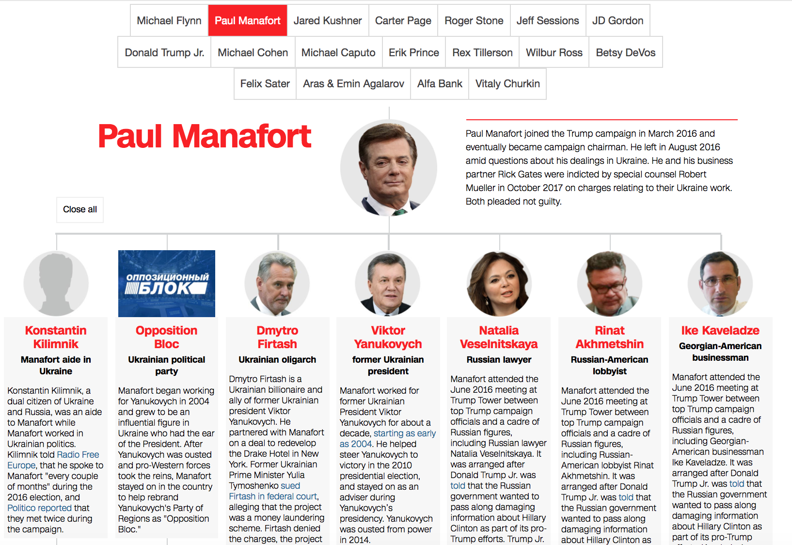
It’s so important to know and contextualize the major players that Politico has an article that is simply seven charts of who’s who. Let’s take a look at one and break down how it is a superior tool for contextualizing information.
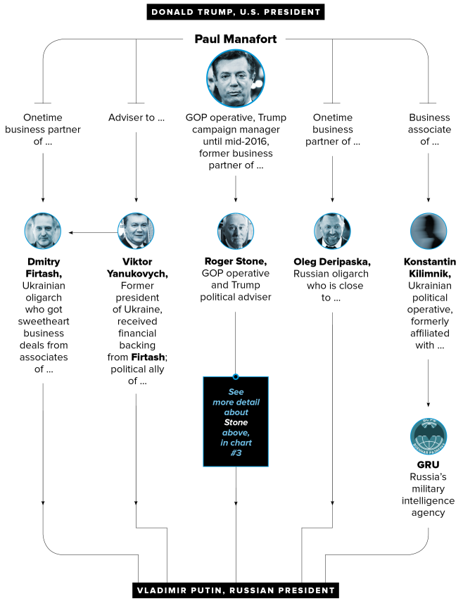
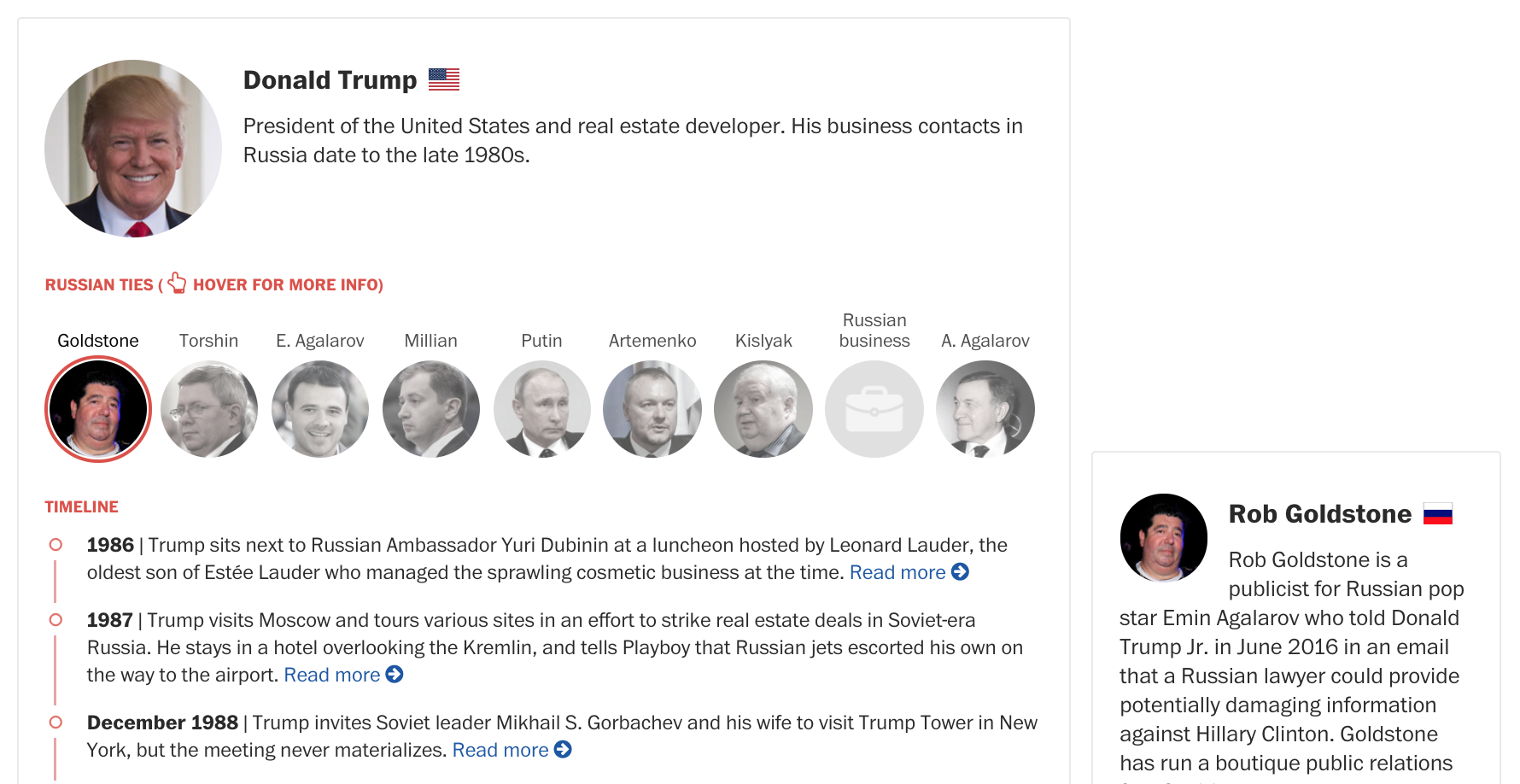
This chart shows degrees of separation from Paul Manafort, a Trump campaign manager and Vladimir Putin, the president of Russia. It’s a condensed way of getting Manafort’s major connections in one fell swoop, and this particular series of charts is an excellent example of a visualization.
- The faces help a reader recognize how key players return throughout the series of charts. Using symbols or photos to accompany names, objects, or ideas is a great way to make things more skimmable and more memorable.
- The color scheme doesn’t distract from the information. Notice how they put all of their photos in grayscale? This color choice cues to the reader that it’s not clear who is the most important link here. It neutralizes the inferences that a reader might make from full-color photos — like paying more attention to someone who is wearing a bright color.
- The layout is the epitome of “Keep it simple, stupid!” When you’re looking at this graphic, it almost seems like this is the only way to lay out the information, because it’s so intuitive. There are no crazy lines, no weird shapes — it’s compact and super easy for the eye to follow.
These qualities make this chart an efficient choice for showing a lot of information in a digestible way. Think of how much you would have to write to explain all these connections, and how dry it would be. Imagine how long it would take you to watch a video of someone explaining Manafort’s context in the collusion investigation. Would it take longer than the 30 seconds that it takes to read this chart?
Another great example of explaining context in the collusion is a clarification on the investigation itself from the LA Times:
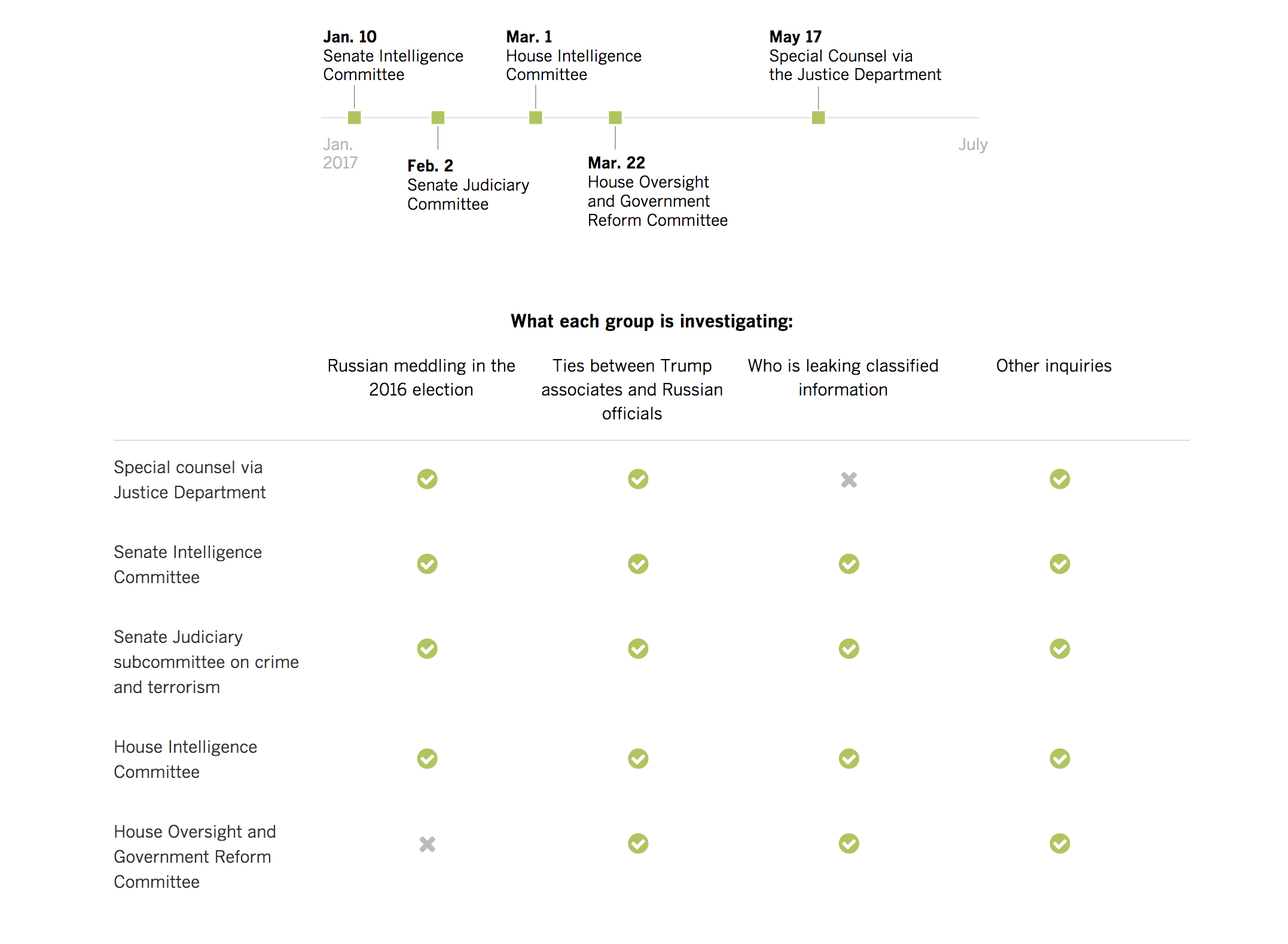 This chart provides a quick checklist for what each group is investigating. This is a crucial piece of context for anyone following the collusion story. A visualization of this keeps repetition to a minimum — imagine reading “Ties between Trump associates and Russian officials” four times — which makes things easier on the reader.
Because this graphic gives context to each different investigation, it is a great takeaway for readers and a good visual to use again. If you were doing a series on Russian collusion, for example, you would be able to pull this in as a refresher for a reader. That’s no extra work for you, and a great reinforcement for a reader’s understanding.
Laying out your context in the clearest way you can is the best way to help inform your readers and give them the tools they need to understand the nuance of your content. Charts and other graphics can be an excellent way to distill even complex webs into digestible formats.
Trends, or, how to actually prove your point
Once is an accident, twice is a coincidence and three is a pattern, and patterns often do reveal the truth. That’s why, many times, arguments and proof for those arguments have to include trends of behavior. And one of the best ways to display those trends is, you guessed it, charts.
For example, asking who the best basketball player of all time is would require you to look at their entire career, not just one phenomenal game. Looking at what the best marketing channel will be for 2018 requires you see recent historical change in ad revenue from different platforms. As for determining how likely it is that the Trump campaign and administration colluded with Russia — that means looking at:
- Regularity of meetings
- Number of business interactions
- Frequency of statements
- Meetings’ relationships to other events (e.g., Trump starting to push Clinton’s emails)
Providing the data to back up these trends could be done with text alone, but a block of text is time-consuming to read and often dry. Worse, if you have more than a handful of data points, it becomes hard for someone to keep in their head how things are aligning to see a pattern. So, when you’re trying to show a trend involving many data points, it’s nearly impossible to do with text alone: humans need visuals!
A great example of how news outlets are using visuals to show trends in Trump’s collusion conundrum is this Washington Post visual on the frequency of Trump and the White House denying collusion:
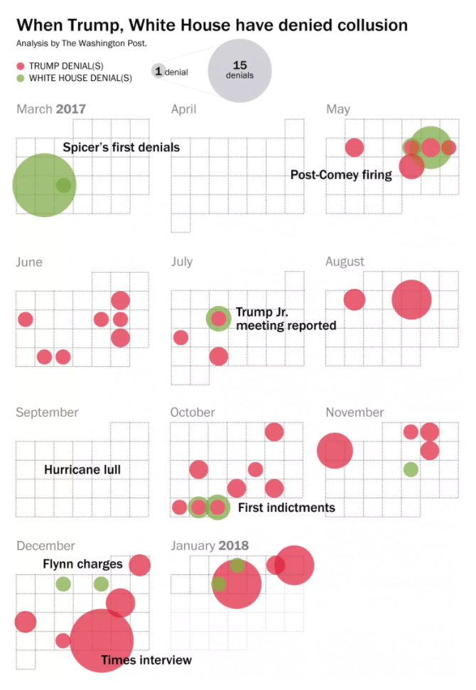 Note that the point of this chart is not to give exact numbers or information. You could guesstimate the exact number of denials from this graphic, but what’s really important is it shows a clear trend: Trump and the White House regularly deny collusion.
Note that this graphic is purely informational. Is this a case of President Trump doth protest too much? Is he being slammed by negative media and false allegations? You could use this graphic to support either case — that’s the beauty of it. It’s a whole bundle of evidence wrapped into a concise package. It’s a tool to use in conjunction with your argument. It makes your case more credible and more compelling. But it doesn’t do all the work for you, and it doesn’t have to.
Words can be persuasive to set up evidence, and graphics can be great displays of evidence. Use them as a one-two punch to pack the most oomph.
Organizing information when words fail
As more and more information about an event, place or person starts to compile, the more complex it is to organize. Humans spend a lot of time trying to make good categorial and organizational structures, from color coding to the Dewey Decimal system to project management tools.
Something as complex as potential collusion or illegal action by the Trump campaign and administration is going to be difficult to organize:
- It is a complex issue with dozens of players
- There are several years’ worth of data
- Readers need an overview of what’s in play to understand developments
- It can be hard to separate fact from fiction with news cycles shortening
- There are esoteric systems at play, like the legal system and the congressional systems, which are not widely understood
Representing some or all of this information visually can help people easily categorize and make connections that help your audience stay engaged. If someone doesn’t understand what’s going on, they will disengage and leave your content; visuals can quickly turn that confusion around.
One way to use viz and graphics to organize information is to link out catchup visuals. This keeps your readers on your site but allows you to write a streamlined piece without extraneous graph injections.
CNN did a great job of this in their article “One year into the FBI’s Russia investigation, Mueller is on the Trump money trail” from August of 2017. As they recapped an entire year of news on the collusion, they embedded links that would help readers quickly get up to date with the story. Some were timelines, some were videos or quotes, and some were more traditional charts and viz. They all appeared to the left of the text, and there was one for each different section of the article. Take this “Related Article” link:
It leads you straight to a Politico-esque visualization of who’s who in the investigation. For comparison, here’s part of Paul Manafort’s:
Notice how the same clean flow is used in CNN and Politico’s pieces? It makes for a quick skim for readers to catch up. We also like that there are bold colors for the names of each person or organization, which makes it easily skimmable, even as it packs a little more information than Politico’s.
Using this kind of backlinking can keep visitors on your site while giving them the information they need. If it interrupts your article’s organization to pull in a whole recap of something you’ve already covered, having a bold call-out that links to a relevant piece of viz keeps your reader on your website and engaging with your content.
Then, there are embeds that use features to help organize information within a piece itself, instead of linking out. Take the example from the Washington Post below. When you scroll over this piece of viz, you can see how one person from Team Trump links to a “Russian tie” or vice versa. Right off the bat, you start to get a sense of who the major players are.
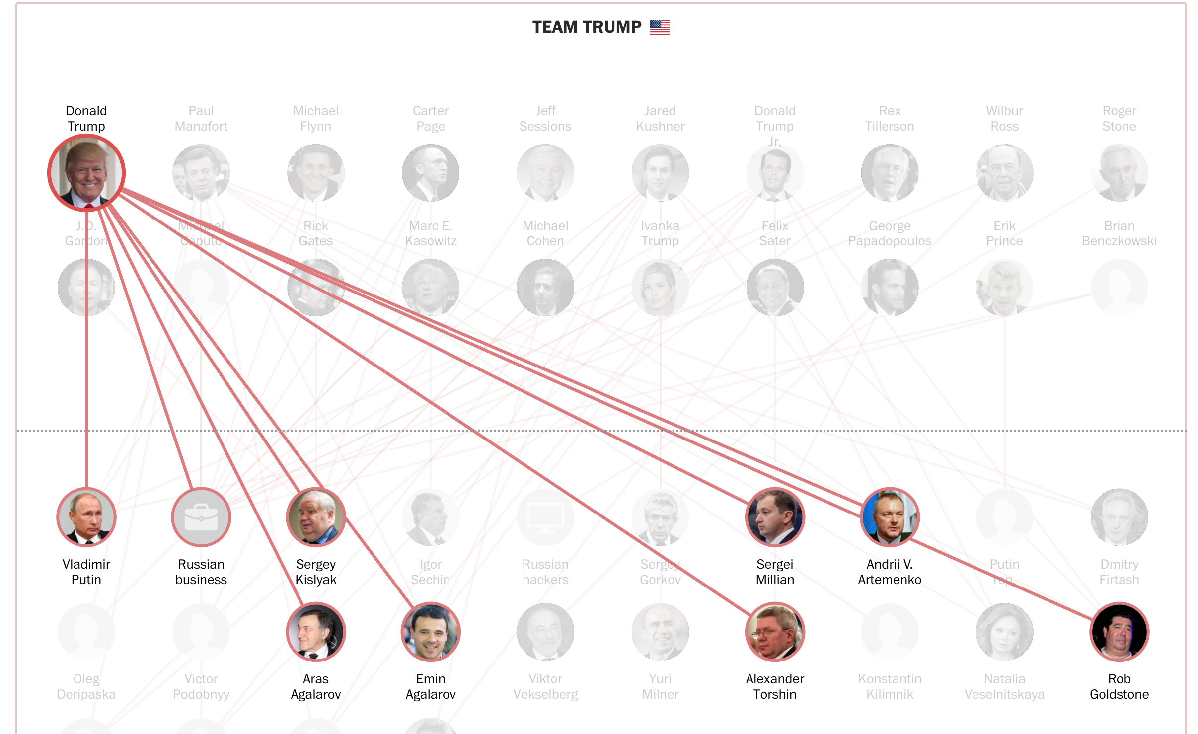
When you click on any of these figures, you’re taken to a brief bio, a timeline of their actions and an interactive element that shows a bio of every person they’re tied to:
This viz is the structure and organization of the article. It empowers readers to choose their own path and explore at their own pace, and packs a huge amount of information into digestible pieces. Without the central organization of the viz and the organizational, readable timeline element, this would be harder to get through than the Econ 210 readings you never did for class.
Both of these prove that charts, interactives, and visualizations can do more than just organize their own information well. They can be a foundational element around which you design a piece of content and one that helps give your readers a true, deep understanding of a complex topic.
So, did Trump collude with the Russians?!
Of, course we don’t know! If we could, rest assured we’d be making some pretty amazing infographics about it.
But what we do know is that news organizations are using charts to make complex topics legible for readers. The story of Trump’s Russian collusion has been one that’s dominated headlines for a year, and it’s not going away. As it grows and grows, media outlets will continue to use viz to help readers understand what’s going on. Keep an eye on how they’re doing it — you can definitely learn a thing or two.
And, when creating your own content, remember that charts, graphs, infographics and other data viz are tools that you can use to shape your content, not just additions. They solidify your point, provide critical context, and drive the organization of your information. All of this makes what you put out there easier for readers to digest and more compelling for them to come back to.
Creative Ways to Share Data in Your Next Email Marketing Campaign
Research and data collection play a huge role in your company’s long-term growth. When you do market research, collect user data, or run competitive analysis, you’re building a data archive that you can use to improve your product and user experience.
But with all of the data you collect, it’s hard to know what to do with it all. Some of it is used to make product decisions while other parts of your data are used to understand your users and cater to their specific needs. But what about the rest of the data you collect?
One option is to use email marketing to share your data with users to reinforce your messages and highlight why you’re the best option for your users. Adding data to your email marketing also gives you the chance to offer your users additional value. Instead of telling them about yours or their success, show them.
The Worst Graphs of 2017
There’s a dark underbelly of all of those beautiful graphs, charts and visualizations you enjoy alongside your news articles and your data-driven arguments. For every person that puts in the hard work to get numbers polished and bar graphs just-so, there’s someone on their fourth cup of coffee laughing maniacally at Microsoft paint and making terrible graphs. Are they deliberately trying to confuse readers? Do they simply not care? Have they been paid off to make spectacularly bad graphs?
We may never know for sure, but what we do know is this: every year we see some truly disheartening data viz mistakes, and there’s no telling when they’ll pop up. It might be on someone’s blog. It might be in one of the biggest news publications in the world. But no matter where they are, these errors make us cringe, they make us laugh, and they make us feel better about our own visualization skills.
So, to round out 2017, we’ve gathered some of the worst graphs of the year. They’re about many different topics from many different sources — nobody is safe. And lest you think we’re just ripping graphs apart for fun, we’re going to walk you through what has gone wrong with each one with the hopes that nobody will make these mistakes again.
Will our efforts be in vain? Only time will tell. But for now, Dolphins presents:

How “Show, Don’t Tell” Will Save Our Political Commentary
If you made it through 2017 without hearing the words “fake news,” you were probably off the grid.
The news cycle for the last year or so has been dominated by meta-discussions about the news itself. And while the explosion of fear around fake news hit everywhere from Facebook to Fox, continually growing distrust of the news, even from reputable media publications, is arguably a bigger problem. As of January 2018, 68% of Americans placed little or no confidence in the media.
Especially when it comes to political news, media outlets have become savvier with how they’re presenting their data and arguments — they have to be, in order to rebuild public confidence. Some of the most popular news articles of 2017 use interactive data, video, embedded primary source documentation and more to add a persuasive element that builds the credibility of their reporting.
Why? Because the better that news organizations can represent facts and figures in their articles, the easier they are to understand and the more reliably they will be seen. Interactive visualizations are key to reliable reporting because they help to demystify data and politics for the masses.
19 Flowcharts That Will Actually Teach You Something
Flowcharts — we’ve all seen them, and we’ve all made one. They’re everywhere from government websites to the backs of receipts. You’ve probably found cause to use one for your content every now and again, as well.
But most flowcharts suck. The visual components are terrible to look at. The layout is hard to follow. The progression doesn’t make sense, or people are jamming way too much info into one chart. Before you know it, you’ve got something that just looks like a pile of spaghetti.
Here’s a secret: that’s probably not the flowchart’s fault. Flowcharts can be a great way to synthesize information and are a valuable takeaway from a piece of content. So where are you going wrong? What can you do better? When should you actually take the effort to make a decent flowchart instead of just writing something out?
Within the 19 examples of flowcharts that we’ve gathered here today are the answers to your questions. Read on.