The 34 Best Interactive Data Visualizations from the New York Times
The New York Times has nailed digital subscribers. Since they became an early adopter of the industry trend and started pushing a digital subscription model, they New York Time’s subscriber numbers have only grown, reaching their highest point in history this year.
One of the big reasons that the Times has been able to find and sustain this success is they’ve gone HAM with interactive data visualizations — sometimes allowing them to usurp the traditional article format to form an entire story altogether. The digital medium has allowed them to elevate their storytelling with viz that compels, engages and helps tell a story that goes far beyond words or pictures.
We’ve rounded up 34 of the best interactive data visualizations from The New York Times to show how they’re helping readers engage with data in their content to keep on subscribing year after year. We’ll break down what makes a successful data visualization, and then highlight what works about each example from the New York Times.
Here are the best of the best—anyone looking for inspiration or guidance for their own interactive dataviz needs to search no further.
Maps
1. Political demographics revealed
This article compares a series of maps of the US, each showing the divide in gun ownership among different demographics. When you hover over any state on any map, it shows you the percentage of voters who (don’t) have guns and who they voted for.
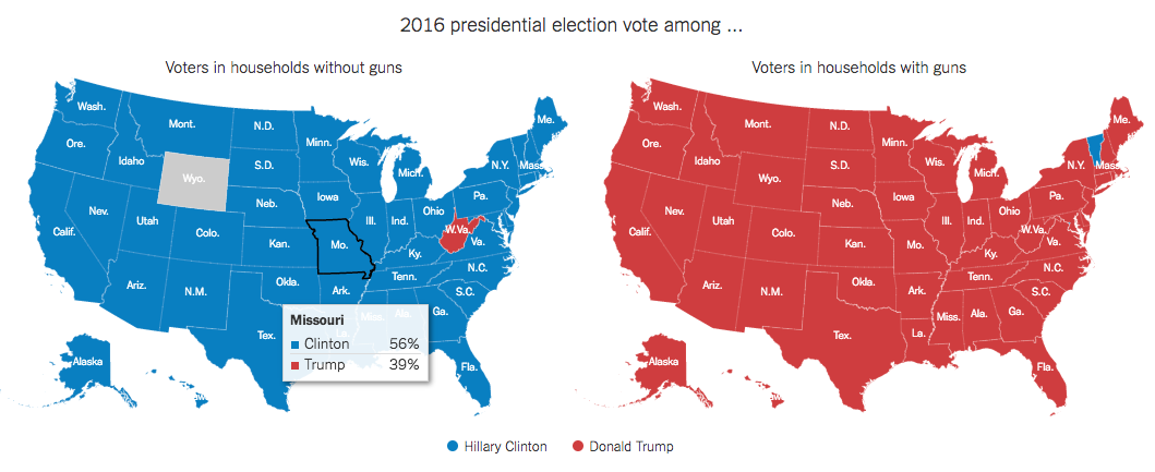
We like this visualization because it uses the classic color associated with the Democratic and Republican parties to give an immediate at-a-glance understanding of how gun owners are divided along party lines. We also like the pop-out information you get when you hover your mouse because it adds a great dimension to the map that otherwise may have been displayed in a series of 50-item graphs, which would not be as dynamic.
2. Annotated map of Aarhus, Denmark
In their famous “36 hours in…” series, The New York Times has included interactive maps that give you information on locations — in this case, Aarhus, Denmark. The map provides information on each of the different locations, and lets you zoom in and out to see how you can get from A to Z.
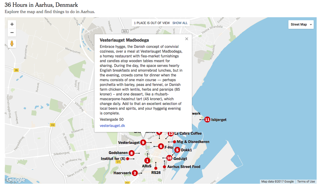
Interactive maps are a great way to pack a lot of data into one tool that your readers can use. Because this is actually a useable map, it gives users multiple layers of information at once: What each point is, the order in which the NYT columnist visited them, how to get around, and where things are in location to each other. This is a great addition to this article because it’s actually useful to anyone trying to follow the advice of the story and navigate the city in 36 hours.
3. Hurricane tracker: Jose’s path
Charting the path of natural disasters is commonplace, but what we like about this viz is that it reads intuitively, even considering all of the data they’re packing in. The severity of the storm is indicated by the colors of the data points embedded in the map.
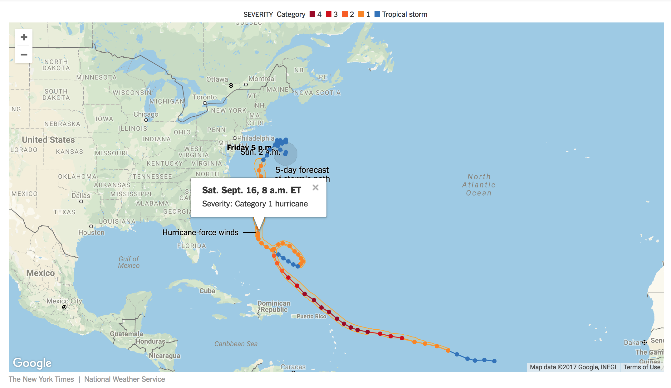
Even if you don’t click on the dots on the hurricane’s path, viewers can still glean supplementary information at a glance. This is a great example of how the basics of good static viz are still important when you add animation or interaction.
4. Bringing the Olympics to your neighborhood
One thing that data visualizations often try to do is to give the reader a real sense of how data compares to what they know. We often see this in the form of comparison (for example, a human figure standing next to a bear shows us better how large the bear is.)
This interactive is an excellent example of making data accessible. If you input an address, the tool will give you a visual representation of a race an Olympian ran, and how quickly they ran it. This helps the average Joe get a good sense of just how incredible these athletes are. They might look, for example, at the marathon:
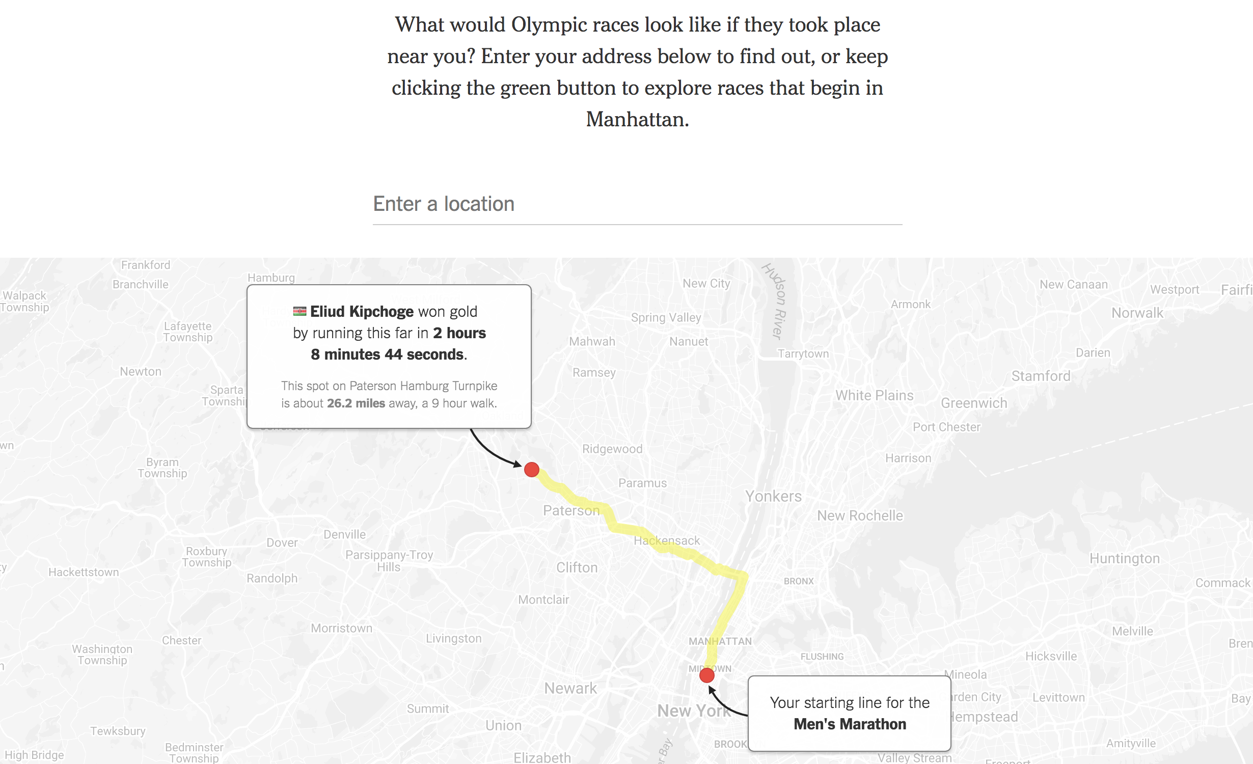
And compare that to how long it would take them to walk, run, ride or drive even part of that distance and realize how fast Olympians, like Eliud Kipchoge, are. Anyone who can picture walking or jog from Midtown to the Bronx would realize that the cruising speed for these athletes is no joke — and that’s not even halfway through the race.
The goal of good data visualizations is to help people connect with statistics, and this feature does that really well by providing a familiar frame of reference.
5. How lifespan and geography intertwine
This map of the entire United States is color-coded to show the life expectancy of a low-income adult. It also gives more information about the area and the wealth of the area. When you zoom in and click on a county, you get more information about how the county’s life expectancy compares with the US as an average and other countries’ averages.
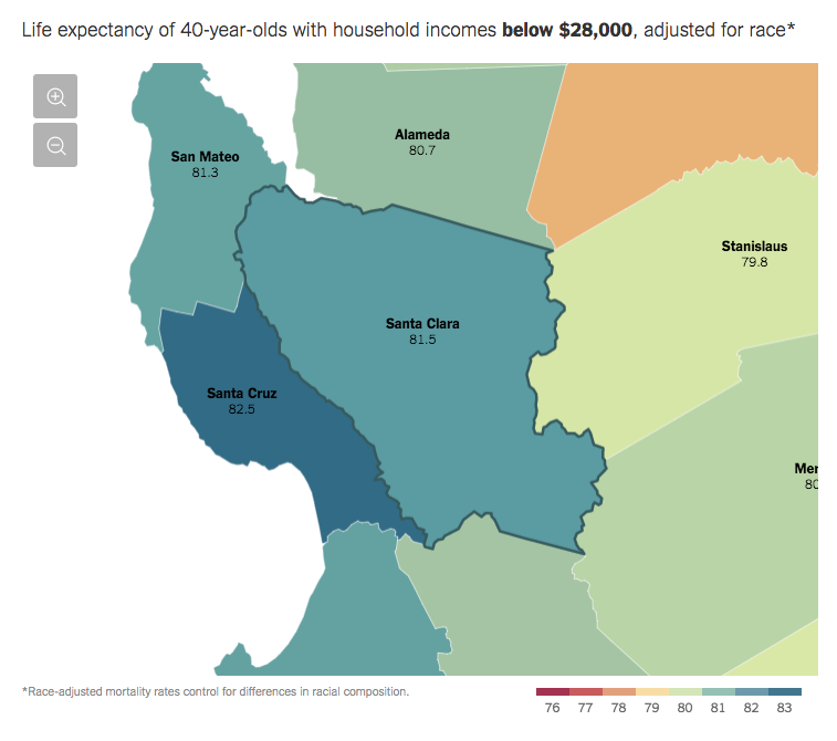
We like the use of color on this map, especially as it pertains to looking at overall trends:
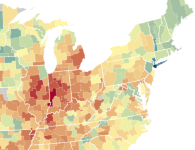
This is another case where a spreadsheet or graph of similar data would be too much for an average person to get through. Unless you’re researching these trends, you wouldn’t scroll through to read the whole thing. But when you overlay this data on the map, it becomes more accessible.
6. Mapping the shadows of New York
This crazy map lets you drag your mouse over any building in New York to get its name, address and height dimensions, or over any street to get the percentage of shadow and sunshine it gets in a day. As part of an exploration on light, shadow, and urban development, this feature starkly shows the areas of Manhattan that the sun don’t shine.

The cartographic features are neat and clean, and the graphics that show percentage shadow are color-coordinated and change in real time depending on where your curser is. Go ahead, click on the link — just be prepared to waste your time, because it’s kind of addictive to look at this data-covered map.
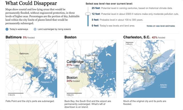
7. Disappearing shorelines
This interactive visualization shows what parts of cities could disappear from water without engineered protection. As you move the slider, different percentages appear for the amount land in major US cities that would be covered by water as sea levels rise. As you move tides higher and higher, the maps will tell you what major landmarks and areas will be submerged. It’s a simple, but effective way to overlay different maps on top of each other that readers can flip back and forth through with ease.
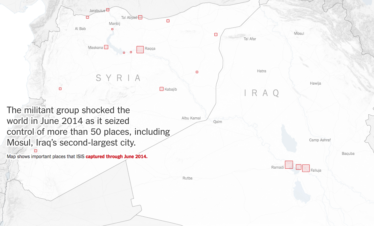
8. The geography of the Islamic State
By scrolling through this article, the map background changes to show you how many cities — and how much relative land area — was in the control of ISIS for various years. By pairing facts with geographic data and overlaying a type of bubble map on top, this interactive piece of viz really helps a reader understand the progression of the Islamic State in Syria and Iraq.
Interactive Simulations
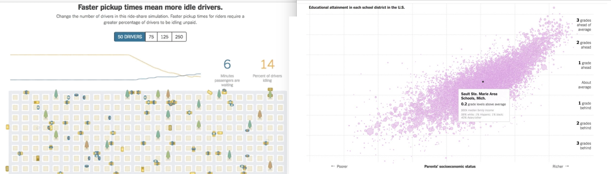
9. Uber wait times
This interactive graphic of a city street shows how the number of drivers idling nearby affects wait times for passengers. Viewers can choose from 50-250 drivers nearby to see how wait times and number of idling drivers changes.
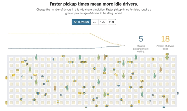
What this interactive graphic does well is give a really clear overview of how many cars have to be present for low wait times. This is an easy way to support the thesis of the article and makes a much more visceral impact than just saying that you need, say 125 cars idling for an eight minute wait time. Interactive data visualizations like this are a great way to convey a message and make an impact with abstract data.
10. Guessing statistics from Obama’s term
This data visualization takes interaction to the next level by asking readers to guess for themselves how the national debt has changed. By drawing on the graph itself, users are interacting with the data in a way that is both novel and informative.
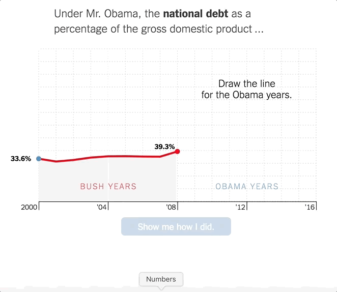
After you’re done, you can hit “Show me how I did.” and the graph will overlay the actual data on top of your guess. We like how the colors are corresponding to the political parties, and how the terms of the presidency are subtly broken up with a white line on ’04 an ’13.
If you have the chance to give your readers an opportunity to draw, click, drag or drop on your chart think about how to make things intuitive and informative at the same time — it will add that extra punch to your point.
11. How do your Game of Thrones opinions stack up?
On a more lighthearted note, data can be a fun way for readers to interact with other readers, as evidenced by this NYT article, Good, Evil, Ugly, Beautiful: Help Us Make a ‘Game of Thrones’ Chart. The NYT asks readers to plot characters on an axis from beautiful to ugly, evil to good. Then, you can see what the aggregate of all data collected from all readers is. (Or, you can skip straight to the aggregate without plotting a soul.)
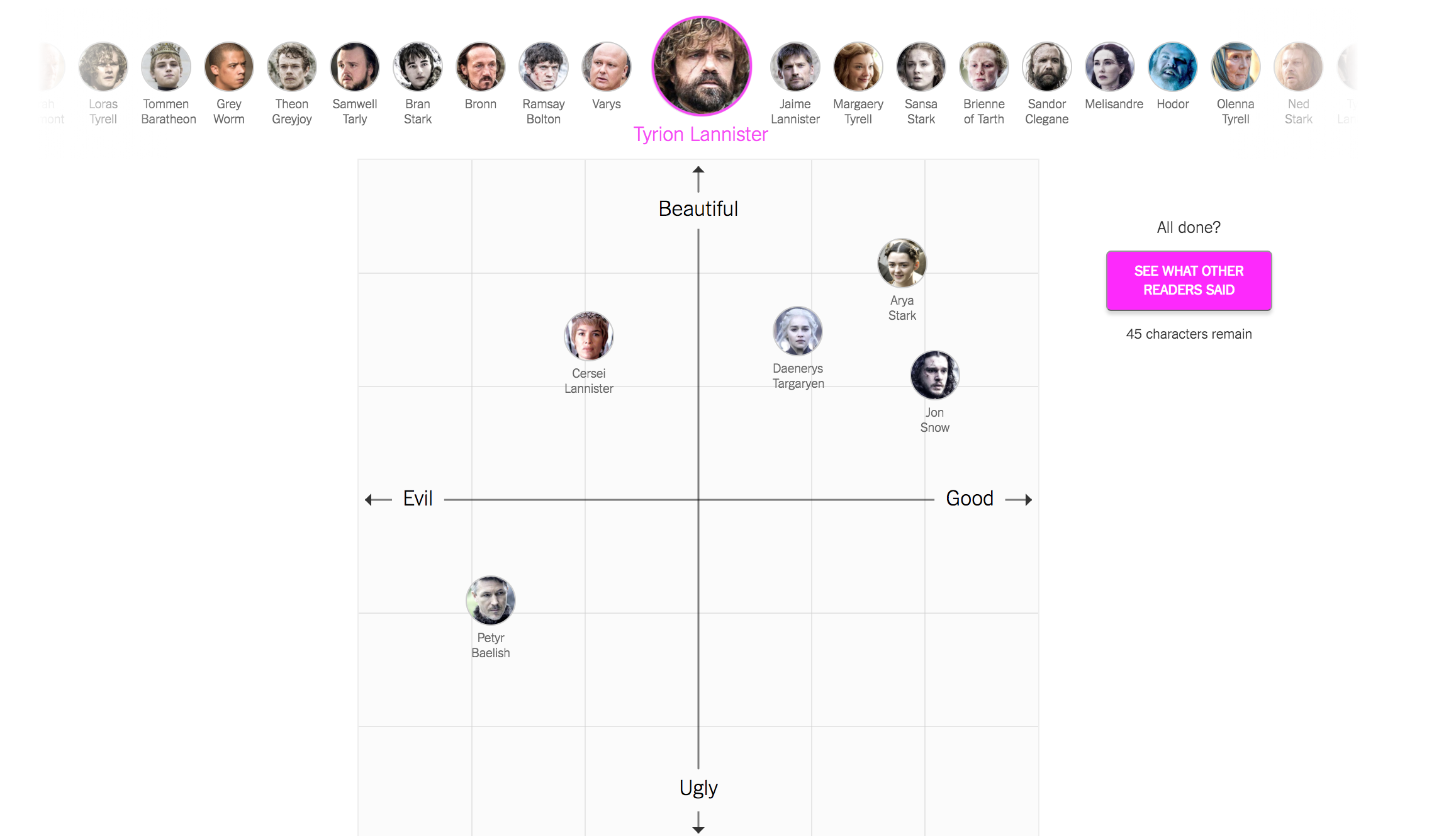
We love that this article is engaging because it’s relying on reader sentiment, and we love that that sentiment is captured in an interactive chart. It also provides a heat map for the average distribution of characters, which shows that some characters have a much bigger consensus than others, some are debatably beautiful and some are debatably good.
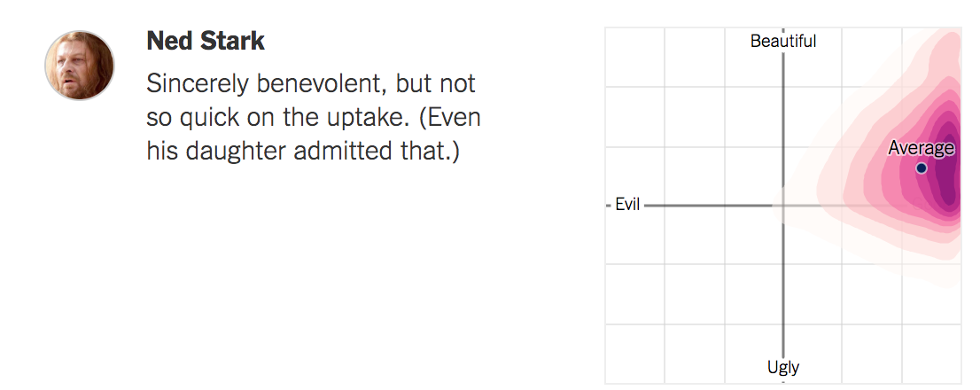
If you can test readers’ intuition and then reveal what more data shows about the question you pose, you can create highly engaging interactive viz, like this. Asking readers to categorize their own thoughts before revealing your data can drive deeper consideration of your pieces.
12. Estimating unemployment rates
Right after the economic downturn of 2008, unemployment rates were at the forefront of the national consciousness. The timeliness of this interactive visualization, released on November 6, 2009, helps make it powerful, but how easily understood this chart is can’t be overlooked.
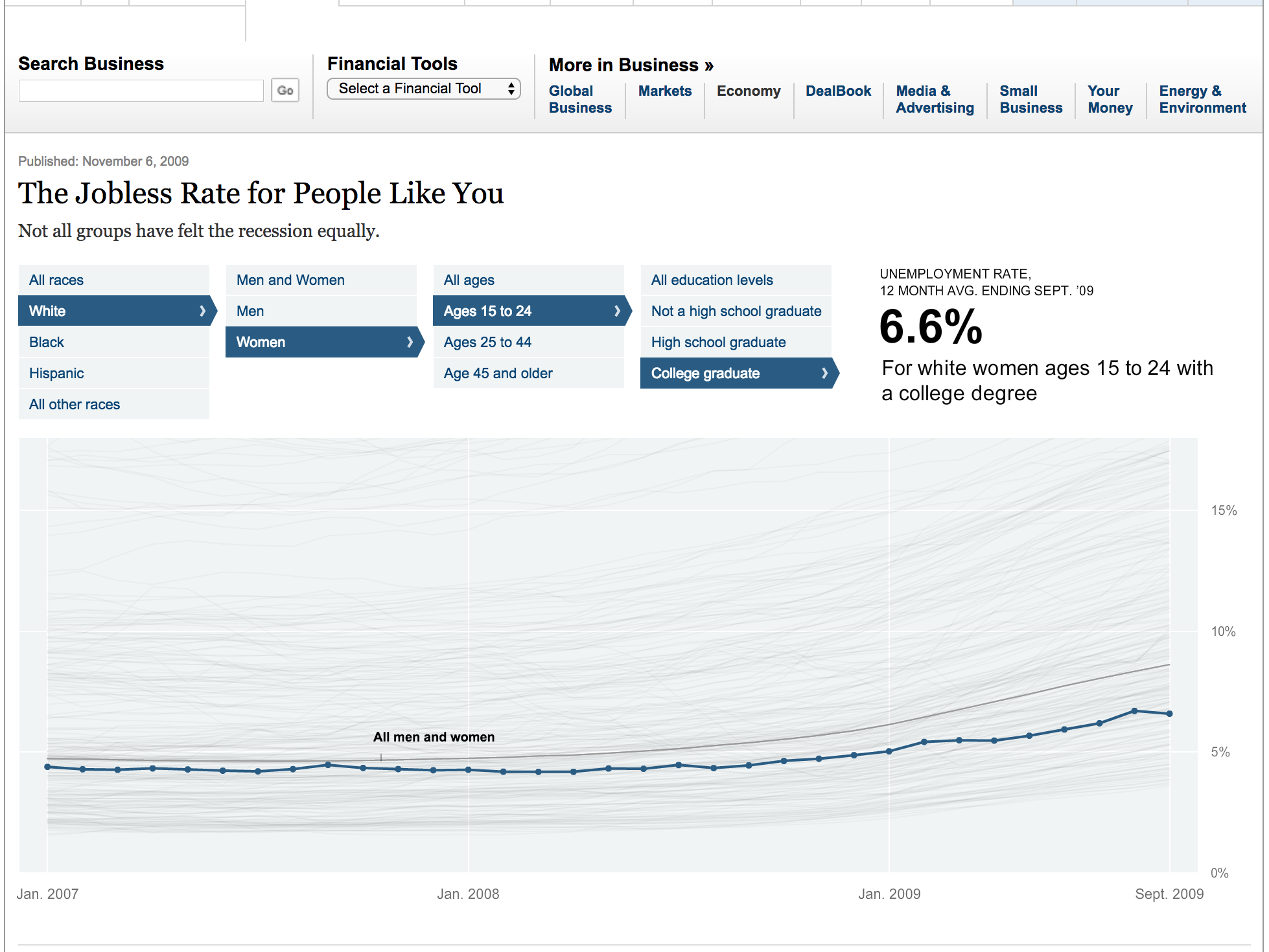
You can either scroll along the map and see data for each plotted line, or choose criteria above the graph to highlight one line. While it’s obvious that all unemployment rates are rising post-2008, it’s clear that the discrepancy in unemployment rates between different groups is rising, and this chart makes that both obvious and easy to explore.
13. Student loan calculator
This student loan calculator is a great example of an online, interactive calculator. For a given set of variables, like expected debt and interest rate, you’re given the average repayment plan (10 years) and more information about what that debt means. For example, you’ll be shown what your income would need to be for your average loan payments to be 20% of your discretionary income.
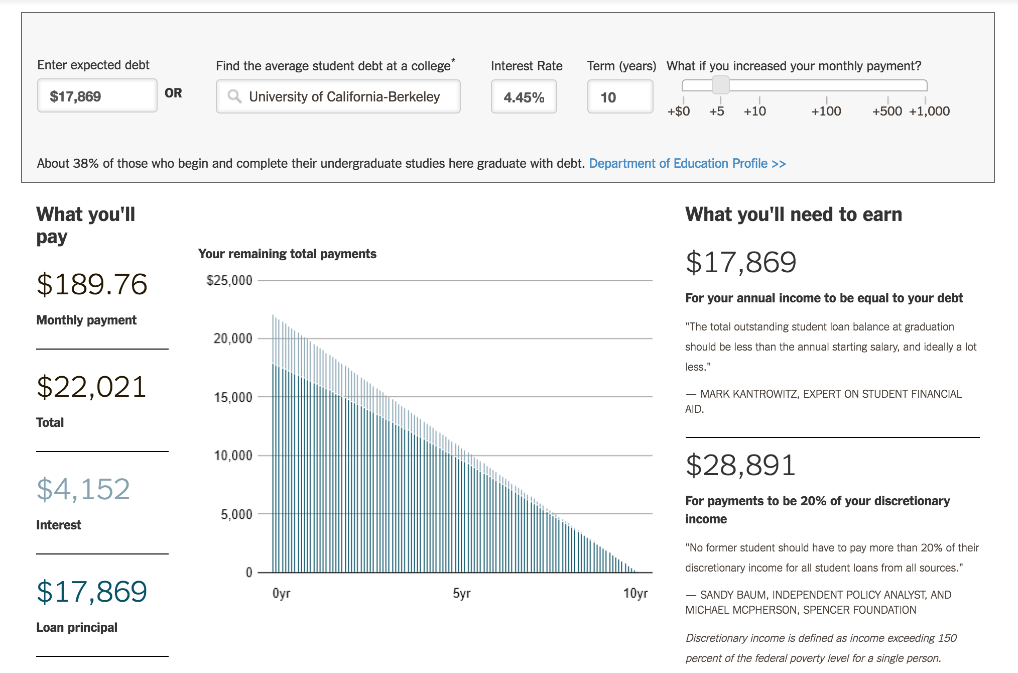
This tool isn’t fancy or complicated, and that’s what makes it great. Anyone who is wondering what their student debt picture looks like could easily input their expected debt parameters and get answers. While some of the other graphics we’ve shown here are more complicated to produce and more impressive to look at, if your viz gets the job done, that’s the most important sign of quality.
14. The cost of renting vs buying
By now I think we’ve established that when graphs are interactive, they’re more fun. And even though thinking about mortgages isn’t everyone’s idea of a leisure activity, the interactive slider on these graphs makes planning your financial future a little less dry.
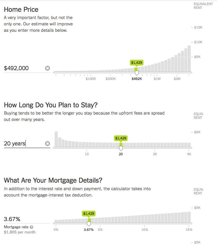
This is a great example of how adding an interactive feature can spice up otherwise straightforward information. One reason it works so well here is that people do want to fiddle around with the term and rates, and creating a live representation of their thoughts is a great way that the NYT helps people figure out whether to rent or buy in this article.
15. Mapping the dawn wall
The New York Times had extensive coverage of Tommy Caldwell and Kevin Jorgeson’s free-climb of the Dawn Wall, including live updates from the climbers themselves. But after all was said and done, they came out with this interactive graphic that helps put readers right on the ascent itself.

As you scroll through the visualization, you’re given information about elevation and how the men climbed this sheer face of rock, including number of attempts for different pitches and each of their strategies to conquer the beast.

Visualizations like this combine an interactive element, data, and a story to bring a truly immersive experience for a reader. While it isn’t appropriate for every story, when you have the opportunity to add that extra notch of drama by embedding your reader in both the story and the data, you should take it.
16. Calculating your daily sugar intake
This interactive article takes you through breakfast, lunch, snack, dinner and dessert all while racking up data on how much sugar you’re eating throughout the day. As you choose items, grams of sugar are added to your counter, and you’re given information on how much sugar is in various foods and how you’re stacking up.
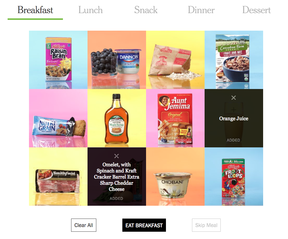
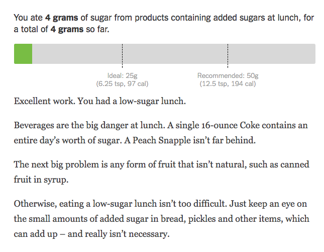
This is a great way to provide data on the grams of sugar in various foods while still engaging people. Most reader’s eyes would probably glaze over at a chart of how much sugar there is in various breakfast foods — we all know pancake syrup is packed with the stuff — but asking readers what they eat adds a personal element that grabs attention.
17. What political experts think you like
In a twist from what we’ve seen so far, this fill-in-the-blank representation shows how the data in a complex decision making tree combines in an interactive way. By choosing from the drop-down menus, you can see how data about you is analyzed by political experts to predict your tastes and behaviors. It’s a novel way to show probability in an engaging way.
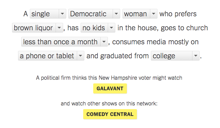
We like that you are encouraged to put in different combinations, and we like that they’re offering the TV shows that this particular firm thinks someone might watch, because it injects an element of whimsy into this data-fueled experiment.
18. N.F.L. playoff simulator
You didn’t think we were done with sports graphics, did you? This N.F.L playoff simulator calculates all of the ways that the season could end for every team in the league — 174 duodecillion ways, actually.
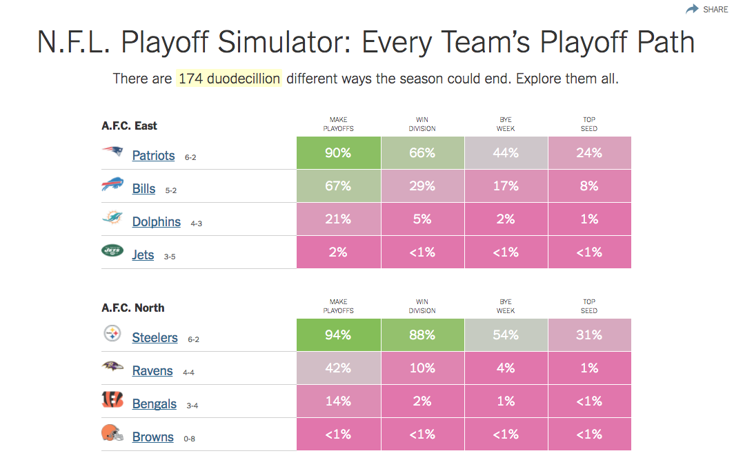
When you click on a percentage, it takes you to a second page of interactive graphics that lets you explore all of the ways your team might make — or win — the playoffs.
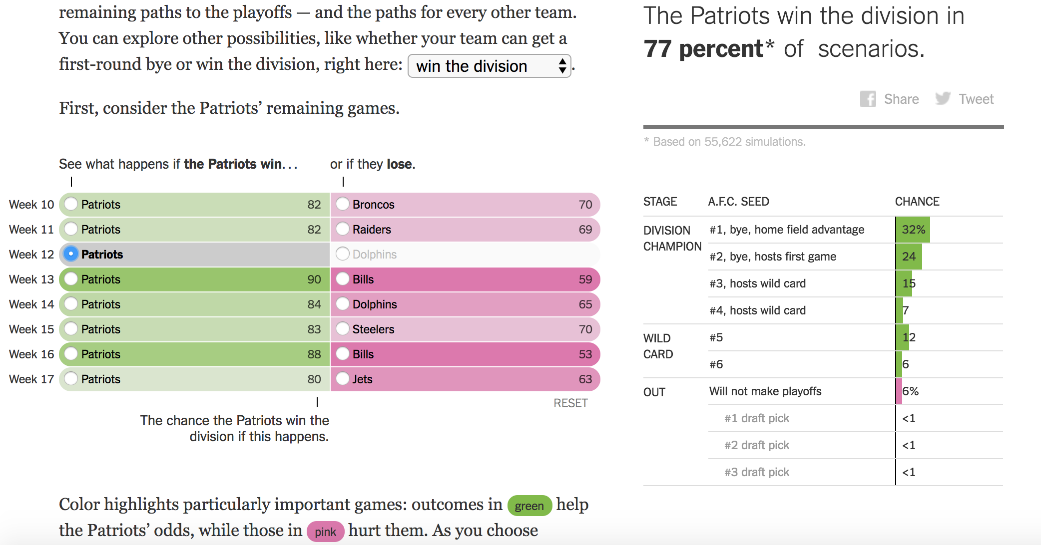
This is another way that probability and decision trees come together thanks to our modern digital capabilities. The interactive nature of this feature is something that’s only possible today, and boy is it fun. Combining it with a more traditional chart that complies after tens of hundreds of simulations are run brings things back to earth and helps readers understand what scenarios are likely to play out in their team’s favor.
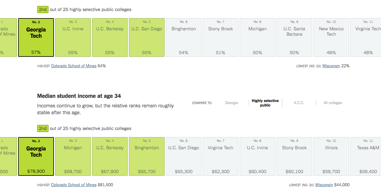
19. College comparisons
In this interactive article full of information on colleges, you can choose different colleges to see different statistics about median income of students in middle age, percentage of the student body that is from a wealthy household, and more. Because of the sheer volume of information, giving an interactive slider where you can choose between different colleges, conferences and college attributes (e.g. public or private) makes available data that could never fit reasonably in a run-of-the-mill static graph.
Bubble Charts
20. Rio Olympics results
This breakdown of all Olympic medals won since 1896 is a great use of a bubble chart. Even by glancing at the dataviz, you get a plethora of information about who has won the most medals. Placing them in a pseudo-map helps viewers connect with trends in the data — like the fact that Central America and the Pacific islands regions have much fewer medals than, say North America or Western Europe.
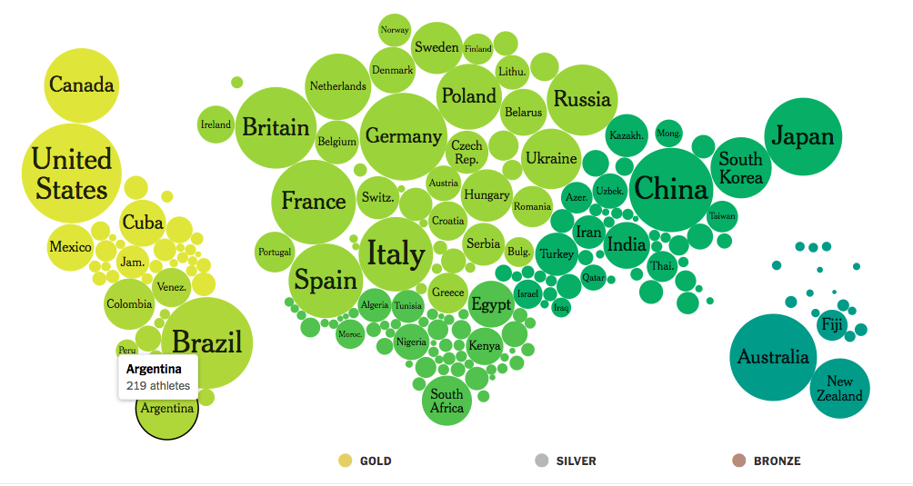
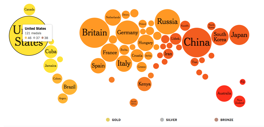
Each circle offers more information when you hover over it, with overall medal total and then medals clearly broken down by gold, silver and bronze tallies. We also like that the colors are bold and are used to help users separate geographic regions.
21. The cost of natural disasters
We love this graph for a couple of reasons. First of all, the coloring is great and makes it easy to differentiate types of storms. The timeline is intuitive and, when combined with the bubble chart, this graph gives a ton of information on storm cost without using any dollar amounts at all.
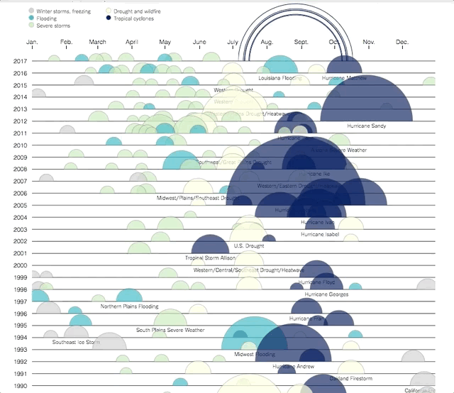
When you take a closer look, it’s easy to see how much particular storms/disasters cost and what they were. This works particularly well for this graphic because there are some big outliers — like Katrina and Sandy — that people will want to investigate. Once you’re dragging your mouse around, your curiosity is piqued and you want to explore more data — which is a good sign that this is a strong interactive visualization.
Chord Diagram
22. Explaining the Euro crisis
This complex and interactive visual shows data about the Euro crisis. If you click on any arrow on the map, it shows you debt information on each country. The arrows indicate which countries borrowed money from banks in another, and the colors help differentiate between more standard national debts and worrying national debts.
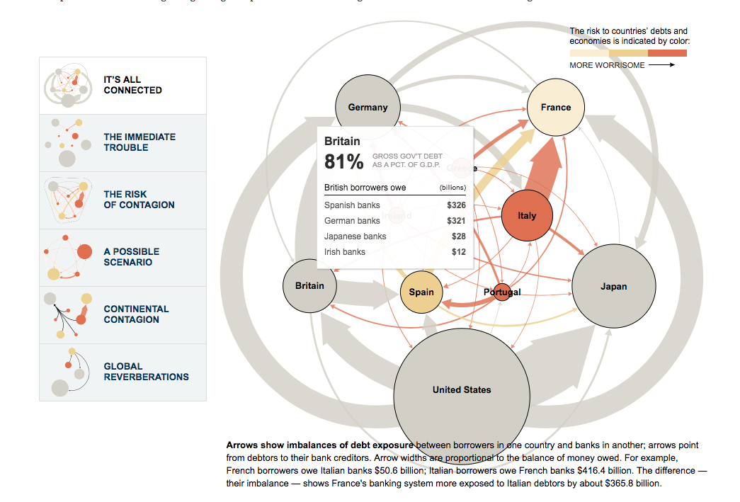
This debt crisis is obviously a complicated issue, and this visualization isn’t something that you can get through at a glance like some of our others. But by interacting with the series of graphs, you get a clear understanding of some of the major ways that this scenario could play out. Each new graph leaves the country bubbles in the same place, melting away and bringing forward selective information.
Because the visuals are well done — even though they’re complicated — a reader can get through several scenarios of the debt crisis without having to read a couple thousand words.
Scatter Plots
23. Plotting how your school district compares
This is another great example of context and how interaction can give more context to a reader. The map included in the article Money, Race and Success: How Your School District Compares plots how far ahead of their grade level students test in comparison to their parents’ socioeconomic status. And while this creates a telling picture in and of itself, the plot thickens when you scroll over the graph.
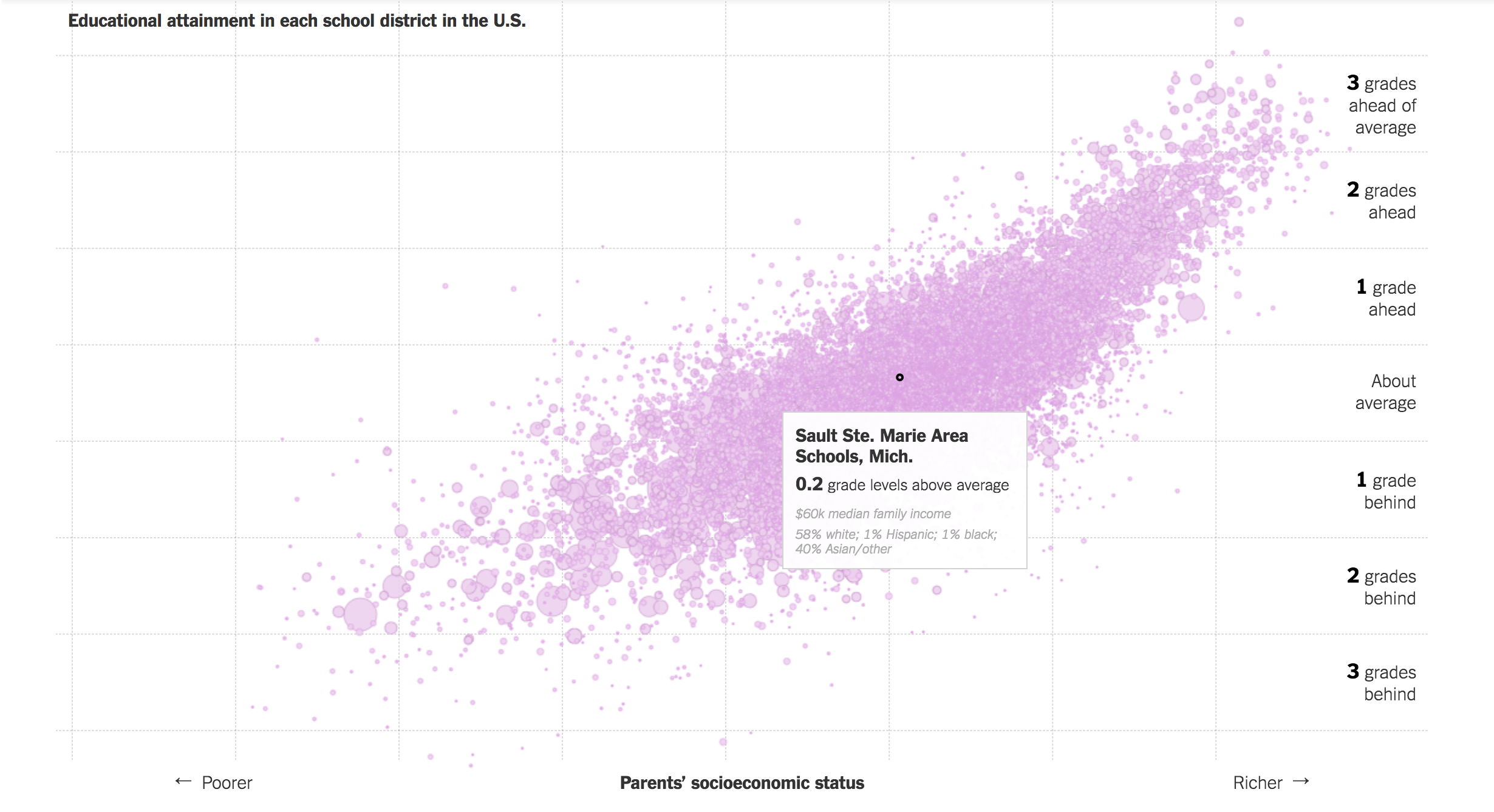
Each dot on the graph represents a school or school district, and scrolling your mouse over one will show which school district it represents, how far above average the students test, the median family income, and the breakdown of ethnicity by percentage.
This is an interactive feature that helps this chart resist reductiveness. A quick scroll over the highest and lowest points reveal that poorer students of color tend to make up the majority of worse-performing schools, while richer white students tend to make up the majority of better-performing schools. This is not surprising to anyone who knows that, for example, the wealth disparity between white and black citizens of the US has risen sharply since the 1980s. Putting the demographic breakdown on this chart, then, is a way that interaction can help this data tell a fuller story.
24. Good schools vs affordable homes
This comparative chart shows the quality of schools relative to the price per square foot of area homes. As we’ve seen with many other of our visualizations on this list, more information pops up on each bubble as you hover over it. This is, again, a great way to pack information into an already crowded cluster, like this one.
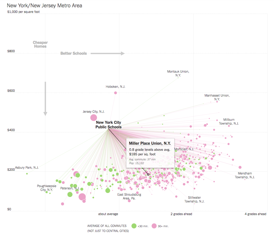
What we think that this chart does really well, though, is adding a legend that makes it super easy to read. See the “Cheaper Homes” and “Better Schools” arrows on the top left? Those make it really easy to understand this chart without even looking at how the axises are labeled. If your audience isn’t familiar with the type of graph you present, or isn’t data-literate, adding shorthand like this can really help them get the necessary information from your charts.
Line, Spline and Area Charts
25. Historical winners for the summer Olympics
The Olympics are a fertile ground for data visualizations — no surprise, since they garner worldwide interest and have hundreds of years worth of data to analyze. Here, The New York Times separates medal counts by discipline for every Olympics since 1896. Below is the graph for high, long and triple jump and pole vault.
The timeline makes this an easy graph to understand, and the interactive feature of checking medal count by country means that readers are getting an overview and event-by-event data all in one. One thing we’d like to see from this graph is a little more play with color—maybe different countries lighting up when they’re clicked on.
26. Minority representation in us colleges
The timelines in this article give you demographic percentages for students of different ethnicities at different schools. When you move your cursor over the graphs, you get specific percentages for every year.
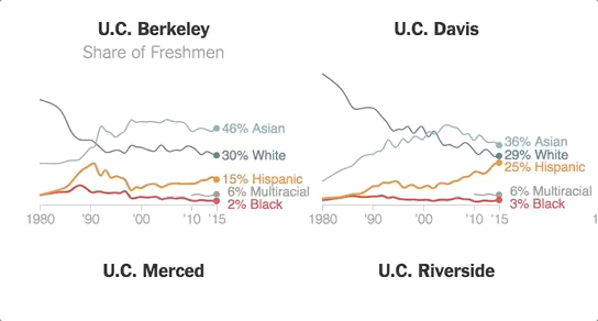
We like that the hues of these colors all go together and make it easy to separate each line on the graph. We also like that you can get an at-a-glance view of the trends from these charts, but that you don’t have to guess at how much each individual percentage changes from year to year.
27. How NBA stars’ three pointers stack up
Context is everything when you’re trying to understand data, and this graph is a great, interactive way to show the context for Stephen Curry’s killer ’15-’16 season. With a line for every player who finished in the top 20 for 3-point attempts since 1980, this graph gives the reader a great sense of just how miraculous Curry’s season was.
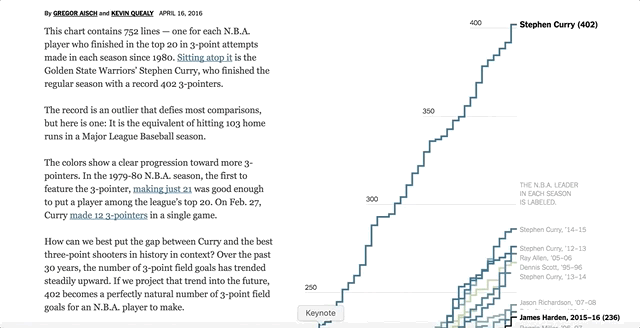
We like that you can scroll over any line and see who it belongs to, and that there are names called out on the side to show each season leader. We also like that the colors correspond with a timeline, moving from brown to blue, so you can easily see that Stephen Curry’s success is part of a larger historical trend, with people generally making more 3-pointers now than in years prior.
This chart is so intuitive and easy to interact with The New York Times almost doesn’t need a description for it. We’d bet that anyone who stumbled on this graph alone would pretty easily be able to figure out what was going on — and that’s a surefire sign of a great visual representation of data.
28. Historic trends in the Arctic’s sea ice
When the NYT proclaims You’ll See A Trend, they aren’t kidding. This, and subsequent charts in the article, show the area of arctic sea ice changing from 1979 to 2017, and just glancing at the chart alone is enough to show that there’s less and less ice each year. When you move your curser over the graph, you get specific statistics for each year represented.
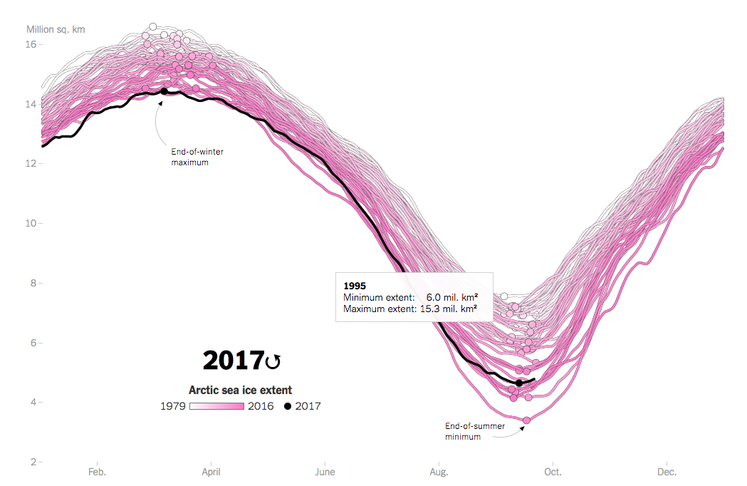
We like that they’re using an intuitive color scheme, with the increasingly hot pink hue backing up the data’s trend of more and more ice melting. We also like that this shows the variation in ice coverage without simply saying the difference in millions of square kilometers — because that’s not exactly a metric that you can easily visualize.
29. How to dominate the NBA postseason
If you want to represent granular data, like this NYT article does with a minute-by-minute graphic representation of the Warrior’s record-setting season, interactive visualizations can be a great way to cram information in while still making the facts accessible.
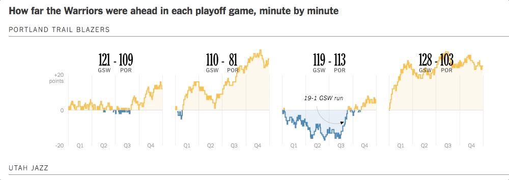
We like that the graphic uses the colors of the Warriors to show this information, especially because they also provide good visual contrast to one another. But what’s really special about these graphs is how much information you can get when you scroll over them. The graph shows timestamps for each data point with shot information and score differential attached. This could never be put together in a static graph because it would simply take up too much room.
Representational Graphics
30. Major League hitting trends
Sports has been a welcoming home for data visualizations, and baseball is no exception. So adding interactive dataviz to this article on trends in ball hitting is a natural fit — or should we say The Natural fit? While the article contains several different types of graphics, we like this one because it gives a visceral understanding of how the ball is popping off the bat.
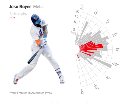
By positioning a bar chart on a radius, readers can practically see the ball’s trajectory. This makes the data about the launch angle of the ball accessible to even casual baseball watchers, and makes it simple to understand how the angle of the hit would change the ball’s path. We also like the incorporation of the picture of Jose Reyes about to hit the ball right next to the launch angle chart — what angle do you think he’s about to hit at?
31. Representing race and power in America
This piece is a great example of how you can represent data in a fun and interactive way. The data presented here — powerful individuals in American public life. When you hover over the individual, you see who they are and what their position is (e.g. what state they represent in the Senate, or what movie studio they head). The predominant focus of this display is race, and the overwhelming whiteness of most people represented is immediately apparent.

In this way the NYT is able to make a powerful visual statement by putting the likeness of their data points front and center. They also highlight in yellow the minorities on each graph, making it even more stark just how many figureheads are white.
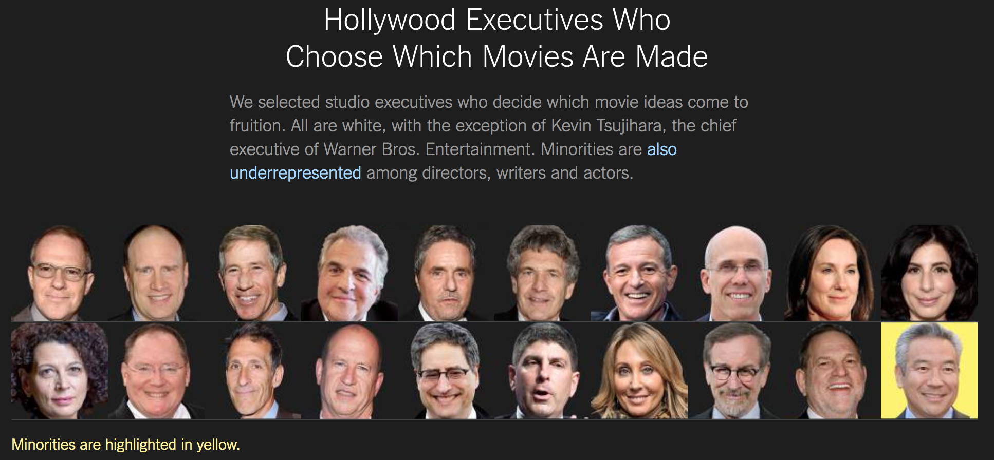
This is a great example of how adding a visualization and an interaction can strengthen your point and make it more powerful for readers.
32. Showing historical achievements
As we saw before, showing the faces of people that you’re presenting data about can be a powerful way to engage your readers with your material. We’d guess that at least a few of the faces below are familiar to you, but there are many trailblazers represented that we don’t know quite as well.
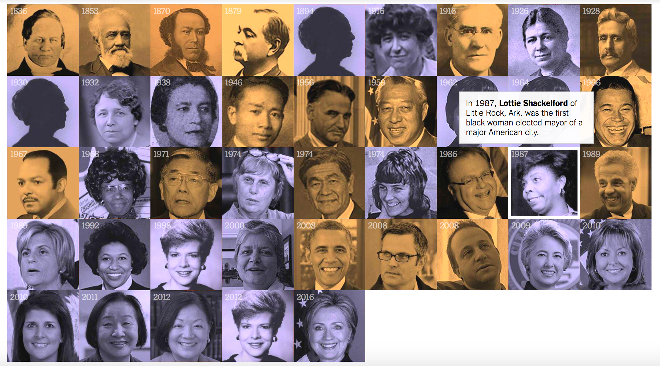
Combining these historic figures with a timeline is a classic way to show historical progress, but the interactive feature keeps this timeline from feeling cluttered, while still giving you information about all of the people that are represented on this chart.
3D Interactive
33. The Economic Future: The Yield Curve
If there’s one piece of viz on this list that’s a blast to play with, it’s this one. With a three-dimensional view of an economic map, the NYT shows you a plethora of information about the financial situation of the United States Federal government.
What we like in particular about this piece of viz is you’re free to explore it yourself for as long as you like, but you are also taken through it by a tour that allows you to see exactly what’s going on at every angle. With charts that aren’t necessarily intuitive for non-data people to read, adding a walkthrough can be a great way to help people interact with your data. But making that tour optional leaves data whizzes free to fly through at their own pace.
Merimekko Chart
34. How Far is Europe Swinging to the Right?
In How Far Is Europe Swinging to the Right?, the NYT shows a breakdown of which parties won what percentage of the vote for countries in Europe. The information is apparent at-a-glance, especially because far-right is highlighted in red, but when you hover, the party name and what percentage of the vote they won is made available.
This is a great way to present information without overwhelming a more casual reader. Anyone can see that there has been some rise in the far-right or right-wing parties in most countries in Europe since the early ’00s. Adding all of the percentile and party information up front might make it more difficult for people who, for example, don’t know what the Fidesz-KDNP party is in Hungary. If there are people that want to explore further, they’re welcome to dive in, but a more casual reader can still get important information without being overloaded.
Big takeaways
There’s so many ways you can represent data in an interesting and interactive way. Let’s go over some common themes we saw in The New York Times best:
- They add through interaction. The NYT’s interactive charts weren’t interactive just because they were fun. Many were interactive because it allowed them to create charts that would have been otherwise hard (or impossible) to plot and read. Others helped the reader think critically about their own choices and perceptions. Making a graphic or a chart just to throw something out there is a waste of time. You want your visualizations to help readers understand your subject and discussion better.
- They don’t have to be complex to be good. Something as simple as a pop up with more information can give your readers insight. Take the map of Aarhus, for example, or the NBA’s three-pointer chart. If you can’t build a full interactive model of the Dawn Wall, don’t let that hold you back from creating something interactive. You can be smart about any data you’re trying to present — if you’re dealing with geographic data, for example, pull out a map and ask yourself how you can use it to illustrate your point. If you’re doing political visualizations, let that pick your color scheme.
- They build an intuitive understanding. The goal of good data viz is to help people better understand and engage with data. Keep your average reader at the forefront of your mind when you’re creating your visualizations. Maybe you’re catering to experts in your field, who don’t need exhaustive descriptions of your data. But, if you’re writing for a more general audience, like the NYT, maybe your readers need an extra key to help them read a chart, like we saw in Good Schools vs Affordable Homes.
- They tell a story. Humans learn and remember through storytelling. When you’re adding an interactive visual, you have a chance to form a narrative through data. Take Calculating Your Daily Sugar Intake — instead of just listing the amount of sugar in common foods, the reader builds the narrative of their day through the visualization. Or take Representing Race and Power in America — this is a story about whiteness that is starkly revealed through visualization.
The data you saw represented here ran the gamut from demographics to sports statistics to global economic systems. There is a world of possibility for any type of data to be explored using interactive visuals, and you might have more data that can be visually represented than you think — it doesn’t have to be two coordinating points on an X and Y axis. The more you can think about interesting and creative ways to represent your data, the better.
Stay tuned for more best-ofs for data visualizations, and, in the meantime, go forth and graph.
Articles, in order of appearance: [1] [2] [3] [4] [5] [6] [7] [8] [9] [10] [11] [12] [13] [14] [15] [16] [17] [18] [19] [20] [21] [22] [23] [24] [25] [26] [27] [28] [29] [30] [31] [32] [33] [34]
