15 Interactive Infographic Examples
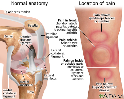
You’re sitting in the doctor’s office, legs kicking the back of the exam table. The nurse has just left and promised the doctor will be in “in a minute” — ten minutes later you’re so bored you’re actually reading a laminated infographic about the human knee from 1997. And it sucks. The graphics are terrible. There’s so much information packed into one image. You don’t know half the words. By the time the doctor arrives, it’s actually a relief.
[Source]
Much like your doctor, we’ve got some good news and some bad news. The good news is that not all infographics have to be as confusing and boring as the laminated pamphlet that made your eyes bleed! You can make good, interesting infographics.
The bad news is you probably aren’t. And one big reason is that you’re still thinking about an infographic as a static image instead of an interactive element.
Some infographics are complex and animated. Some are simple. Some pack in a huge amount of information and some just give a basic overview. No matter what you’re trying to accomplish, you should take a good hard look at these interactive infographic examples before you end up with yet another boring doctor’s office disaster.
What to look for in these interactive infographic examples
We’ve said it before and we’ll say it again: making good visualizations are one part conceptual and one part design. If either falls short, you’re going to have a mess on your hands. You need:
- Clear scope. You need to know exactly how much info is going in your graphic before you start.
- Consistent design elements. Especially for longer graphics, visual consistency is important.
- At-a-glance takeaways. While some people will love interacting, others will skim. If you hide all your information, you’re making a half-brochure half-picture hybrid, not an interactive infographic.
- Sharp copy. This is where you can hone in on your usefulness for a reader. Copy should be short but impactful.
- Big takeaway. When you’re planning an infographic, you need to keep that big takeaway for your readers in mind. Every element should go towards helping someone understand it.
And as for the interactive elements, they should:
- Enhance your point. While some aesthetic interactions or animations are ok, adding bells and whistles just because you can is a waste of everyone’s time.
- Be intuitive. Rage clicking should be avoided at all costs — and there should be no tutorials needed. If it can’t be figured out intuitively, leave the interaction out.
From the just alright to the very good, here’s a look at 15 interactive infographic examples that hit some or all of these criteria, why they work, where they fall short and what you should look for when getting into interactive infographics.
Infographic timelines: more than just BCE to CE
No offense to timelines, but they’re generally… pretty average. Nothing to write home about. Still the temporal organization of information is key to understanding many concepts and a great way to layer a story.
The nature of a timeline is that it’s hard to cram the necessary information in because a single line doesn’t have much space. Some people try to get around this by making snaking lines that weave down an eternity of scrolling. But even the tightest layout will be a-clutter with text boxes.
So, when you’re building a timeline, interactive features can be a godsend. Animations, popups and interaction bring a classic way of displaying information into the 21st century.
1. Market research made riveting: the Evolution of Insight
This interactive timeline from Vision Critical explains the development of modern-day market research. It combines great visuals with animations and an interactive element.
One reason this timeline works so well is that splitting up information by decade allows for extras that enhance the information. You get historical photos, portraits of notable figures, and a reminder of how technology changes over the years. That’s right — that fun background is actually adding to the timeline by helping readers make historical associations between the technology of the time and the market research innovations.
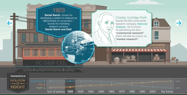
Not only that, but the timeline makes it easy for a reader to flip back and forth. No endless scrolling, no flipping back through web pages. You can just click on the decade you want at the bottom and boom: the information you want.
There’s not much to pick apart in this timeline. The only thing that you might be able to take away from it is that there’s pretty much no background going on — it’s up to the reader to connect the dots to market research. But given that there’s a professional audience for this piece, the copy is at the appropriate level. Well done.
2. Walkthrough of how to dismantle a nuclear weapon
Some timelines are historical, like the one above. Some are theoretical guides. That’s what the International Partnership for Nuclear Disarmament Verification shows in its extremely detailed infographic walkthrough of how to dismantle a nuclear weapon.
This is a great example of how a timeline can pack in a ton of information and read like a checklist of steps that need to happen in order rather than a list of events that have already happened. The temporal aspect is integral — you can’t jump around in the sequence or remove a step when disarming weapons — but it isn’t the focus here, it’s a framework for the information to be organized.
Take a look at how they’re organizing information. When you scroll through, you’re given an overview of a particular sequence of steps:
When you click on one of the bullets, it opens up additional information that helps you understand why and how that step is completed:
![]()
Now that’s what I call packing a huge amount of information into an infographic. The interactivity here makes the infographic readable. And it allows readers to pick and choose how much they want to know. The key here is that you get a good overview of what the timeline of dismantling a nuclear weapon is without opening up all the asides. They’re packed with information for the serious reader, but they don’t impede the laymen.
Don’t stop scrolling!
The web is a particularly good place for infographics because it is a near-100% scrolling-based medium that builds in a layout for infographics, and gives companies a lot of options for how they want to host and produce interactive infographics. Animations and interactions make a good play on the length of infographics.
That is if your audience is going to have to scroll anyway, making things interactive can be a good way to keep them scrolling through and paying attention rather than just zooming to the bottom.
The examples below are creative ways that you can make the scrolling motion integral to your infographics.
3. You vs John Paulson
What we like about this infographic is it is completely unique to the user. At the beginning, you put in your annual income — say, $40,000. Then, as you scroll the infographic tallies itself to correspond to your exact situation:
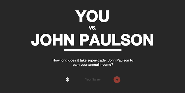
That means that a user is invested in what the infographic is saying because it directly applies to them. There are also interactive elements within the infographic that prompt the user to further engage and see how they “stack up.”
Its bold colors and clear contrast make it easy on the eyes, and the striking graphic design pairs well with the slap in the face that the infographic delivers: that your salary is not even a drop in the bucket for John Paulson.
But mostly what we like about this is that it’s a brilliant piece of marketing. MahiFX is trying to get people to try its new online forex trading system and it’s using an infographic to do it. If these types of informational infographics are appealing because they directly relate to the user, and this infographic is telling the user that their income is paltry compared to a trader, then it makes sense it would be a great piece of marketing.
4. Home protection gets stylish
Speaking of great marketing, take this scroll through this infographic resource from home security system provider SimpliSafe. It offers a burglar alert system, which is only one part of a robust home defense system. So, on its website it offers a full guide of tips to keep your home safe — from storing valuables inside to the height of your garden fence.
This infographic has two different forms of interaction. One is that it changes as you scroll through to take you on a tour of different layers of security. The second is that you only get information about how exactly to improve security when you scroll your mouse over, for example, the safe:
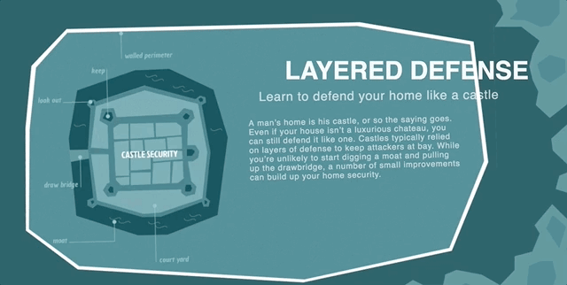
The reason why this works so well as marketing is twofold. First is that thinking about home security is not fun and it’s not sexy. It’s boring at best and frightening at worst. So turning this topic into a cute and well-designed graphic takes the intimidation out of things. It breaks up what is essentially a laundry list of tasks into digestible bites that you actively engage with.
The other reason this works so well is presented as a whole web page, not just as an embed. While we love embeds, getting this front and center as a resource, without any caveats or text explanations, centers the immersive experience of the graphic.
5. Minimize the risk of healthcare-associated infections
This is a simple graphic that combines scroll and hover to make a punchy presentation. One thing that it does really well is provide information about healthcare-associated infections in an engaging way while still presenting the material in an appropriate matter. Healthcare isn’t the place for gimmicks and tricks.
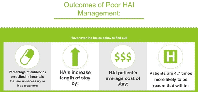
Instead, what makes this graphic work is a bold color scheme and crisp copy. The graphics are appropriate and informative, and the use of negative space alongside primary colors draws the eye in and keeps the graphics, which appear as you scroll, from feeling cluttered.
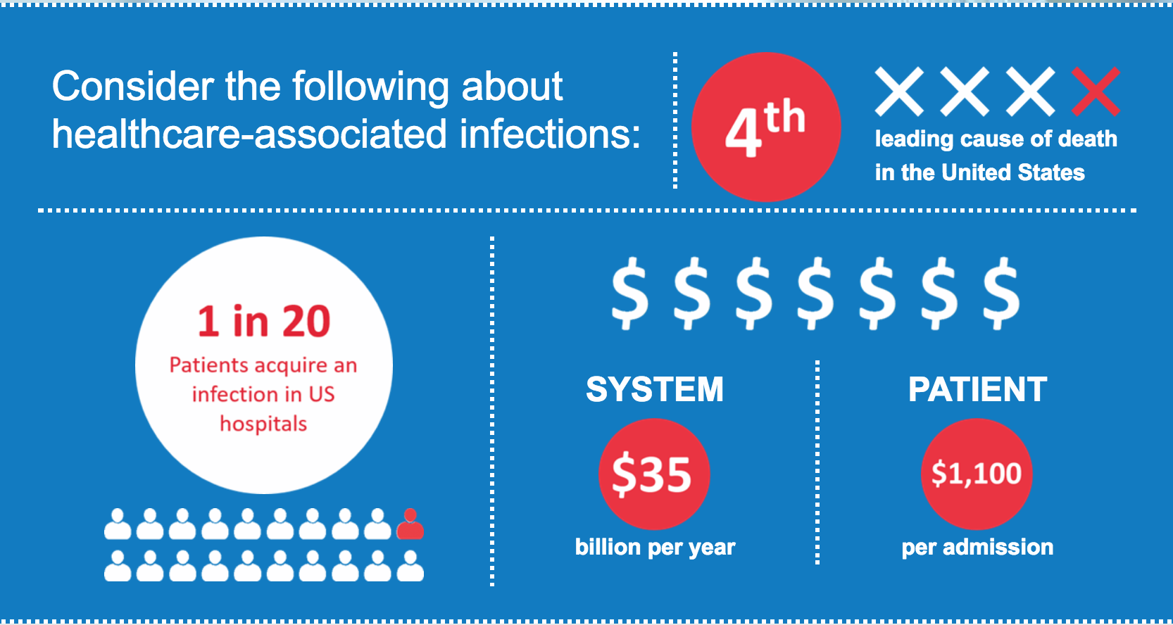
This is a great example of how good, simple designs can provide that visual pop that keeps readers scrolling without coming off as too gauche. Even serious presentations can benefit from clean, strong design. And, when you aren’t creating a whole animated scroll-through of something like a house security system, you’re saving on time and costs as well.
Popups: packing in the info
The easiest way to kill an infographic is to pile on so many graphics and so much text that it becomes an incomprehensible jumble. Where this once may have been a cruel necessity of the infographic, you can now make your information dense without sacrificing that sweet, sweet aesthetic. Thank you, digital graphics, for giving us annotations and popups. Let’s see how it’s done.
6. Inequality is fixable
Turning a complex issue like economic inequality into an infographic would be a daunting task for anyone, but the Economic Policy Institute knocks it out of the park. It uses a background graphic of Washington, DC, to display the five major factors of economic inequality in a circle. Each provides a brief overview of the issue when you hover:
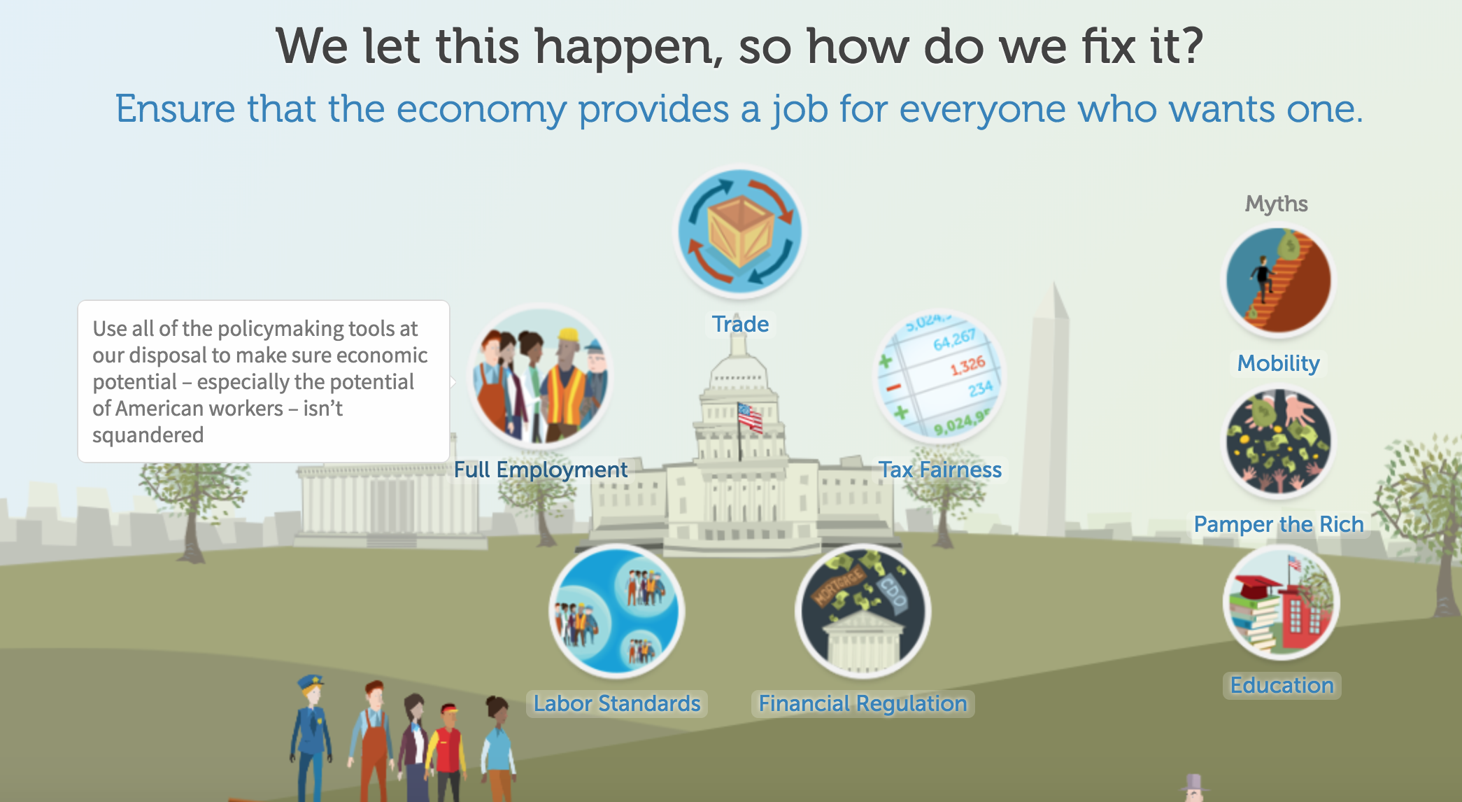
And when you click a bubble, you get a popup with more information: graphs, text, and a call to action:
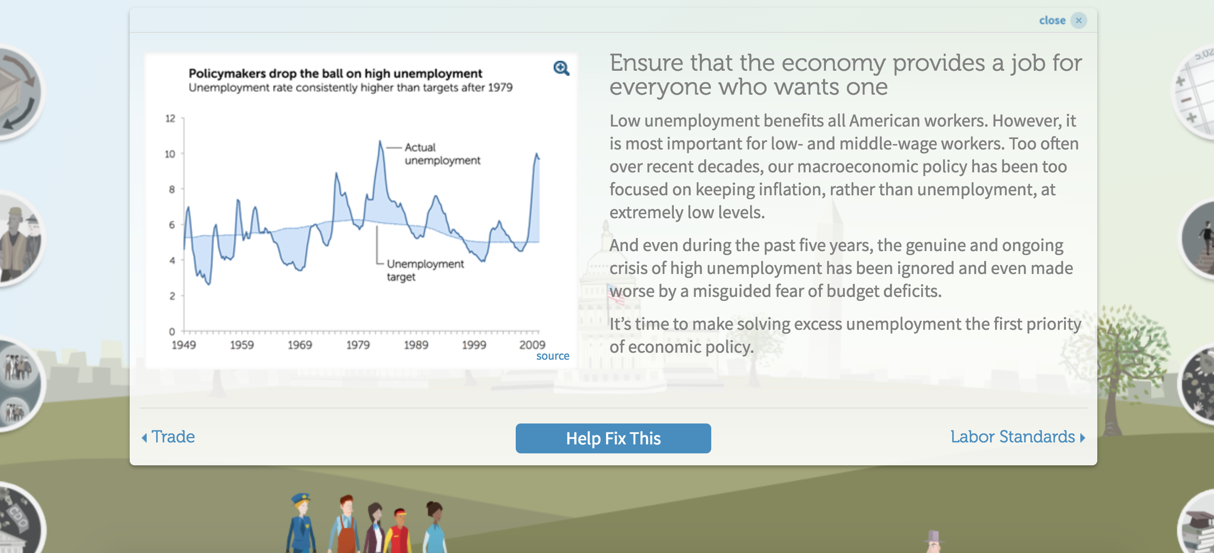
This is a great way to provide both an easy overview and an in-depth review in one graphic. A key to getting people to click on this infographic is sound and animation. Each bubble makes a little noise as you pass over it, and it becomes slightly bigger. Though these are small cues, they encourage the reader to give a click around and see what happens.
7. Goldman Sachs’ millennials page
Goldman Sach’s infographic on millennials is a great combination of the scroll features we’ve already explored with some classic data viz annotations. As you move through, you’re provided with graphs that come alive with information as you move over them. Why these annotations are a brilliant move comes down to this: it makes the information actually digestible, instead of being overwhelming.
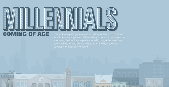
There’s a lot going on in this infographic, and if it didn’t provide an annotated option, the data would get lost. It was a smart idea to keep things uncluttered and let people interact with data at their own pace.
But in our opinion, this infographic is trying to pack a bit too much into one web page. If Goldman Sachs was intent on giving this much information out, a key or a guide at the top with hyperlinks to take you to the different parts of the infographic would’ve been key. That may have provided the overview needed to make this feel less overwhelming.
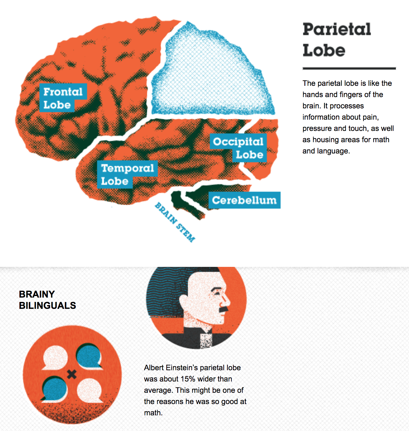
8. Basic functions of the brain
On the other end of the spectrum, this graphic from Online College Courses keeps it short and simple. It’s an overview of the different parts of the brain that provide an annotation on their functions when you click on an area of the brain. It’s got some good contrasting color and a nice vintage graphic feel.
Overall, this is an excellent example of how to use annotations to make a quick-and-dirty guide to a single topic.
And, in a smart move, they include the embed code for this graphic at the bottom of their post:
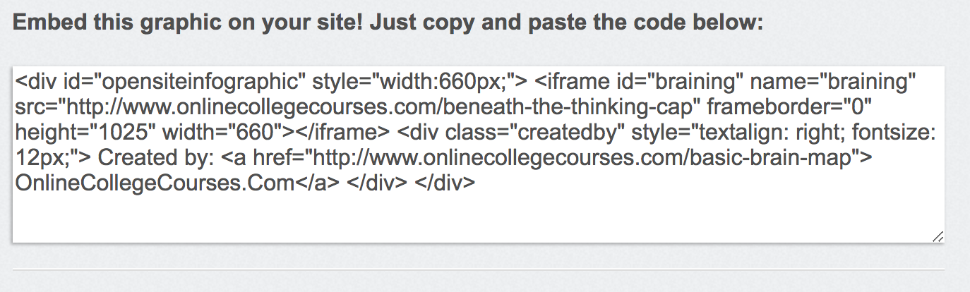
That’s right! This graphic was made for other people to share and use in their own content. This is a great recognition of how many graphics work as quick takeaways. Plus, most people feel much more comfortable writing than they do making graphics — why do you think we aren’t making up our own examples for each post? — which means they’re on the lookout to supplement their own content with other people’s visuals and graphs.
Making it easy for them to use your hard work is a great way to provide value to your readers and to get an all-important back link.
9. Walmart infographic
When you think big business, we’d guess that Walmart is one of the first corporations that comes to mind. It’s all about that corporate graphic, and we’re here for it.
Right off the bat, we like that it’s using something we haven’t seen a lot of yet: pictures of people. The smiling faces are reminiscent of the Walmart branding and underscore the message of empowerment Walmart is trying to send. Whether or not you’re buying its corporate message, it is very well done.
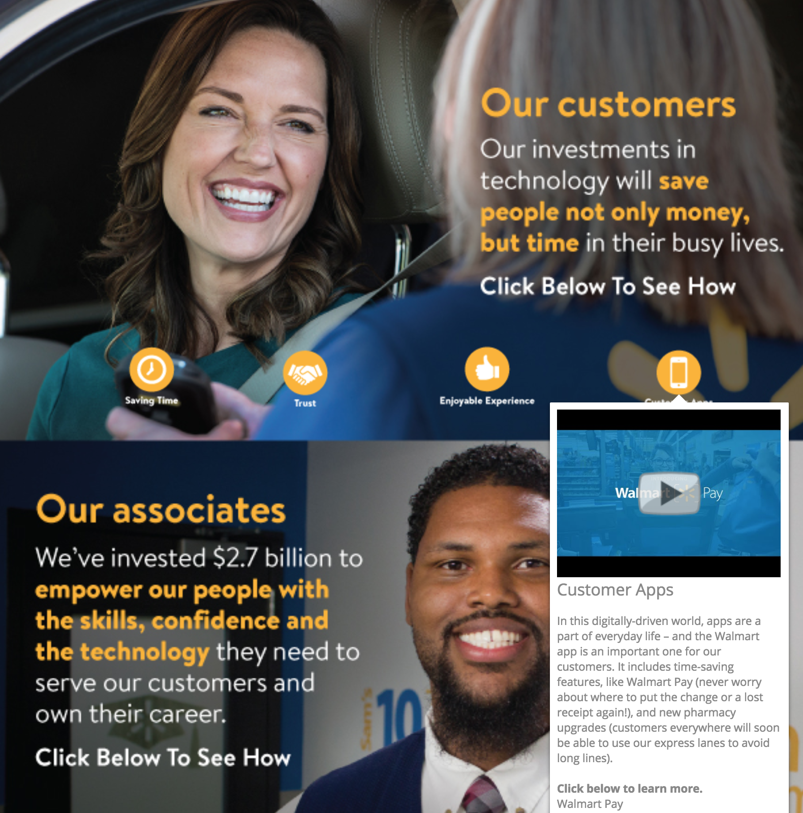
The annotations also incorporate another thing we haven’t seen yet: video annotations. Although it offers text annotations as well, Walmart allows you to play several videos in this infographic without leaving the web page. That’s cool. When you can use multimedia that’s embedded, you’re keeping your readers engaged and on your website, rather than on YouTube or Vimeo where related video links will lure readers away.
10. 12 ways to name your business
We’ve made it this far without encountering something that’s more miss than hit, but we can learn just as much from meh infographics as we can from good ones.
This interactive infographic from Ink and Key is a great example of something that would do better as another graphic type or even an article.
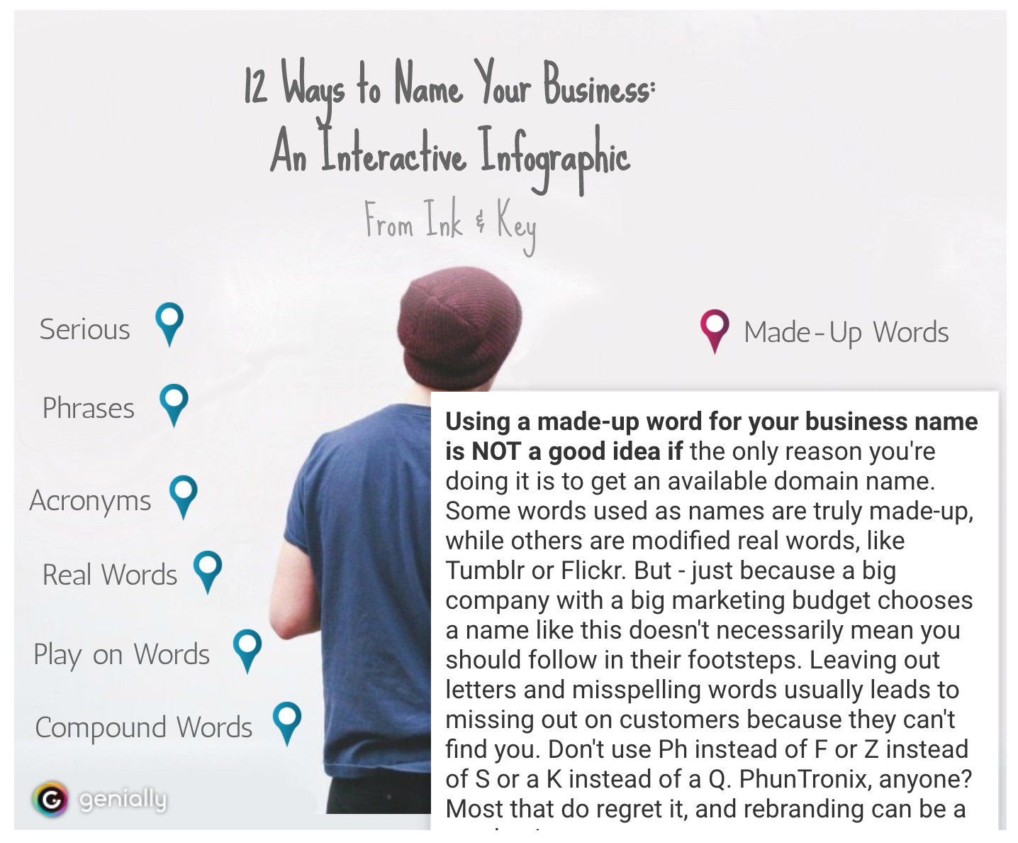
Why? Because it’s essentially just a list of bullet points where the text is hidden. The graphic has little relevance and none of the design elements are enticing or add to the experience of the piece. Actually, the star of this piece is the copy — it’s engaging, funny and actually gives helpful advice. And it’s buried under a boring graphic and clickable elements that, quite frankly, don’t even look like they should be clicked.
While we love to push graphics and mixed media as a way of hitting home with your content, sometimes you need to take a step back and hit the basics. This could have been a straightforward listicle piece with a hundred words per bullet point and some screenshots of examples and that would’ve been a better, more engaging piece.
11. Cybersecurity 2017
In direct contrast to the infographic above is this security infographic from NIST, which details some of the biggest digital security concerns for 2017. The content of this infographic is also basically a bulleted list, but this time there’s visual appeal and a bit of a story that goes on with the graphic.
Each area of concern is highlighted orange and corresponds to a physical object in the image. This is a simple way of adding some interest without investing in a big narrative or animated graphics.
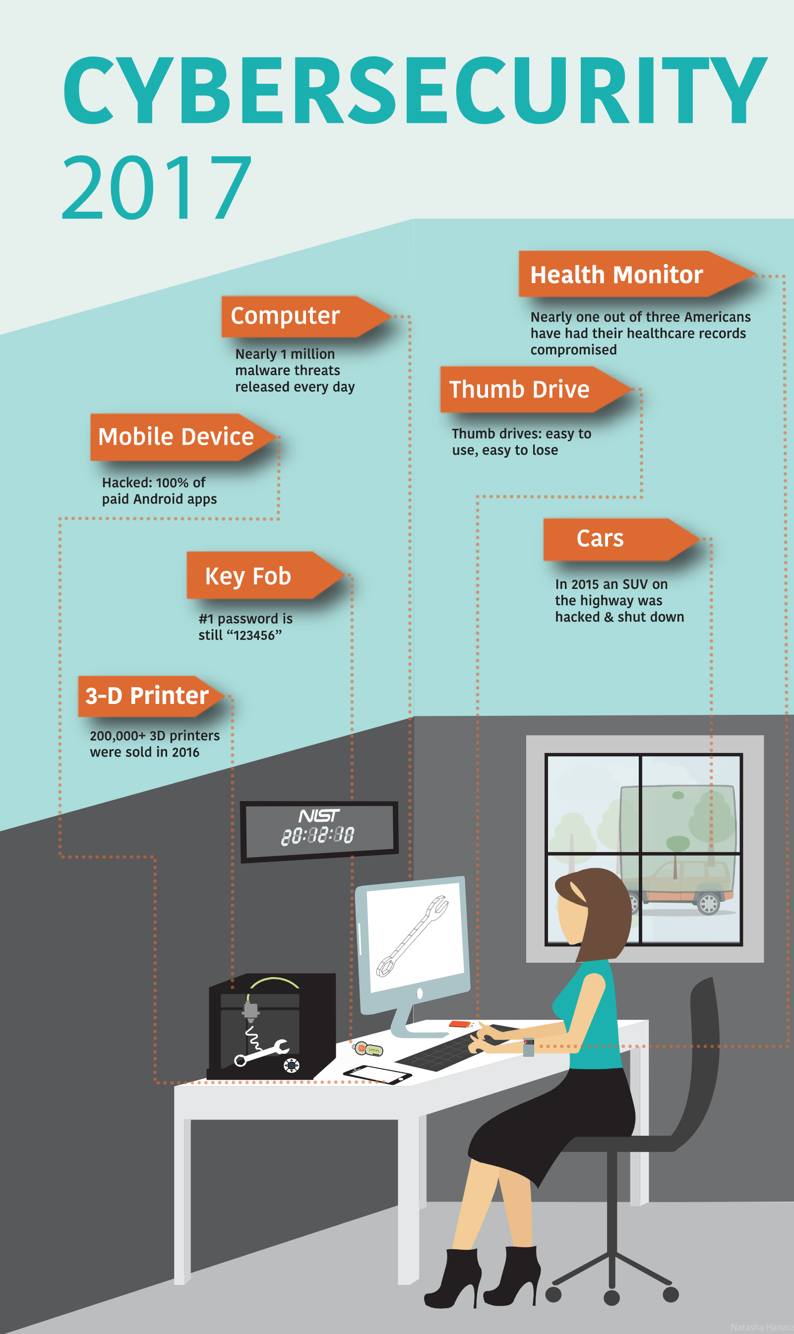
When you click on a subject, an annotation pops up that provides you with more information and links you to resources by NIST:
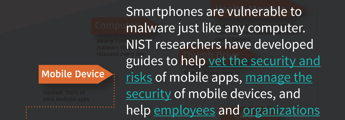
It’s great that NIST is using an infographic to get links going and direct people back to its website, but if you put in links do not have them open in the same page as your infographic, as NIST does here. That takes the person right out of your infographic. Setting your links to open in a new tab is definitely preferred.
One other linking note: keep your linkage obvious. In the screenshot above, it’s pretty clear where you’re going with “vet the security and risks” and “manage the security” links. But where will you end up if you click “employees”? The content of the page you’re redirecting people to should be obvious. If you are linking random words, take a more sparing and thoughtful approach.
Animations and annotations
Sometimes infographics are about more than just popups and small interactions. That’s what we have in this set: a series of infographics that have animation, swiping, sound, annotation, external links, popups, or any combination of those elements.
While some of the more complex infographics might be too much for your average company project, they’re good fun and an idea to keep in your back pocket when you can spend some more time and effort on spotlight content.
12. A Guide to 100 Musical Instruments
This is a fun, informal infographic that we could easily see in any elementary school classroom. But wait… what’s that? There’s a sample of an instrument that plays when you click on a square? Sweet. That’s a great use of an additional element that really makes this infographic pop. Full disclosure: clicking on the instruments is fun, and it is actually informative.
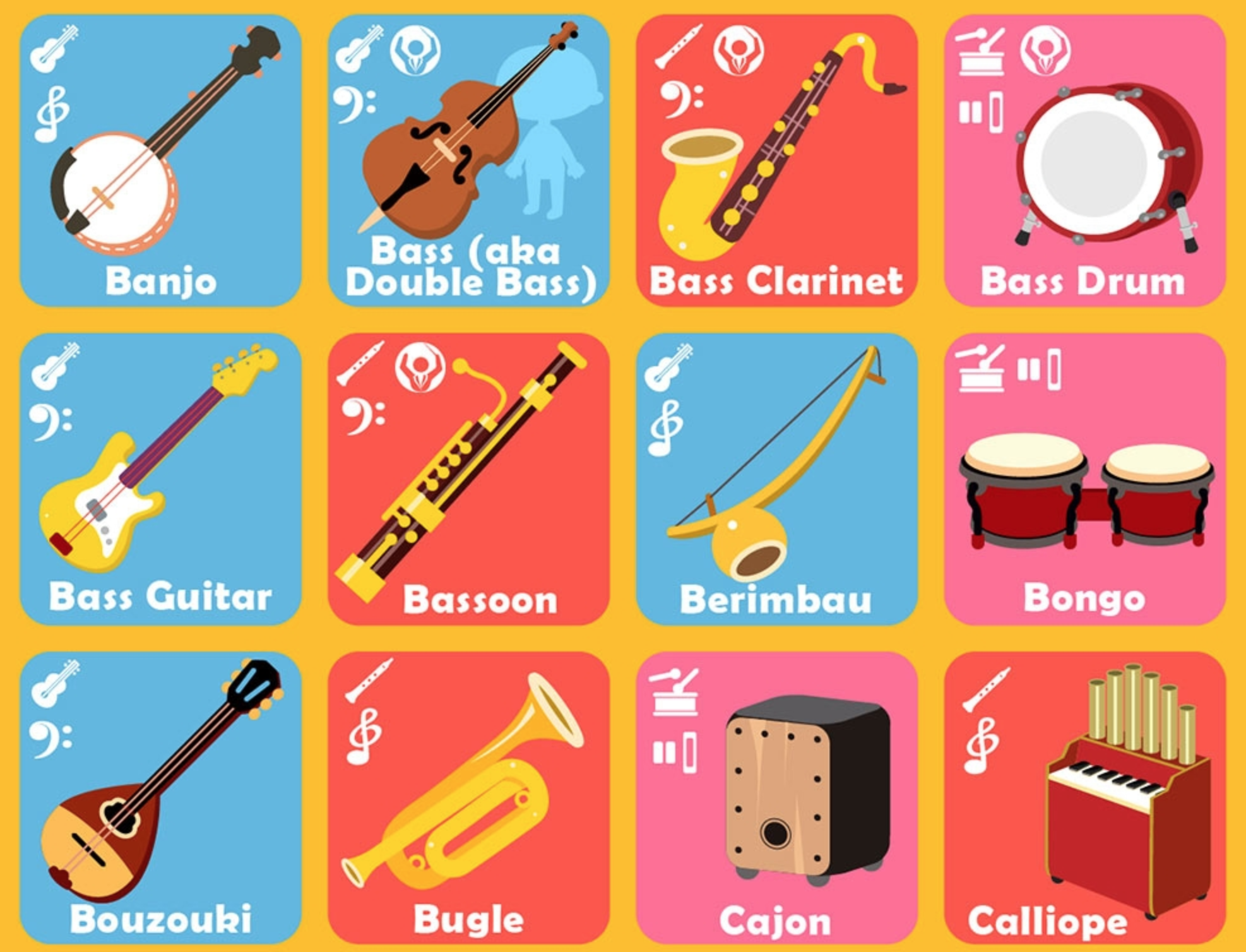
This is a great example of how adding one complex element to an otherwise simple graphic is just as, if not more, effective than making some of the more complex scroll + annotation + data input + popups that we’ve seen. It’s also a great reminder that what matters the most is that you’re getting the most relevant information to your readers in the easiest way possible.
13. Common mythconceptions
This is a great example of a piece of evergreen content. The interactive infographic is essentially a giant list of myths, like you shouldn’t wake a sleepwalker. For each myth, the bubble size corresponds to the prevalence of the myth, and when you click on a myth you’re taken to an in-depth explanation of why it’s false. You can sort by category and we’d bet you could lose at least half a workday clicking around before sending this to a friend.
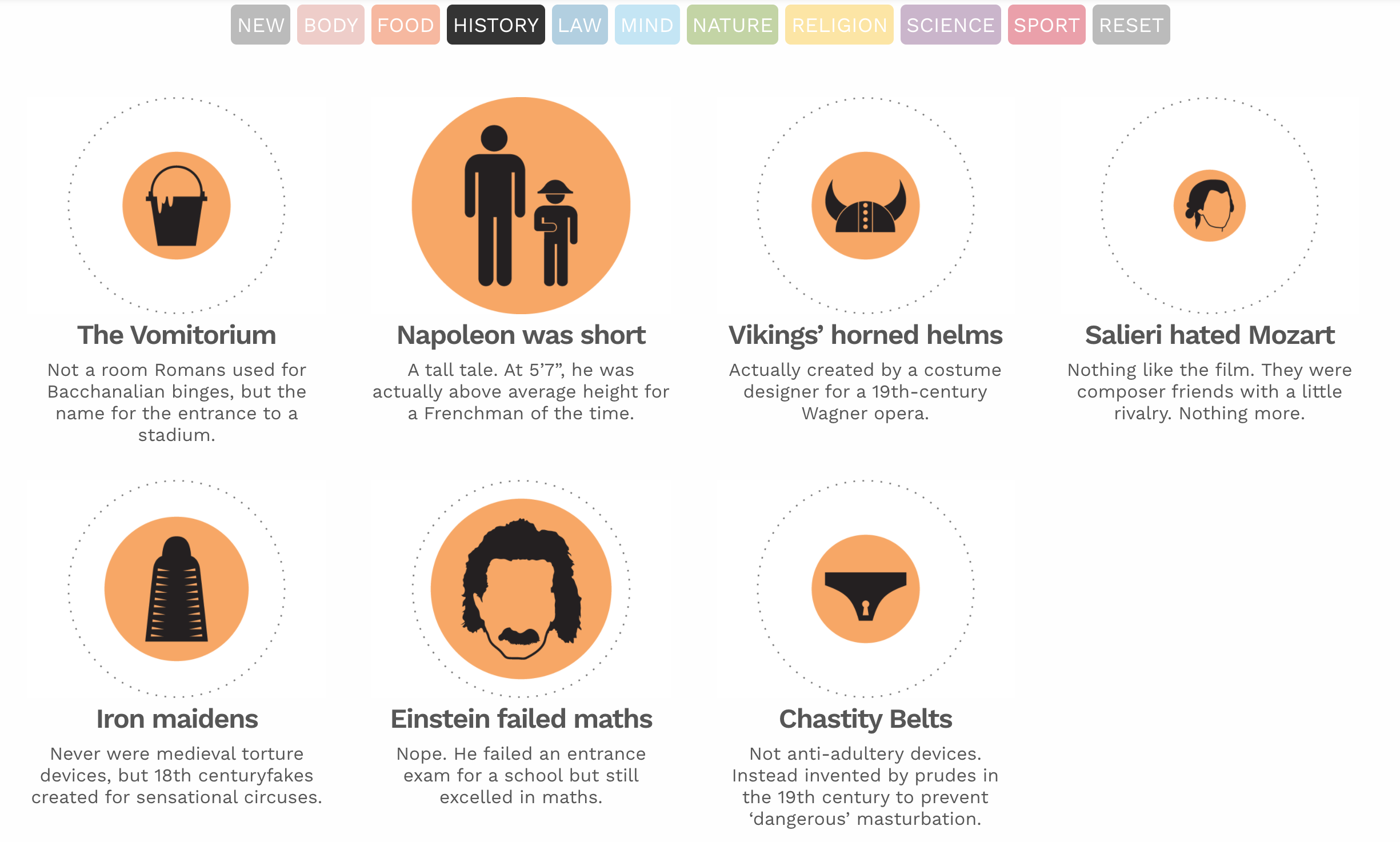
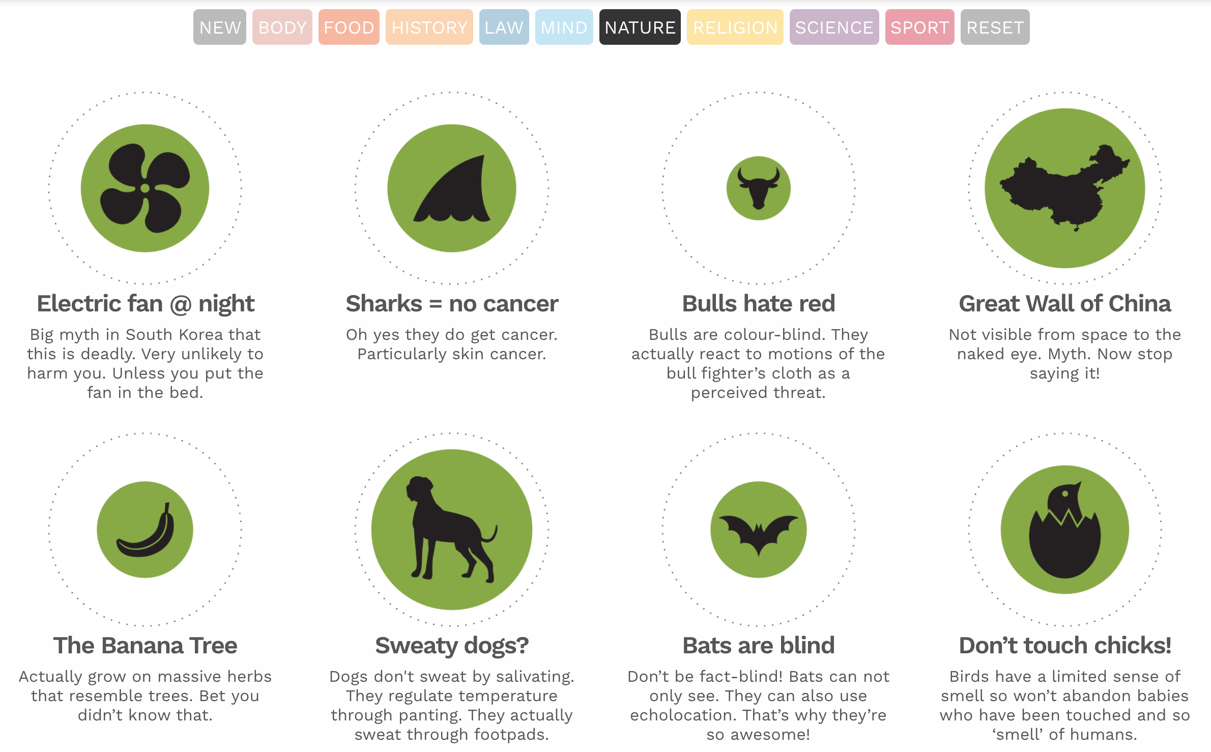
There’s enough information in the infographic that you don’t have to click through, and the clean graphics and saturated colors make for an overall pleasant experience for this infographic, and its topic is going to stand the test of time. Given that this site is dedicated to data visualizations in and of itself, this is a great representation of their work and their value.
14. How small businesses use technology
So far, we’ve pretty much only seen infographics that work in a linear manner from top to bottom, but this infographic breaks the mold. Instead of scrolling from one section to the next or clicking and having a popup, this infographic on how small business can use tech is more like a series of interlinked infographics.
You are presented with an opening page that acts as a three-item menu. As you click, it brings you to different areas in which SMBs can take advantage of technology. If you click on one, you’re brought to stats and facts about that area.
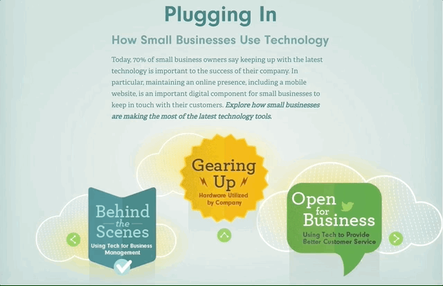
Rather than try and pack a bunch of information into an overly complicated web, this infographic acts as a series of interconnected graphics. With the digital age ushering in new and exciting ways to get from A to Z, to make art to display data, why not?
And if you don’t have the inclination to make this much information animated and easily readable, narrow your scope or consider making a series of standalone graphics instead.
15. Smarter schools
We’ll end on this infographic about schools, which is a similar graphic to the one above, but a bit more straightforward. Instead of being a continuous graphic that you scroll, this is a click-through from side to side.
Adding this animation might be a good fit for you if you have a series of items that’s linked that would become way too long if you put it all together from top to bottom. Nobody wants endless scrolling on an infographic — or anything else.
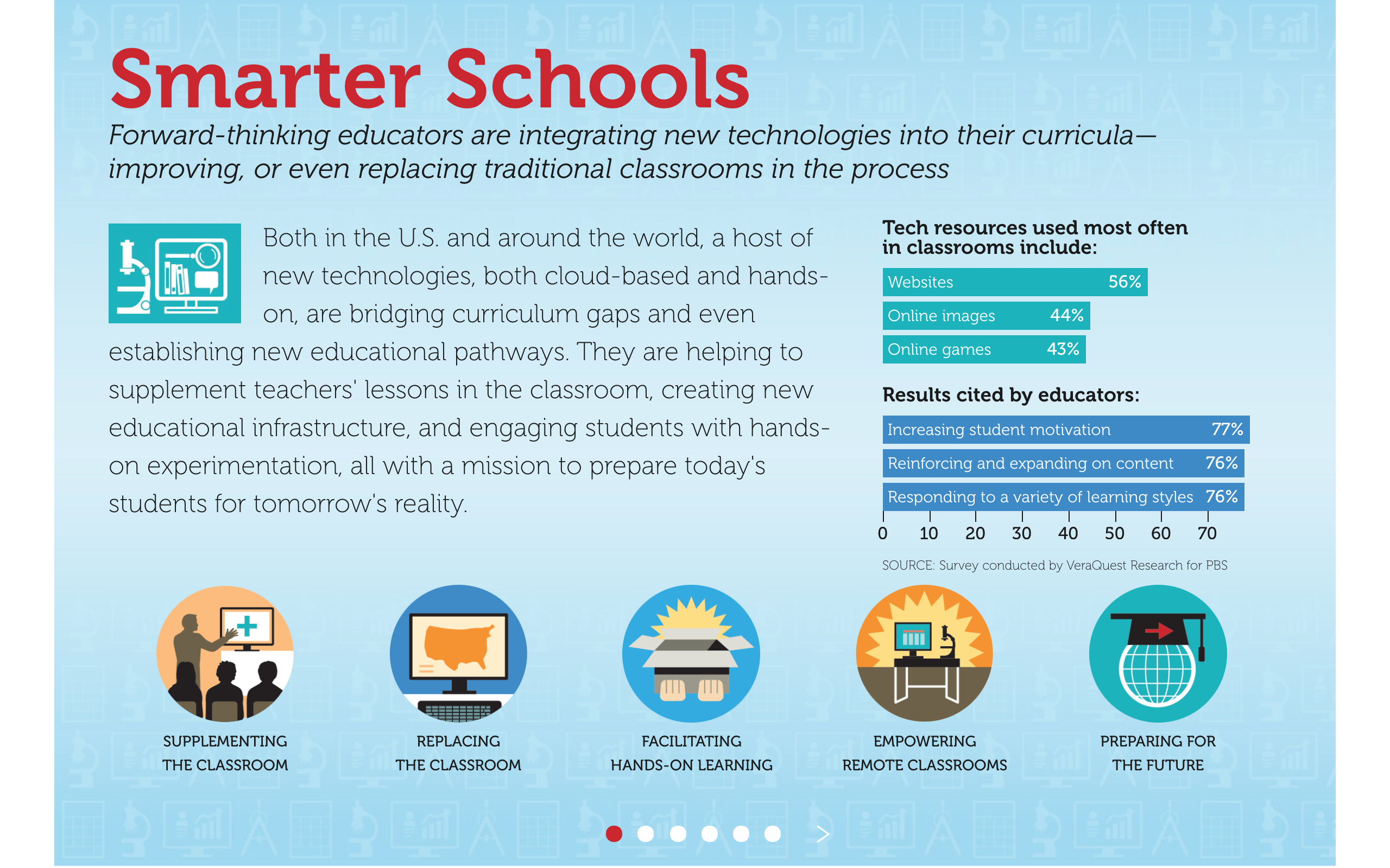
This is also a great way to think about the structuring of an infographic. Even if you’ve got animations that allow people to pick and choose where to go, you want to think about the best way to present information. Putting it in a slide form, like this, encourages you to think about an infographic more like a deck to go with a presentation, which is a great way to work through your concept and structure.
You’ve seen our interactive infographic examples, now it’s your turn.
Have something great? Terrible? In between? Let us know! We love looking at data viz and infographics, so never hesitate to send them our way.
