Worst Graphs of 2018

Well, well, well. It’s that time of year again. Time to look back on all that was accomplished in 2018… and all that wasn’t. Unfortunately, as the years pass, the same graph mistakes come up again and again. As we saw with The Worst Graphs Of 2017, the internet abounds with subpar graphs. This year was no exception and so, Dolphins presents: The Worst Graphs Of 2018. (Bugle noise.)

Why do we harp on bad graphs so continually? Because communication now is more visual than ever before. On Twitter, a graph does wonders for supplementing 280 characters. In articles, data viz makes valuable information legible for readers. In politics, graphs can make liars out of candidates and news sources in a split second. (Remember Dean Lockhart MSP?)
Anyone can create informative, engaging, and accurate graphs with any number of user-friendly programs. So for all you writers, data-lovers, content experts, journalists, statisticians, and internet trolls out there: this one’s for you.
Where The Worst Graphs of 2018 Go Wrong
What the graphs we’re about to present prove is that it’s about more than just forgetting to label an axis. These worst graphs suffer from a variety of mistakes that aren’t just limited to what’s going on in the graph itself. They represent wider mistakes about interpreting and presenting data in order to prove a point. Look out for:
- Insufficient, misleading or missing titles
- Going after Chrissy Teigen on Twitter
- Pretending 3% is above and 97%
- Burying good charts with unreadable bubble disasters
- Satire gone wrong
Read on, brave friends. Have a blast, and we’ll see you on the other side.
Line Graphs
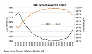
1. 3% is more than 97%, right?
This graph has two lines and two scales, which can be an informative way to give multiple pieces of information on one graph.
It can also be a really easy way to manipulate data and Reddit commentators are quick to point out that this graph is doing just that. Both of the scales are the same thing — percentage market share — and by using the same percentage in two different ways, they make it seem as though a 3% market share looks bigger than a 97% market share:
[Source]
The fact of the matter is that this graph should have both these lines at a scale of 0-100 if they wanted to prove a point about market shares. It’s deliberately misleading, and there’s no denying it.
Additionally, if we’re going to nitpick — and we are — the Q in the bottom scale looks like a zero. So “1Q13” (meaning first quarter of 2013) looks like 1013, and so on. Easily avoidable with another font.
Lastly, there’s no reason to put the key in the middle of this graph. It could easily be on the side, and not distracting from what’s actually happening in the data. A more complicated graph could have data obscured by slapping a legend in the middle.
2. Ideological Lines
Following politics can be confusing enough in our 24-hour news cycle world. Each day, another story breaks and with it comes another deluge of charts and graphs and interactive viz.
But if you make enough graphs, eventually one will be bad — like this one from Vox. Take a look at this electric line graph:
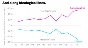
[Source]
At first blush, this graph makes it look like there are more and more Conservatives, while the Liberal ideology is rapidly decreasing in popularity. But the chart is a mirror image — both are actually going up. Negative percentages and mirroring used as a way to show a rise is counterintuitive. When someone sees -60%, they think something is going down, not up.
But perhaps the biggest problem here is that the information presented is not actual numbers, but relative percentages. When looking at a split between Conservatives and Liberals, one would expect that a) those are the only relevant political ideologies and b) as the only relevant ideologies, the total would be close to 100%. Instead it starts at… well either 30% or 0% if you’re factoring in a negative, and ends up at over 100%.
Contrast that attempt to interpret this graph with this intuitive graph from Gallup, which shows a similar data:
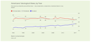
[Source]
Should have done that in the first place.
For what it’s worth, Vox’s bad chart is surrounded by a sea of good ones — in that very same piece, no less. But it only takes one bad or confusing graph for a reader to start doubting your information.
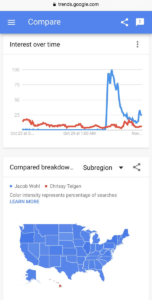
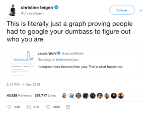
3. Don’t go after Chrissy Teigen. we repeat: Don’t go after Chrissy Teigen!
Sometimes your graphs are good, but what you do with them gets you in trouble. That’s the whole story of these graphs, showing the number of Google searches for right-wing fraudster Jacob Wohl compared to the number of searches for model and author Chrissy Teigen:
[Source]
In an exchange on Twitter, Wohl used this graph as quote-unquote proof that he “became more famous” than Chrissy Teigen. Her response says it all:
[Source]
There are two morals to be learned here. One is that bad faith claims made from a graph that you present readers will never pay off.
The other is: do not attempt to one-up or troll Chrissy Teigen on Twitter. She’s mastered the platform, and we salute her.
Pie and Bar Graphs
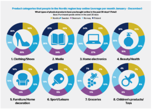
4. Nobody gets 100% of the pie
Comments from our Dolphins researcher about these graphs we “A bunch of pie graphs and none of them add up to 100 lol,” and that pretty much sums up what is wrong with this infographic.
If you’re going to put statistics in a circle, people will expect that you are dividing 100% into something. But these graphs? Each of the percentages is measuring a different whole, with one statistic representing an average. So why not just use a bar graph? H/T to CB Insights for shedding light on this… creation.
[Source]
The problems continue from there on this cluttered graphic. The ring shape makes it look like roughly the same percentage of people are purchasing items in every category. That’s because these numbers don’t add up to 100%, and therefore the space they take up is pretty arbitrary. How else could you explain the 37% of Swedes purchasing clothing and 8% of Swedes purchasing child toys being represented by the exact same proportion of the circle?
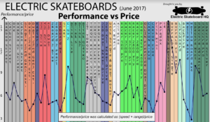
5. Electric skateboard Overload of the Year
This is a front-runner for worst graph of the year, courtesy of the bad stats Reddit.
In theory, it’s an amazing concept: Compare all the major electronic skateboards to help people figure out what’s the best board for them to buy. In reality, it’s more headache-inducing than useful.
[Source]
This would have been better as a simple table that people could sort by price high-low, speed high-low and range high-low. A scatter plot with an interactive component to show board information as a user hovered over a dot would have been great as well.
As it stands, the color makes this jarring and hard to interpret. The labels on each bar conflict with the lines and, to be honest with you, there’s no reason to connect these dots. Each data point here is completely separate.
Additionally, combining speed and range doesn’t make a ton of sense. Speed is a unit of MPH and range is either in miles or time — they don’t combine intuitively. And it doesn’t make sense to combine them from an information standpoint, anyway. If I want a super-fast board and don’t care about range, that stat means nothing to me.
Dot Charts and Maps
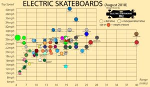
6. Too MAny Dots To Handle
Alright, so you were discouraged by the previous electric skateboard chart, but you still want some info about an electric skateboard. When you come across this, you may give up on electric skateboards altogether:
[Source]
This chart is borderline unusable. There are simply too many different boards packed on it to help you identify what’s right for you. We like that they’re using dots with a clear legend to help you see the features you want, but unless the board you’re looking for is an outlier, good luck finding it or figuring out which dot its label goes with.
If this chart were interactive, and people could hover to get readable labels on the dots, that would have helped a lot. But quite frankly, this is difficult to use as it stands.
Electric Skateboard HQ’s individual board cards are crisp, informative, easy to read at a glance and even linked to the purchase page for every board — now that’s the way to do a graph. But, frustratingly, they put their worst graph front and center instead of featuring the more useful viz.

[Source]
7. Hey, it’s all relative, right?
This article by Business Insider has some truly bad graphs. The most glaring error is that these graphs present relative data for no real reason. A simple graph of approval rating state by state would have easily made the point these graphs are trying to make.
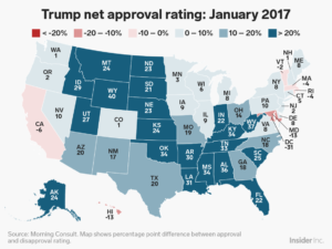
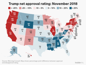
[Source]
Think about it this way: if a state is 55/45 for approval/disapproval of Trump, is it more intuitive to label that state “55%” on a graph of Trump’s approval rating, or “10” on a relative percentage graph? On this graph, it would be 10.
The final nail to the coffin here is that the colors are counterintuitive. Red is traditionally the Republican color and blue is the Democrat color, in American politics. It stands to reason that Republican-leaning states (“red states”) would be more likely to have a higher approval rating for a Republican president.
But this map has blue as higher approval and red as lower — the opposite of what an average reader would expect.
Infographics and Miscellaneous Charts
8. Tipping the scales
We love some good New York Times data viz, but this series of graphs is seriously misleading. The problem here is that there are several graphs in a row, each with a very different scale. However, side-by-side, it seems like there should be a relation in scale between these graphs:
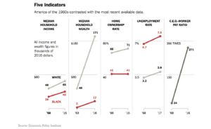
[Source]
That’s especially true when you look at Median Household Wealth and C.E.O.-Worker Pay Ratio. A quick glance at the graph makes it seem like median wealth is rising at about the same rate as the pay ratio, which is not true. This is partially because the wealth statistics are in dollars, but the pay gap statistic is a ratio.
This series of graphs would be clearer if similar graphs were grouped together, rather than being a block of five. Median household income and median household wealth could be paired, as they’re both in dollars. Home ownership and unemployment could be paired as they’re both in percentages. The pay ratio should be standing alone. This is important data, and the NYT should do it justice.
9. Are you… Are you kidding?
We all like to have a bit of fun with a graph now and again. Satirical graphs and data sets that are obviously falsified can be a source of levity, or a good way to prove a hypothetical point. In theory, that’s what this graph is doing — it falsely correlates the height of the Fed Chair and interest rate fluctuations, i.e., when the Fed Chair is shorter, interest rates are lower.
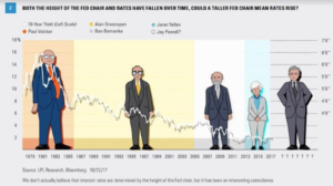
[Source]
Of course, the height of one person has nothing to do with interest rates, but this chart is presented so earnestly that it’s not immediately obvious that it’s satire to someone who is scrolling quickly or not familiar with correlation/causation mix-ups. It even has two legitimate research sources.
The only indication from the graph itself that this is satire is a low-contrast sentence under the bottom of the source attribution. Quite frankly, it’s somewhat funny but not crisp enough. Having strange cartoon people isn’t working, the line for the 10-Year Yield is not fully visible everywhere and seems to have a strange shadow. The satire should be about the height/interest rate correlation, but it’s bogged down in how strange the graph is.
Wha’d we miss?
The internet is a big place, and we’ve definitely missed a graph or two. If you have a good one, drop us a line any time or tweet us @getdolphins.
Otherwise, Godspeed, get dolphins, and may your life be free of data-skewing eyesores until our 2019 round-up.
