How “Show, Don’t Tell” Will Save Our Political Commentary
If you made it through 2017 without hearing the words “fake news,” you were probably off the grid.
The news cycle for the last year or so has been dominated by meta-discussions about the news itself. And while the explosion of fear around fake news hit everywhere from Facebook to Fox, continually growing distrust of the news, even from reputable media publications, is arguably a bigger problem. As of January 2018, 68% of Americans placed little or no confidence in the media.
Especially when it comes to political news, media outlets have become savvier with how they’re presenting their data and arguments — they have to be, in order to rebuild public confidence. Some of the most popular news articles of 2017 use interactive data, video, embedded primary source documentation and more to add a persuasive element that builds the credibility of their reporting.
Why? Because the better that news organizations can represent facts and figures in their articles, the easier they are to understand and the more reliably they will be seen. Interactive visualizations are key to reliable reporting because they help to demystify data and politics for the masses.
Why Interactive Viz?
Out of all the ways that news organizations can represent data, one of the most powerful is interactive visualizations — graphs or tools that change and reveal information as readers interact with them. Other multimedia tools are good, but each has its drawback. Videos can be slow to load and take time to watch. Backlinks to sources and additional information take readers out of articles.
Interactive viz provides clarity without load time or loss of context. They help give context to data that makes it more compelling. Things like policy legislation and congressional voting are very complex, and having interactive data can help clarify historical trends, changes and the personal effects of political policies.
As New York Times graphics editor Gregor Aisch points out, you can’t necessarily fit every poll or graph into one piece as a standalone. But if you use interactive viz, you can pack more information in — thus strengthening your argument and your reader’s knowledge — while maintaining readability.
And, with interactive data viz, readers are more engaged with concepts and arguments, because they’re interacting to get information. Even if a reader isn’t interacting, they’re still getting valuable data from a graph.
Let’s look at some examples of how news organizations are using interactive viz to support and give more credibility to their arguments. We’ll go over the why and how of building an argument with interactive viz that clarifies political news.
Fact or Fiction?: One Glance Tells All
At this point, it’s no surprise to anyone that President Trump lies in his speeches. We saw it in his campaign, and it’s continued into his presidency to even more ridicule. We’ve talked about data visualizations being used to represent political absurdity before, and they can be a powerful way of showing just how much that comes out of a politician’s mouth is untrue.
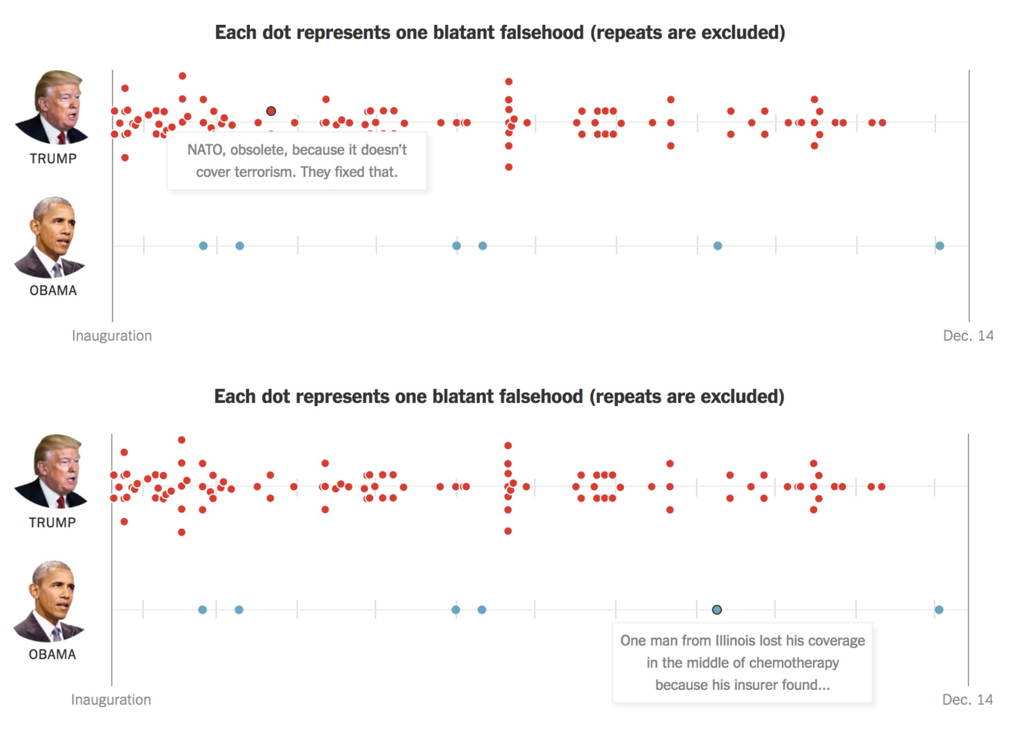
A great example of this is a piece by the New York Times that compares the number of lies told by Trump to the number of lies told by Obama. The article uses a combination of visualizations, writing, and pull-out quotes to show that Trump does indeed lie more than Obama, a position that had previously been doubted by readers.
One of the best representations of data in this piece is an interactive timeline with a dot to represent each “blatant falsehood” that each president told from their inauguration to Dec 14 of their first year in office.
This visualization hits you right off the bat. It stands out because:
- The striking contrast between the number of red and blue dots immediately relays the graph’s meaning, even if you don’t interact with the timeline.
- Each dot brings up the falsehood it represents — when you click, you’re brought to the exact quote with corrections to the lie.
What this does, from a consumer’s perspective, is provide an undeniable underscoring of the Times‘ argument at every turn. When you look at the piece as a static representation, it proves the point, and interacting with the viz tells the story of each lie. This visualization is a counterargument in and of itself.
Keeping Up With Trump
As Trump’s campaign shaped up and his presidency began, he continuously spoke (and tweeted) about his political efficacy, his policy wins and his popularity. Congress, special elections, and international affairs crop up at what feels like a breakneck pace. How can someone easily keep up? And, in an age where the news cycle is hyper-speed, and the president can — and does — tweet at any hour of the night or day, how does a news publication stay up to date?
Constantly updating interactive data viz.
There are some distinct advantages to using interactive viz as an up-to-date overview:
- You can quickly update the data once you’ve set up the infrastructure, rather than writing or creating something from scratch each time.
- Broader trends are immediately accessible to readers, because information is presented visually.
- Supplementary resources are easily added as stories develop.
Take this timeline of where Trump is on each of his policy promises from CNN:
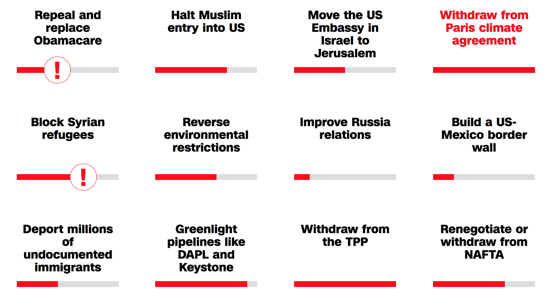
The red meter at the bottom indicates how close he is to fulfilling the policy promise. When you click on a policy promise, you can see 1-5 key points that are advancing (or halting) his policy agenda.
Sure, CNN probably wrote multiple pieces on all of these stories as they broke. But keeping a live update in dataviz means that readers can check on any policy as it develops without having to search for individual articles — they’re linked in the “key points” — which is a huge plus in the “attention economy.”
Another ongoing effort is Gallup’s tracker for Trump’s approval rating. They started updating daily, and have now moved to weekly updates on the president’s approval rating, showing the ups and downs of his public perception as they happen. When a reader scrolls over the graph, the date and exact approval rating appear:
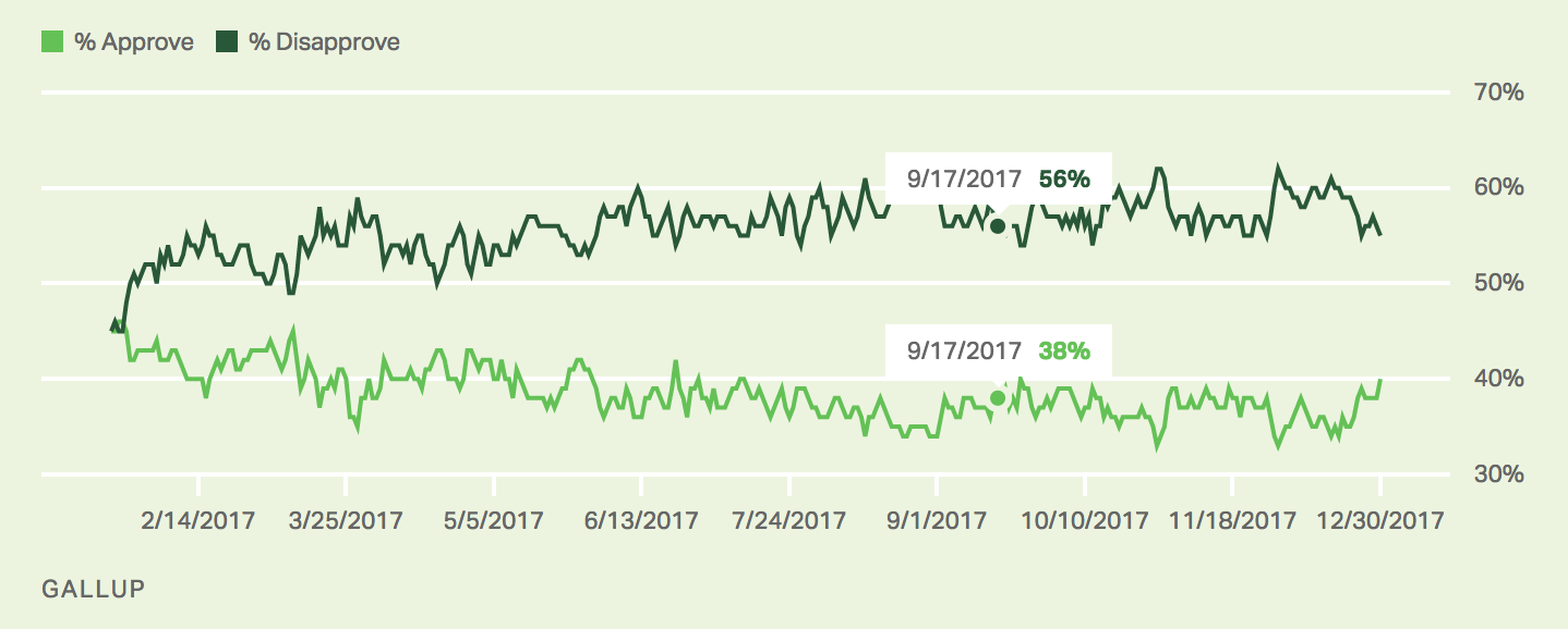
This is a particularly effective tool under Trump’s presidency for a few reasons. The first is that President Trump is infamous for exaggerating the highs of his administration — from day one. (Anyone remember his lies about the size of his inauguration crowd?) When he claims that he understands what the American people want, or that he’s been a huge success, one need only pull up the Gallup approval page to find out if that’s true.
The second is that approval ratings depend heavily on historical trends. If you read that someone had an approval rating of 62%, that might seem great, until you found out the week before that their approval rating was 72%. For Trump, approval around 50% would be a huge turnaround from his term so far, but you wouldn’t know that without his historical data — for many former presidents, that would have been par for the course.
One thing that could have made this viz a little punchier is a better choice of color here. Since both lines are green, a reader has to check the key to decipher which line is which. If approve was green and disapprove red, readability would be bumped a little. The 50% line also might do well in another color, as it marks a crucial tipping point for political approval (“majority” rule/representation).
Legislation And You: A User’s Guide
Getting through the finer points of most government documents is not something that the general public has the time, resources or knowledge to do. But it is extremely important that the general public be able to understand exactly how policy is going to work, how it’s going to shape their lives, others’ lives, and the course of the nation. News organizations are turning to interactive data to help people quickly understand policy.
That’s because good interactive viz synthesizes huge amounts of information (like points in a bill) and can spit it back out in an easily understandable way. Take the GOP’s tax plan, for example. Trump, among other lawmakers, consistently claimed that it would represent a tax cut for the American public:
As a candidate, I promised we would pass a massive TAX CUT for the everyday working American families who are the backbone and the heartbeat of our country. Now, we are just days away… pic.twitter.com/MADTGUMktX
— Donald J. Trump (@realDonaldTrump) December 17, 2017
But this was only a very small sliver of the policy’s real impact. Yes, many people would see a tax cut immediately after the passing of the bill. However, the long-term impact of the policy was clearly designed to raise taxes on lower-income people while keeping a tax cut on the highest income brackets. To illustrate this, CNBC designed an interactive that allows you to choose any state and specify any income bracket. It then shows the changes you should expect to see in your taxes in 2019 and in 2027:
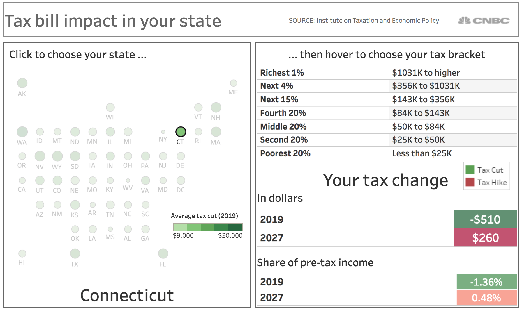
While there is accompanying text to clarify some policy points, the focus of this page is an interactive chart for a good reason: fooling around with this interactive gives anyone a crystal-clear window into the actual effect of the tax policy.
That’s not to say that interactive viz is the only or the best way to illustrate policy changes. However, it can be a powerful tool that helps people understand the effects of policy in a personal and immediate way.
For major news organizations such as CNBC, it makes sense to devote a page to this piece of viz, as they’re creating a huge amount of news and policy content. For less-covered topics, or sites with a smaller output, incorporating a piece of interactive data viz into a discussion makes the most sense. Facts, stats, rhetorical arguments, quotes, embedded tweets, viz — these should all come together to create an informative argument.
It’s a Mad, Mad, Mad, Mad World
Politics is as complicated as ever, and our news cycle has sped up to keep pace with our increasingly connected world. The media needs to build and maintain trust by providing the public with data-backed pieces that can keep up with this breakneck speed.
With data visualizations, news sources can show, rather than tell readers changes in the political landscape. Viz lends credence to arguments because it is data-based but accessible, and it lends rhetorical punch because it backs up positions that news organizations take in a tangible way.
