The Worst Graphs of 2017

There’s a dark underbelly of all of those beautiful graphs, charts and visualizations you enjoy alongside your news articles and your data-driven arguments. For every person that puts in the hard work to get numbers polished and bar graphs just-so, there’s someone on their fourth cup of coffee laughing maniacally at Microsoft paint and making terrible graphs. Are they deliberately trying to confuse readers? Do they simply not care? Have they been paid off to make spectacularly bad graphs?
We may never know for sure, but what we do know is this: every year we see some truly disheartening data viz mistakes, and there’s no telling when they’ll pop up. It might be on someone’s blog. It might be in one of the biggest news publications in the world. But no matter where they are, these errors make us cringe, they make us laugh, and they make us feel better about our own visualization skills.
So, to round out 2017, we’ve gathered some of the worst graphs of the year. They’re about many different topics from many different sources — nobody is safe. And lest you think we’re just ripping graphs apart for fun, we’re going to walk you through what has gone wrong with each one with the hopes that nobody will make these mistakes again.
Will our efforts be in vain? Only time will tell. But for now, Dolphins presents:

Look out for these mistakes…
Good graphs help your readers understand your argument and the evidence that supports it. They’re clear, well-labeled and persuasive.
The graphs we have here are pretty much the opposite of all of those things. They’re total head scratchers, which makes it hard for people to engage with your argument and can cause people to skip over whole chunks of what you’re presenting. At worst, they can actually convince people to throw away your argument or article altogether, because they’re confusing or misleading.
Here are some big red flags to look for in graphs — including your own:
- Lack of clear axis labeling
- Truncation of an axis so it ends or starts in a misleading place
- Numbers not adding up correctly, especially in pie charts
- Visual deceptions, like inappropriate use of white space or comparative elements that don’t seem to correspond to the data they represent
- Poor use of a graph type (like making a series of bar graphs when a line graph would be clearer)
- Cherrypicking data, like including limited years or responses chosen to support a specific argument
- Bad graphic choices, like low-contrast color choices or a distorting perspective
- No title
- No key for the information in the graph
Yes, it seems like some of these are rudimentary graphing skills — like adding a title. But somehow, people still manage to miss them.
If you’re regularly making graphs, make a checklist of key graph elements for everyone to follow so nobody ends up making a stupid mistake. The tips and critiques we provide below are separated by chart type, which can be a good way to organize your checklist. Let’s get started.
Bar Graphs
Bar graphs are one of the most familiar types of graphs to pretty much everyone. They’re a great way to show simple comparative information, or trends over time. Bar graphs should have clear, bold colors and an appropriate scale. They can be vertical or horizontal, dealer’s choice.
Best of all, they’re easily made in pretty much any Excel-type program. Our advice is stick to preset color schemes and double check your data to make sure you’re giving an accurate overview with your bar charts. If you don’t, you risk following the path of one of the graphs below.
1. Intel and AMD are how different?
A graph that was much-maligned on Twitter and Reddit this year came from a TechRadar article comparing AMD Threadripper and Intel Core processors. The article in question has had the offending graph removed, but it has been saved forever in many a Twitter comment thread. Although it has good, bold colors, titles, and decent labeling (we could use a label on the x-axis), there’s one oversight.
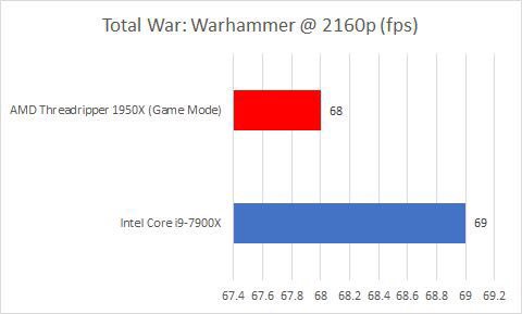
The mistake here is simple: the x-axis should start at zero (remember proper scale?) but it starts at… 67.4? This means that, at first glance, the difference between the AMD Threadripper and Intel Core products seems pretty stark, when in reality it’s a difference of 68 to 69. The chart furthers the idea that the difference is great by providing line marks every .2 of a number. Even if that type of precision is an appropriate unit for your graph, emphasizing it with lines here is not necessary.
This is a cheap trick to make one thing look dramatically better, which will definitely work on any reader who is skimming through the article. But fess up, guys. Keep your axises properly scaled and make sure that you’re giving an accurate idea of your data at-a-glance.
2. When zero gets a positive value
Another chart that was critiqued by Twitter was this one, which is more than a little confusing. The primary reason? “Other” has a value of zero — fair enough — but that value looks like it should be eight when compared to the other bars on this chart.

While that’s the biggest error in terms of data representation, this graph is missing some other key things, like a title. It’s about an Australian election results — but you probably would never have guessed that from the chart itself.
Even if you are going to be embedding your graphs with paragraphs chock-full of information that renders a chart understandable, know that charts and other images often function as takeaways. They’re what pops up in your article preview and what people pull away to use when they’re referencing you elsewhere. That means you need to give readers as much information in the chart as possible. Even a simple title would’ve sufficed here, although we would also recommend a key.
3. Q4 went well… or did it?
While the Daily Mail may not be known for being the source of the hardest-hitting news, they can surely make a graph better than this. Too bad they didn’t, and got roasted on — you guessed it — Twitter. #BadGraphs included. If you will recall from our TechRadar teardown, a non-zero axis is, in general, a non-starter for simple bar graphs, as it distorts the scale. Glancing at this chart, it seems like the second estimate for Q4 of the British economy’s growth was far above the first, when in reality it was .1% more.
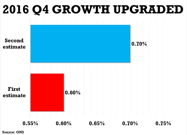
Let’s say, for the sake of argument, that .1% was a really big deal in terms of what you were trying to graph — that’s all well and good, but you can indicate that without misleading your audience based on scale. Nobody would look at this bar graph sans numbers and guess that there was a .1 increase between those two estimates.
If you want to make a big deal about a particular piece of your data, write persuasively about it around your graph and include a descriptive title — don’t wildly throw off scale to prove a point.
4. Which of these charts should be grouped together?
Trick question — none of these charts needed to be grouped together. Although they are all comparative stats between Xiaomi and other phone retailers in China, forcing these different comparisons next to each other carries with it more than a few problems, a surprising bumble from Forbes.
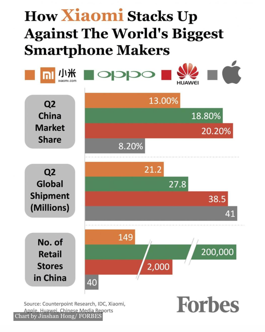
While each of these graphs individually could be picked apart, let’s take the problems as a whole. First, grouping these comparative graphs together makes you want to find a link in between the items present when there isn’t necessarily a link between them at all. If there is one, it isn’t clear.
Secondly, the proportions of the graphs are thrown off with comparison. If you look at the first graph, Q2 China Market Share, and the second, Q2 Global Shipment (Millions) the orange bar makes it look like 13 is greater than 21. But both of these charts are representing totally different things. The first chart is a percentage, and the second is numbers in the millions. Their scale has nothing to do with each other at all.
There is good here — fairly well done labeling (although a year would be nice), strong colors and a key. But the moral of the story here is give your graphs space to breathe unless they need to be placed in the same graphic for explicit comparative purposes.
5. Fox news vs. the World
Lest you think that Forbes is the only big name we take issue with on this list, here’s a chart straight from the Washington Post. In this article, they’re looking at the social habits of people who identify as Republican, Independent and Democrat. This particular chart is looking at what news source people trust the most.
Let’s start with the good, because it’s not insignificant:
- Their title is descriptive
- They have a date and source for their data
- The colors are bold
- Their labels are clear and accurate
- They have a key
Sounds great! But reserve your judgement. Let’s take a closer look at what’s going on.
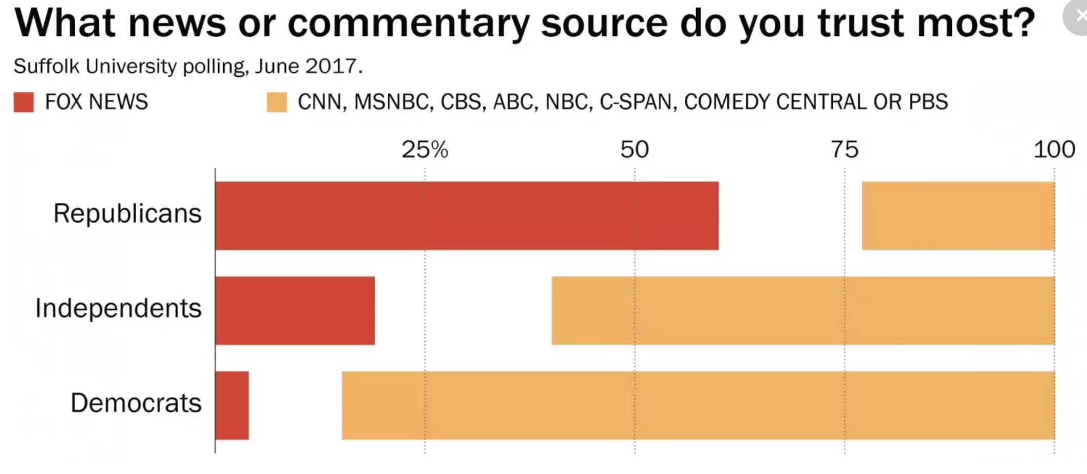
Look closely at the key. This chart should just be a chart about who trusts Fox news, and it should leave the rest out. The non-Fox category is a huge lump of news sources, including MSNBC, PBS, C-SPAN and Comedy Central. Call us crazy, but C-SPAN and Comedy Central don’t exactly belong in the same category.
This confuses what the graph means. Is it that Independents and Democrats trust all-non Fox sources more than Fox, ranking Fox below every other source? Or did different respondents choose different sources as the “most trusted”, only to have them lumped together, so one person’s top-ranked CNN is indistinguishable from another’s CBS, and the fact that they both put Fox over Comedy Central discarded because Fox was not in their number one spot?
If it had been a chart with just “people choosing Fox as their most-trusted news source”, leaving only the red bars, it still would have made a strong point. And we wouldn’t be sitting here trying to figure out what, exactly, was going on. Sometimes simplicity makes your graph easier to understand and more convincing, and it makes you look more trustworthy.
There are other problems with this graph, but let’s just leave it at that. It’s a big enough lesson to take away.
Line Graphs
Line graphs can be an excellent way to show a clear contrast in trends or behaviors between two or more things. They should have the basics of good graphing covered, of course, but there are extra questions when it comes to line graphs.
- Should you smooth your data or mark where each point falls in the trend?
- Are you going to label two or three axes?
- Is the interaction of the lines readable?
- Do you need to call out any specific points along a line? How? Why?
It’s choices like these that can make or break how good your line graphs are. Let’s see how our next cast of characters dealt with these intricacies.
6. Nobody can tell who will win the NFC West
When a sportswriter at ESPN tweeted out this chart, the comments across the web were not pretty. A glance at the graph tells you why: the colors of the lines for the Rams and Seahawks are so similar they’re virtually indistinguishable. Are the Rams going to win the NFC West? Are the Seahawks? And for that matter, where the heck are the Cardinals and the 49ers? Are they both that red line at the bottom? We have no idea!
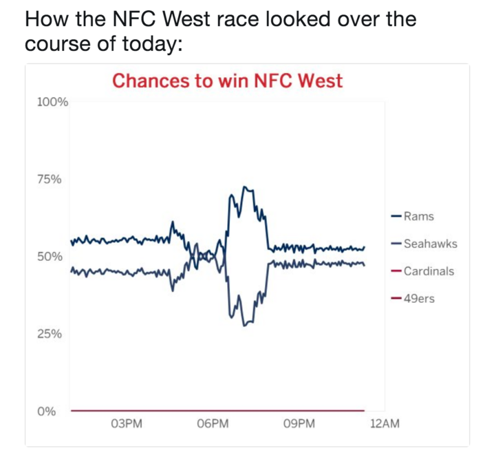
This error aside, though, this graph is pretty well done. Clear, easy to read key, well-labeled axes and a simple, standout title all make for a good graph. This is the perfect example of how one mistake can turn a good graph into a terrible one. While it was probably tempting to use team colors to seem clever here, it was a bad judgement call — and one that got paid for with mocking from people on social media.
7. America’s homeless population
At first glance, this graph from the AP probably seems innocuous. It is showing how the homeless population changed in each state from 2015 to 2017, and it starts out well. But scroll down to find the red line — that represents the total homeless population of the US — and, without looking at the numbers on the sides, try to figure out if it is increasing, declining or remains the same.
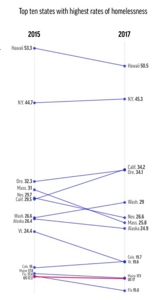
Pretty difficult, right? Because of the color contrast, the surrounding lines, and the scale of the graph, it’s very hard to tell that the US’s homeless population declined in these two years. By the way, the main point of this article is that the US homeless population increased, so that alone is pretty misleading.
How could they improve this graph? Resist complexity. Imagine if they took a handful of the states’ homeless population and the total US homeless population and put them each on their own graph. You could show a 10-year window, with each year getting its own, defined point on the line. Readability for information would increase dramatically, because each graph would be a simple representation of one thing, rather than an overloaded jumble.
8. The economy is a mystery
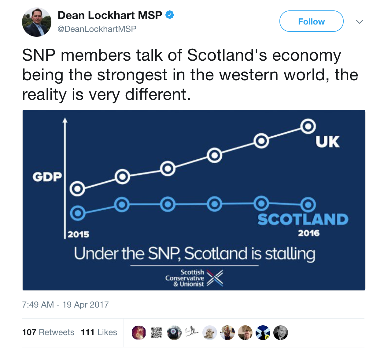
Politicians aren’t known for being the most truthful types, and this graph tweeted out by a member of the Scottish Parliament is another data point to add in favor of that thesis. This graph has some good — bold contrasting colors and clear labeling of which line is which — but that’s about it.
There are no numbers or scale on this chart to tell you what the rate of change was for the GDP of either the UK or Scotland. It’s unclear whether or not Scotland is included in the overall UK data, or if that really means “The UK (Minus Scotland)”. And the title is inflammatory rather than informative. You don’t have to disagree with this MSP to see that he has not shared a good, informative chart.
What might this chart look like if it were properly labeled and took into account more historical data? Glad you asked.
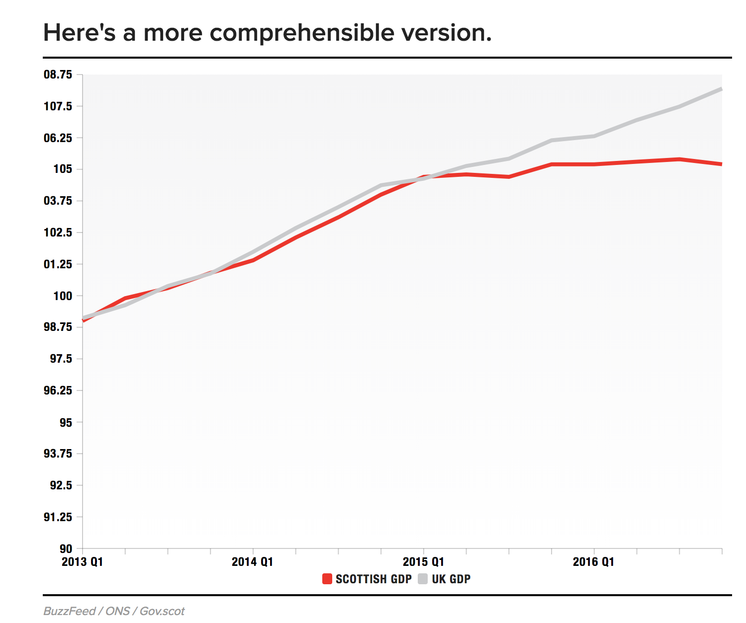
Now, this graph is by no means perfect — we actually prefer the color contrast of the original, and the UK is still not specified — but it does make a genuine attempt to show the fuller picture of this trend. That means readers of this graph can ask deeper questions, like what happened in Q1 of 2015 that caused the split in GDP change over time? If you don’t feel like you can show the larger picture of your data, seriously ask yourself if you’re cherrypicking what you present to your audience.
9. A graph as tangled as the issue it represents
Tackling an issue like race is never easy, but it can be less befuddled than what NBC presents here. One of the biggest problems with this graph is the x-axis. The chart starts with data from September, 1994, and ends with information from September 2017, but there’s no standard rate of change. According to this graph, there’s the same amount of “time” between 1995 and 2005 and 2009 and 2010.
If you want to show data from much earlier as a reference for a graph that primarily deals with another time period, the appropriate way to do so is to show a “break” in the graph, usually with a line, a set of parallel lines, or a zig-zagged line.
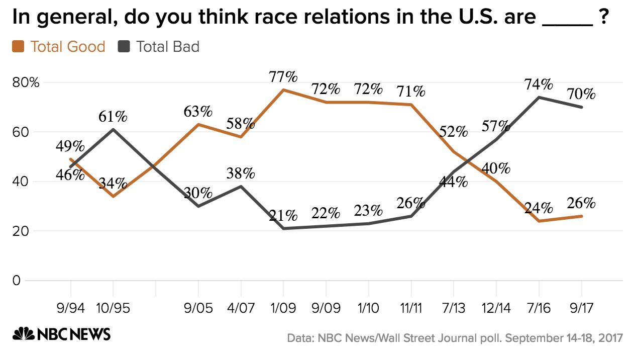
Another thing that doesn’t read well on this graph is the fact that some of the numbers are obscured by the lines themselves. It might take a little extra time to adjust each of these manually, but it would improve the neatness and readability of this graph. It might not seem like a big deal to those of us with perfect eyesight looking on a computer, but imagine someone using this in a powerpoint, for example.
Pie Char-Wait… Pizza Charts?
The pie chart is a great way to show a breakdown of a whole. It gives you a neat, proportional idea of how constituent parts come together, which can be a clean way to underscore the relationship between parts. Pie charts nowadays are used for everything from business stats to memes.
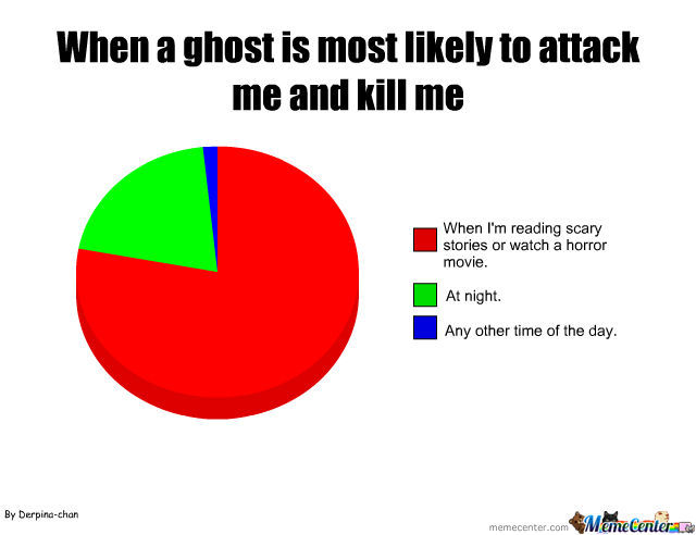
(Actually, this meme is… not a bad chart. | Source)
But, as we’ve seen time and time again, no chart is foolproof. We will provide a sampling of some of the worst offenders of the year, but keep out a sharp eye — bad versions of the pie chart are everywhere.
10. It’s a pizza chart, not a pie chart
Yes, we’ve talked about charts getting destroyed on Twitter already, but this may take the cake for most-destroyed. YouGov posted this chart of Britain’s most-liked pizza toppings and everything from the toppings chosen to the graph itself were mocked.
It might take a second to figure out what the most egregious error here is, but see if you can spot it:
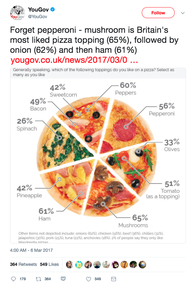 The big problem here is that each segment represents multiple options, all of which add up to significantly over 100%. Many people on Twitter humorously let this bad visualization slide by saying Hey, it’s a pizza graph, not a pie graph! But that sort of lax behavior is not in the spirit of The Worst Graphs Of 2017, so we won’t.
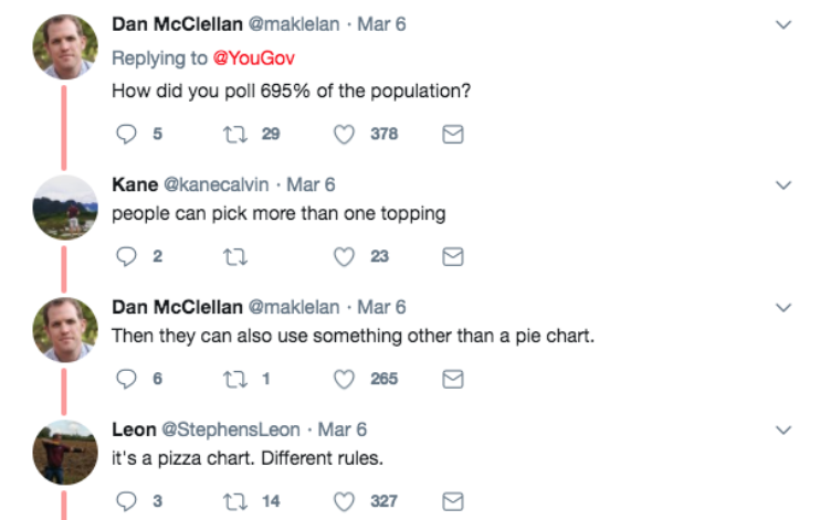
When you present information in a pie-chart formation, people expect those “slices” to add up to 100% of the whole, not 695%, as this chart ads up to. Worse, they don’t even make an attempt to show any sort of relativity, cutting each slice into an equal percentage when some toppings are clearly less-favored than others. To be fair, they may have do that because they didn’t give every choice it’s own slice.
Did we mention they leave nine topping choices off of this chart to put them in a footnote?
If you want to make a cute graphic, that can be a great option for adding some pop and color to your content. We’ll be the first ones to tell you that visuals of all types — infographics, comics, doodles, memes, photos, visualizations, what have you — can be extremely valuable additions. But don’t mistake an informational graph for an excuse to do some mediocre at-home graphic design.
11. The bitcoin wealth distribution
This chart is not your typical idea of a pie chart, as it splits the sections seemingly at random, rather than using neat slices. Being creative with graphs and trying new types of visualizations is good, but you need to keep the integrity of the data in tact. This article underscoring the centralization of Bitcoin wealth is not a great example of trying to step outside of the box.
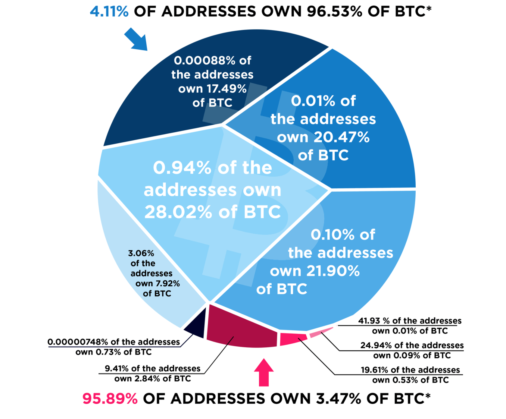
The hectic way this is split up makes it more difficult to see exactly what is going on and how the different proportions interact with each other. Rather than making clean pieces that are easy to compare, the volume of these pieces is not a reliable source of information for the viewer.
In addition, this data may not even be well-suited to the pie chart. The point of this graphic is to impress upon someone how the majority of BTC are owned by a tiny group of people. They needed to find the most impactful way to show this point — and it’s clearly not a graph that has to be explained with a bright pink arrow and a bright pink statistic.
12. Public services budget
These pie charts on the change in the portion of public services budget spent on health from the BBC could benefit from one, quick fix: change the colors. Although they put in that thin stripe of white to offset NHS spending, they don’t make the alternate color pop, and this chart would be hard to read if your screen brightness was low, if you were looking at a screen in sunlight, or seeing this graph projected.
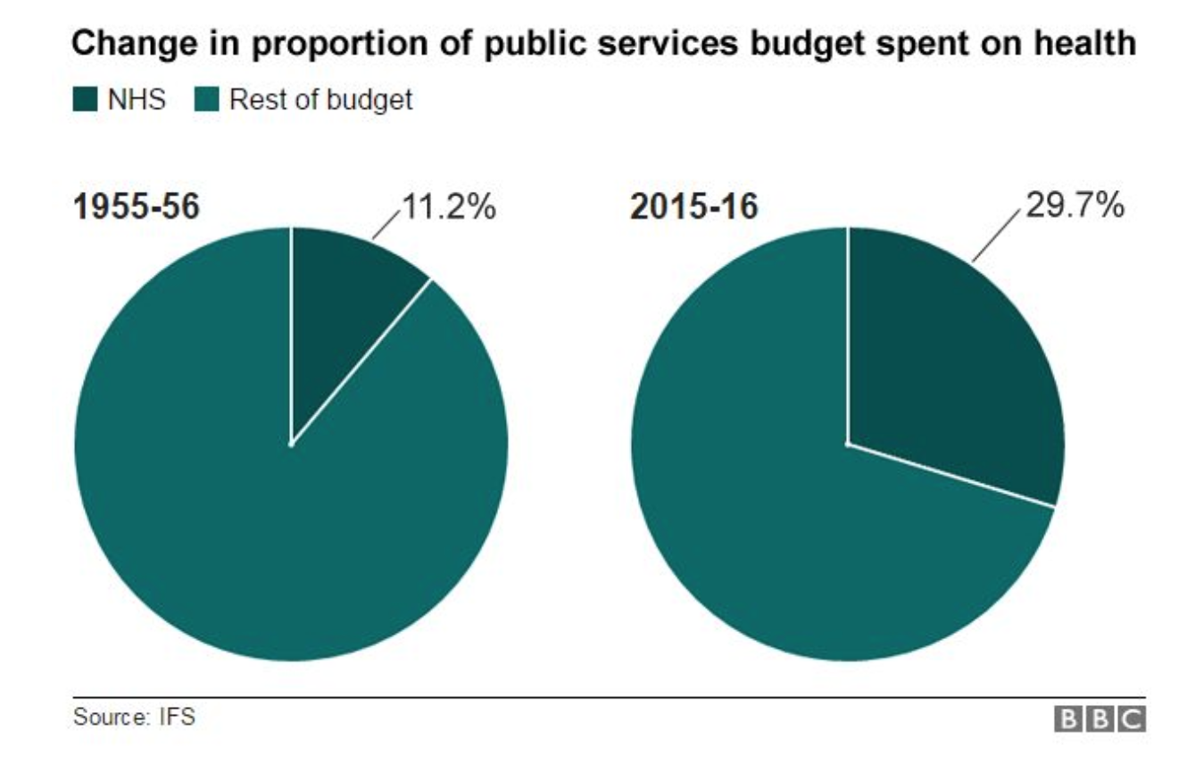
It takes a few seconds to make that color change, and look at how much more readable these charts are once it has been done:
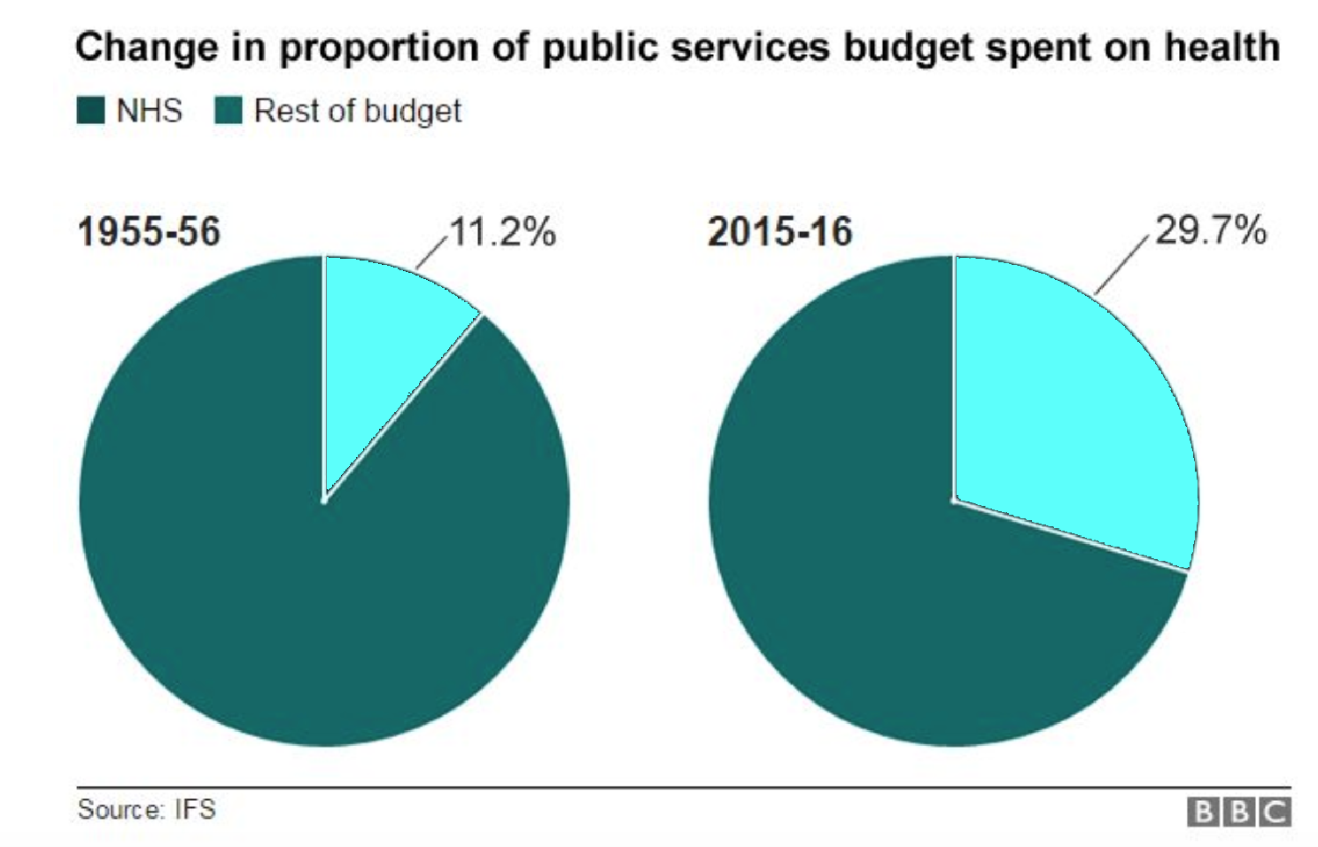
Coloring aside, the other thing that we would switch about this pie chart is, well, making it a line graph. This shows two data snapshots: one from 1955-1956 and one from 2015-2016. Yes, that shows a stark contrast — that the NHS budget has just about tripled — but having a line graph would show a better story about this data. When were increases made? Was it linear progress, or cuts and funding alternating? When you’re talking about change over time, a pie chart is not generally the right choice, unless you’re doing a series.
As you’re deciding on what charts to use, don’t just look at how the data can be represented, look at what those representations add to the narrative you’re trying to tell.
“Flow” Charts
Flowcharts are a great way to show processes, connections between different elements, or possible paths for a scenario to take. They can be chock-full of symbols, color-coding, keys, even cut-aways to other flowcharts and they can still make sense.
In fact, we like flowcharts so much we’ve written an entire article on them. They can be complex, simple, humorous, or serious and pack a serious informational punch. Good flowcharts:
- Visually reinforce a structural or procedural concept
- Use the proper symbols and markings, for legibility
- Have good use of color and graphics
The flowchart you’re about to see doesn’t even really get the basics down. In fact, we hesitate to even call it a flowchart.
15. Rep. Louie Gohmert’s chart
Legal editor and supreme court correspondent for BuzzFeed News Chris Geidner tweeted out this chart that was used in a hearing in the US House Judiciary Committee, and boy is it a doozy. We’ll give you a minute to try and make heads or tails of it.
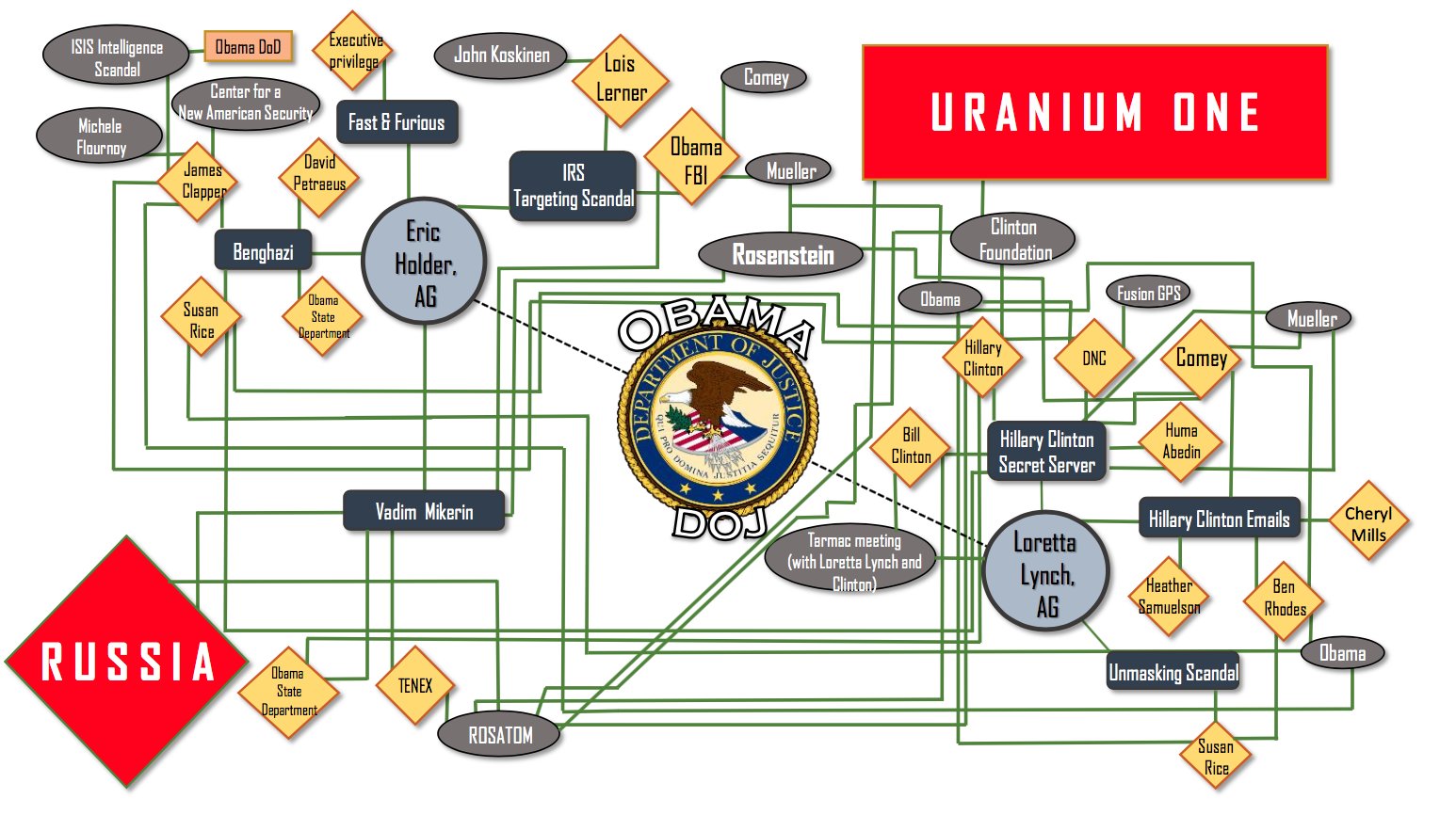
While you were trying to figure this one out, did you notice that there are two ovals for Obama? The lines are so intermixed, it’s hard to find, but when you see it, it seems like there’s a line running from Obama to… Obama:

This brings up a really easy starting point for what makes this graph so bad: the lines are impossible to follow. Whenever lines cross one another it is impossible to determine if the line is meant to turn, branch out in all directions, continue on, or some combination of the three. While there is an attempt at color coding and using symbols, clearly there is no rhyme or reason to the majority of it.
Take the huge, red diamond that says “Russia” — it has the same number of lines going to it as at least seven other diamonds — so why is it marked as some sort of standout? Why is there a huge symbol for the DOJ in the middle when it is connected to only two other nodes — and obviously blocks the path of lines going around it?
More to the point, what could anyone possibly glean from this chart? It’s fairly incomprehensible, and would still be fairly incomprehensible with an explanation. Given that this was apparently used in a committee hearing, we doubt anyone participating had adequate time to try and make heads or tails of this.
Yeah, we could spend time trying to make this better, but why bother? Go check out these great flowcharts instead. It’ll cleanse your eyes after staring too long at this.
Visualizations that Defy Category
It’s not unusual to see graphs that are more complex than your average line or pie chart. Sometimes, graphs combine multiple elements of different data visualizations to help readers absorb complex information. One great example of this is a bubble chart, which is a cross between a scatter plot and an area chart.
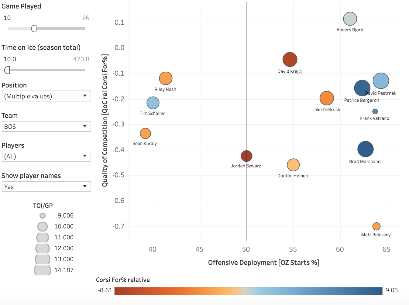
Take this iteration, which is a bubble chart about NHL player usage. It has the traditional elements of a bubble chart, because it’s a scatter plot whose dots are relatively sized, in this case based on time on ice, with more time on ice being a large bubble. But it also combines coloring to show which players see more shots taken by their team when they’re on the ice as well, with blue being more shots for and red being more shots against.
 (Source)
Yes, this chart is complicated, and it packs in the information. But for someone familiar with hockey statistics, it’s a serviceable way to visually compare players. For example, it’s easy to see which players spend more time on ice. Even if you have no experience with sports statistics, you can see that Frank Vatrano (upper right) has the least amount of ice time, because he has the smallest dot on the graph.
Unfortunately, you can kiss that type of readability goodbye. While we love the idea of getting deep into the possibilities of data visualization, there needs to be a certain organization present — something that is missing in these two gems from this year.
13. Climate Change: boy, is it complex
Climate change is not an easy issue to explain. While most people are probably familiar with some version of data visualizations on climate change — a graph of average summer temperature for a given location, for example — it’s rare that the entire issue is summarized by an entire graph.
Alright, the entire issue isn’t summarized by this graph, originally from a journal but repurposed by Vox. And by repurposed, we mean they wrote an entire article just trying to explain this graph, which is awash with symbols, several different color coding schemes, lines, two different scales, and confidence markers.
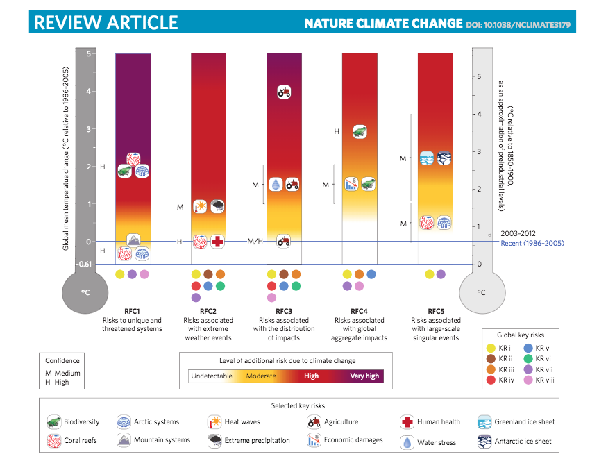
There’s a couple of lessons to take away here, but the biggest in terms of design is to think about what elements you want in your visualization. There will come a point when it does no good to add more information, even if it’s relevant, because it will obscure what you are trying to say.
But the other more relevant point here is that you need to use visualizations that your audience will understand. You’d expect to find our example chart about the NHL on a website dedicated to NHL analysis. You’d expect to find this climate change chart in an academic article, which was its original context. As soon as you take it out of that context, you end up in Vox’s position of having to spend an inordinate amount of time just trying to explain what’s going on.
14. Alabama voter turnout: Surprising. Graph used to represent it: Also Surprising.
This graph is an interactive piece of data viz used by Politico to underscore the changes in voter behavior during Alabama’s special Senate election. When you scroll over a dot, it gives you the voter turnout information for that county. (If you’ll recall, this can be a great way to pack more information into interactive viz.)
But instead of being an engaging feature. This is a confusing conglomeration of possibly a scatter plot mixed with coloring that does not seem to be strictly necessary. As one Reddit commenter put it, “I’ve been looking at this for five minutes and can’t figure out what it’s trying to say.”
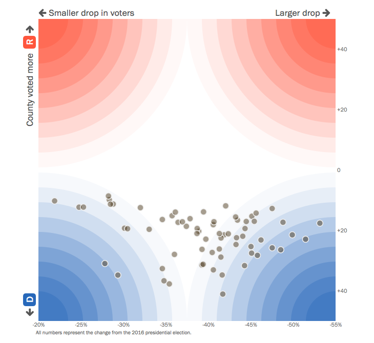
This chart is another example of when getting fancy with data just doesn’t pan out. If the intent is to show that there are far fewer voters turning out this midterm election, it would be much more effective to visually show the distance between the percentage of turnout for a handful of counties at a time (perhaps grouped geographically) rather than sticking everything on a chart like this.
This chart could also seriously benefit from an x (and possibly y) axis. At first glance, a viewer expects the bottom to be zero, as it is on the standard scatter plot. However, the 0 of the x-axis is actually in the middle of the graph. Instead of radiating color out to show percentage change, perhaps instituting a bit more of a grid would help a viewer group counties together to see what counties had 10, 20, 30, or 40+ percent rates of change.
To avoid mistakes like this, try to bring an outsider in to view any more complicated graphs you’re planning on using. If someone who is unfamiliar with your data can’t parse through your graph with a little time and written explanation, it’s probably too complicated.
Here’s to 2018…
Happy new year, everyone! May your 2018 be filled with good charts and good cheer, and none of the mistakes we’ve gone over above.
Did you see a hideous graph this year? Let us know in the comments — and keep an eye out for the bad viz of 2018. We’ll be doing another roundup then.
