15 of the Best Pieces of SaaS Content Published in 2017

In 2017, we as a people published more blog posts than ever before.
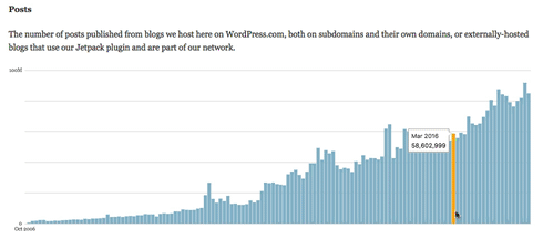
Since the beginning of the year, about 80 million blog posts have been published a month on WordPress alone. In October, more than 91,000,000 new blog posts were published. That’s almost 4x the number of posts that were published the previous October.
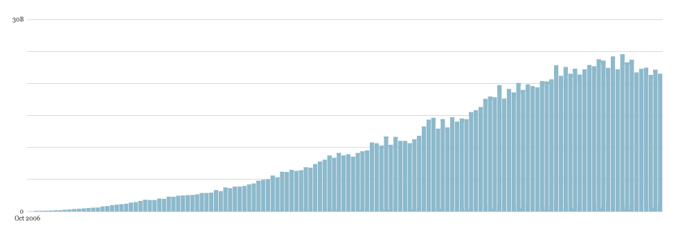
Reading, however, appears to be tapering off. In some cases, it’s actually dropping. Over that same timeframe (October 2016 to October 2017), pageviews went from 23 billion to 22 billion.
The idea of “content saturation” isn’t a hypothetical anymore. We’re definitely producing more and more content every month while the number of people reading that content is dropping. That raises the bar for everything you strategize, research, write and publish — considerably.
That’s why, in the spirit of the holidays, we decided to share 15 of our picks for best SaaS content of the year. Let these examples inspire you as you step back, recharge, and stretch out those content-writing fingers for 2018.
1. Slack: Reducing Slack’s Memory Footprint
This article from Slack is masterful because it takes a concept that’s very simplistic on its face — deciding when to send a push notification — and pulls it apart, thread by thread, to show that it’s actually far more complex and interesting than it seems.
The five developers behind the post start by taking the reader through the process of building a “tiny new Slack client” that runs when you have idle teams. This client, in order to reduce Slack’s memory consumption, only performs a few tasks. One of these is updating your notifications.
This presented a problem. “Slack is known for its granular and powerful notification preferences ,” they write, “Which is great for customers but meant we needed to migrate a good deal of client-side logic to the server.”
Just how complex could a notification system be? See for yourself:
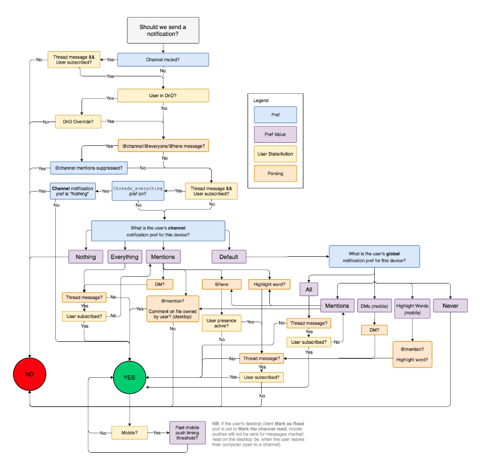
And you thought that little noise was just mindlessly interrupting you all the time.
This flowchart is not only a great example of a flowchart, it’s also an example of a piece of content that everyone can absorb.
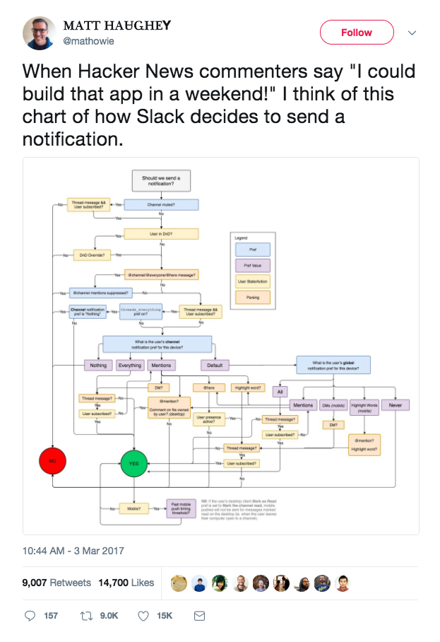
A regular person can understand exactly what this flowchart implies — that even the simplest feature in a complex piece of software is probably going to be fairly complex. And this accessibility opened up the path to this post going viral, which is exactly what happened when a writer at Slack sent out this tweet:
Lots of logic behind that little knockbrush.
2. Appcues: The 5 Best User Onboarding Experiences
“‘So, who has the best user onboarding experience?’ We get this question all the time.” With an opening like that, is it any wonder why Appcues nailed this piece on user onboarding? They gave their audience exactly what they asked for. If you have any FAQs that can be answered with a piece of content, don’t hesitate to get your blog fired up.
This article lays out exactly how each onboarding sequence succeeds with bullet points of key takeaways and demonstrates each sequence with a slideshow. This is a clever way to show the entirety of a given company’s onboarding while leaving the article skim-able. It’s a huge upgrade from stitched together screenshots or lengthy picture embeds.
3. Help Scout: The Truth About AI in Customer Service
Yes, customer service is a huge use case for Help Scout’s product, but one reason why this piece resonates in particular is that it deals with a huge worry of today’s workers — automation. Those in front-facing and service positions are likely to be especially worried about AI taking over their roles, and Help Scout is here to spread the truth.
One thing that sets this content apart is that it includes a video of Nick Francis, CEO of Help Scout, talking about chat automation. That video is part of a larger series put out by Help Scout, and incorporating an episode with some candid responses from their CEO tips the scales from good to great for them when thinking about this post as a complete piece of content.
4. Groove: How We Built an Online Course That Generated $120,679 in 5 Days
When your online course generates hundreds of thousands of dollars in under a week, it’s probably safe to say that your readers are interested in the topics and, more importantly for this piece by Groove, interested in online courses themselves. They parlayed the chunk of their readership who signed up for the course into a successful series of pieces that delved into why and how they made their online course.
The honest, transparent tone has been key to many successful pieces of content — from CEO letters to YouTube Stars — and this article takes a pragmatic twist on the bare-all confessional. They present their exact worries and reasoning for each step it took to get the course off the ground, starting with their worries about even putting on the course itself. And they clue the reader in on the keys to their success, like how they used online course platform Podia, which made it super simple to build and launch the online course.
They also back up their position with some slick graphics, like the one we’ve screenshotted part of above. They offset their important takeaways with text boxes and subheadings, and really put in the work to make this one of the most readable pieces of the year. They proved that breaking up text effectively is one of the best things you can do to get a reader through a piece.
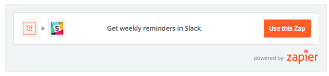
5. Zapier: The Remote Work Survival Guide
Many articles focus on weaving an argument into an arc that’s easily followed, usually by pulling it through a narrative arc. Zapier throws this model out in their how-to guide to remote work. They split the article into discrete sections that you can click through to, and each section has its own graphic and list of tips to deal with remote-specific work hurdles.
These discrete sections work well because this article is informational without being driven by an overarching narrative — and to try and put one in would probably feel stilted. We could imagine some cringe-worthy attempts to stuff this in a narrative — Jane is new to remote work and needs to schedule her time… — and segmenting this guide was the right move.

Another thing that makes this article particularly effective is the embedded tips and links. The article covers workplace behavior and they beef up the personal tips, like how to set up your own schedule, with suggestions for Zaps, quotes from professionals, and links to other content that deals with the difficulty of a digitally connected, remote workplace. Given the positioning of Zapier’s product in the digital workplace, filling this article with personal and practical tips for remote workers who are 100% reliant on digital systems nails their audience.
6. Piktochart: 50 Visual Marketing Statistics For Today’s Marketer
This article from Piktochart puts its money where its mouth is. The article details how visuals are much more engaging and easy to process for readers, and it represents each statistic it discusses with its own graphic, like the following:
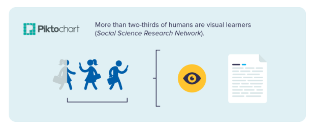
The article is super easy to scroll through and each stat is interesting and relevant to a marketer’s interests. The graphics are well done and you can feel yourself tucking away these facts for future use as you scroll through. Best of all, each image comes with an embed code, so readers can easily share their learnings.
Since this content is clearly meant to be repurposed as facts and figures, letting readers know that they can easily embed these visuals is a great way to pique interest. Readers will read the article because it’s relevant and interesting, and return to it for stats when they need them, encouraging reengagement with time.
7. Price Intelligently: A Comprehensive Data Guide to Why You Shouldn’t Discount
When we talk about engaging with content, we mean getting people to pay attention — and this Price Intelligently article grabs attention in a number of ways. Their writing is clear and easy to understand, and their points are supplemented with graphics, especially charts that demonstrate the principals of why you shouldn’t discount.
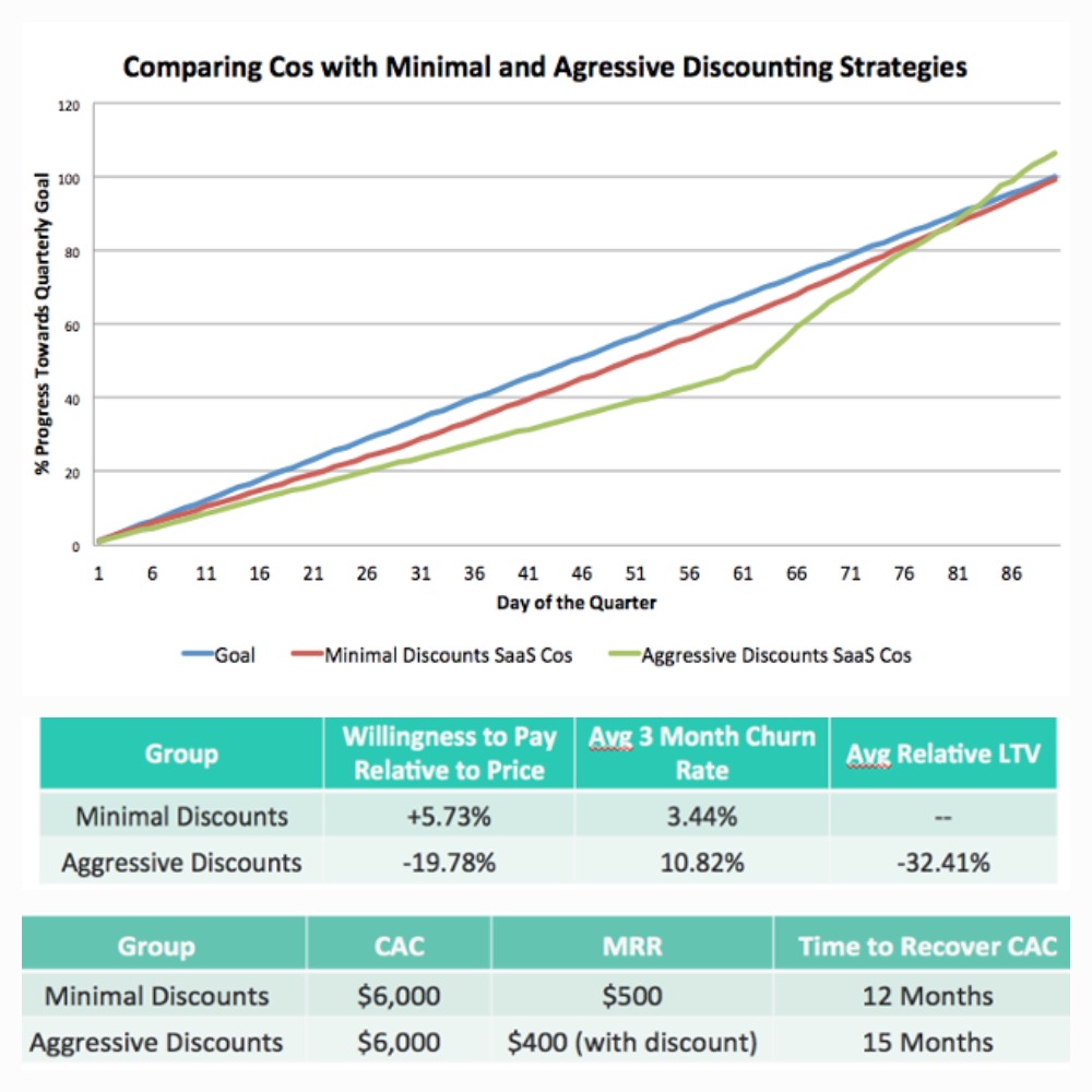
Math and equations can be cumbersome to explain just using text, so putting in tables, graphs and plots as Price Intelligently does makes it easier for readers to engage in their material and gives them a quicker grasp of their concepts — and the proof behind them.
We also like that this article includes a video of Patrick Campbell, CEO and Founder, giving some more color to the post. His presence gives a pop and another point of engagement for people who are reading this post. While the video and the post cover roughly the same topic, they both have their own color and use, letting people absorb the material in the way that feels best for them. This is a trend for Price Intelligently’s content, and it plays well on pretty much every post.
8. Moz: Which of My Competitor’s Keywords Should (& Shouldn’t ) I Target?
Speaking of multiple points of engagement, this Moz post from their Whiteboard Friday series is a great example of how to parlay one piece of content into a constellation of content. For the video lover, there’s a clip with explanation and visuals. For the serial podcaster, there’s a SoundCloud file embedded in the post. For those looking for a quick, graphic takeaway, there’s one of those and for everyone else there’s a video transcription.
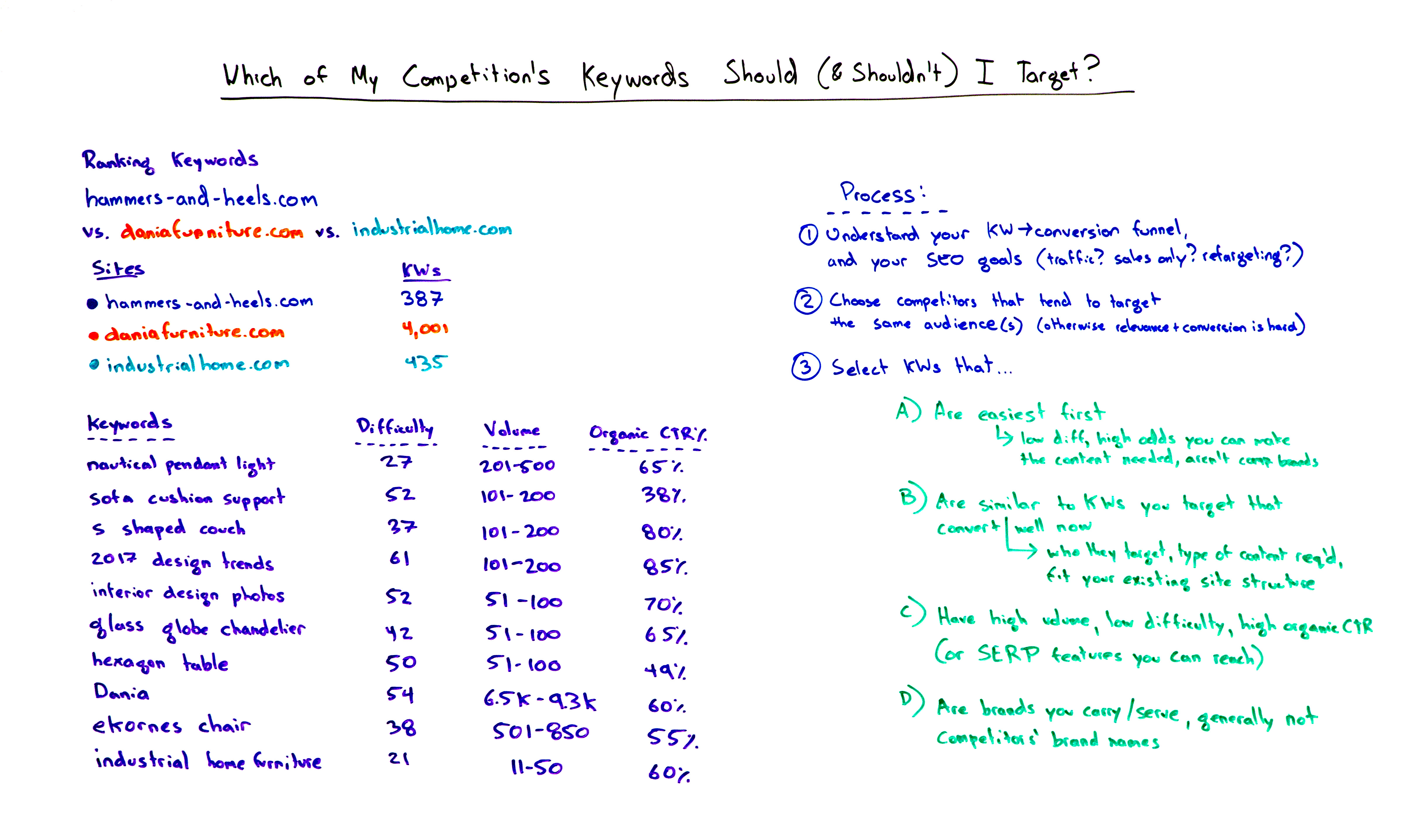
A takeaway whiteboard graphic that shows Moz’s process for competitive keyword research.
Unlike what Price Intelligently did, Moz is taking the exact same content and displaying it different ways. This can be a great way to extend the life and engagement of your content without putting in the extra work to, say, write a video script and a blog post. The key is to make sure that every element you spin off of your original concept — in this case, a video — is valuable in its own way. If someone is commuting to work, they might not be able to watch a video, which is why the audio file works, for example.
9. Patreon: 44 Award-Nominated Podcasts & Their Top Rated Episodes
If you want to get people engaged with your content, why not make them engage to get your content? That’s exactly what Patreon has done in their cut-above list of award-nominated podcasts. They don’t just slap on a logo and a brief description in an endless list of recommendations. Instead, they engage readers in three ways:
- They encourage readers to rate their favorite podcast episodes to change the list
- They require readers to expand a text box to see a description of the podcast
- They require readers to expand a text box to see a description of the most popular episode of that podcast
This means that readers have to make a decision about how interested they are in each podcast, and get a reward (information) for each podcast they engage with. This stops people from mindlessly scrolling around the list because it prompts reader engagement to reveal the meat of the article.
While this technique might not work in every scenario, when you can integrate ways for your readers to reveal information for themselves, it pulls your audience in and makes them feel like they’re a part of the material they’re reading.
10. Buffer: A Simple 3-Step Approach to Increasing Conversions and ROI with Social Media Advertising
This Buffer article is a great piece of content for a couple of reasons. For one, the content in the article is useful and relevant. But how they structure the article and give readers different tools to absorb the information is what truly makes this an engaging piece.
They use a combination of video, text, graphics and annotated screenshots to present a full picture of their strategy to increase conversions. With each element that they add, they’re giving new and important information, not just reiterating what the text says.
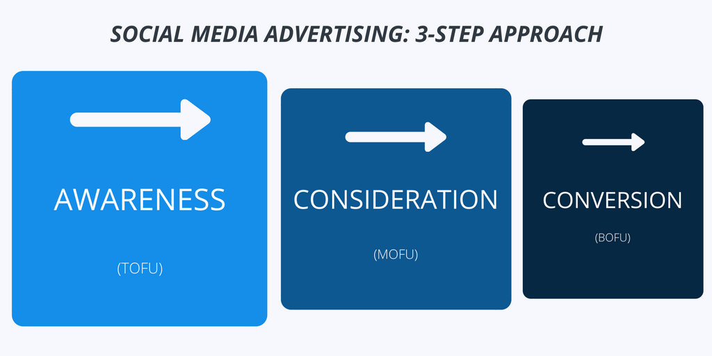
This is a masterclass on how to blend different mediums together into a consistent, readable piece of content. Rather than just being a jumble of resources, the article keeps moving along and presents each argument in a structured way with thoughtful additions to help you digest and solidify what you’re learning.
11. Shopify: Black Friday Cyber Monday 2017: An Analysis of Over $1 Billion in Sales
When it comes right down to it, this Shopify article recapping black Friday and cyber Monday probably doesn’t even need any words — that’s how good their graphs are. And they realize it, too — instead of choking their excellent visual work with too much explanation, they keep their paragraphs short and to-the-point, letting their stars do the talking.
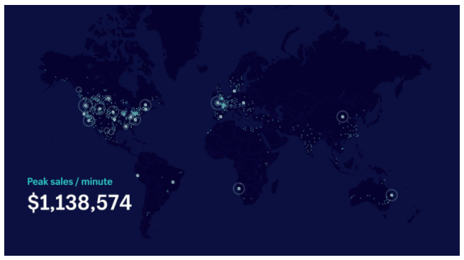
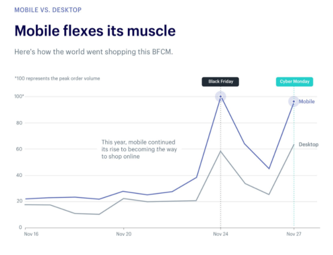
This means that their article is more engaging because they’re focusing on the content that is their strongest and letting it come to the forefront. If you’re great at one thing — writing, video, gif explanations, graphs, original drawings — use that to your advantage.
12. Airtable: How to Build a Content Marketing Pipeline
This piece from Airtable discusses building a content marketing pipeline — and the information is good. But what’s truly impressive is the way that Airtable shows off their product by embedding different parts of the Airtable base right into the article. You can click on and expand cards, see how the base works, and play around with the product a little, all without leaving the article.
They also include gifs that show further how their product works, without feeling like pushy product placement. Because the article is discussing the finer points of organizing content, it makes sense to see how you should label, categorize and arrange potential articles in a base.
The gifs and the inserts of the base tell a story about the topic that integrates into the text and enhances reader understanding. They’ve taken their product and used it to fuel this understanding, which is the best possible way to show a reader that you’re part of the solution to their problem.
As a blog post, it’s innovative and informative. As a piece of marketing, it’s very effective. And that’s why it’s on our best SaaS blog content list.
13. Wistia: Wearing Color for the Camera
Anyone who is a regular reader of the Wistia blog will not be surprised to find a post of theirs on this list. Wistia, a video hosting software, frequently posts about content that’s relevant to anyone who is trying to shoot a video, from lighting to scripts.
This particular article covers what to wear when you’re shooting, and it’s full of useful tips. Each of those tips comes with a little video of people demonstrating the suggestion in a number of different ways, so you can see how things play out. Take this gif from their video accompanying a tip to wear jewel tones near your face:

By demonstrating how each tip plays out, Wistia positions themselves as an expert not just through the strength of their brand, but by actually showing you how well their suggestions work. The videos they include are lighthearted and welcoming, which makes the article a pleasant read and falls in line with their brand.
We also love how the videos serve as additional information for the reader. The clip above, for example, shows the basic range of jewel tones at the bottom, and demonstrates how they look in different clothing combinations on different people. In this way, the videos are really what elevate this article.
14. Grammarly: Do You Know How to Network?
So far, we’ve talked about a lot of different types of content that can go into a blog post. But what if your blog post wasn’t actually a post at all?
It’s worked well for Grammarly. The company, who market their grammar- and spell-checking software as a way to level up professionalism, created a quiz to help people figure out how good they were at networking.

The quiz is an effective tool that can help you realize if you’re thinking about networking in the wrong way, and Grammarly links you to other posts that are relevant to your job search, as well:
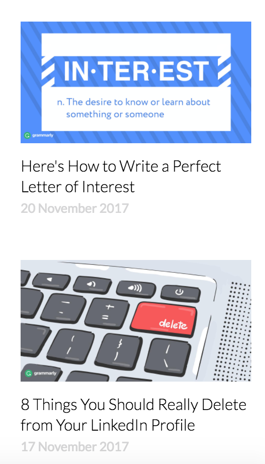
This means that they’re turning the quiz into more than just a fun few minutes at work, and helping you solve your problems. We would guess that someone who isn’t great at networking might need to take a second look at their LinkedIn, or might be a new job seeker who can’t write a great letter of interest. Giving the quiz-taker these extra resources ensures that the taker is getting real value from even just a few clicks.
We love the idea of a quiz because it is a great way to engage the audience and, as anyone who has taken one (or a hundred) Buzzfeed quizzes knows, they’re hard to resist. People love being tested on the knowledge and told facts about themselves in a lighthearted way.
Lastly, one big thing this quiz does right is act completely separate from the product. It’s not saying “Did you get Grammarly to check the spelling on your business cards?” Instead, it really is just a fun little quiz, with bonus extras to help someone out. That type of genuine feeling plays well, and fits well with the rest of the content that the company puts out: sympathetic tone with real value.
When you can create content that’s unexpected, go for it.
15. Clearbit: Clearbit Reveal in Salesforce – Turn Anonymous Traffic Into Qualified Sales Prospects
This post from Clearbit is brilliant in its simplicity. The entire thing is a short paragraph and a gif, but boy is it effective. The post is supposed to be straightforward and instructional, and, in this case, a gif is a great way to get that. They could have written out steps, or even done annotated screenshots, but the gif is the most efficient way to relay their message, which means that it’s delivering maximum value with minimal work for the reader.
![]()
The lesson to be learned here is that you don’t need to be fancy to be good. It might be easy to see this choice as a risk on Clearbit’s part — it’s extremely curt and almost doesn’t feel like a blog post. But it works because Clearbit understood that the best thing you can do for your content is to make it valuable, not to make it formulaic or run of the mill because that’s what it seems like you’re supposed to do.
That’s all for this list. If you had a piece you particularly loved or that you think we should have checked out, why not let us know in the comments?